Fyodor Rokotov Palette 2

Palette Analysis
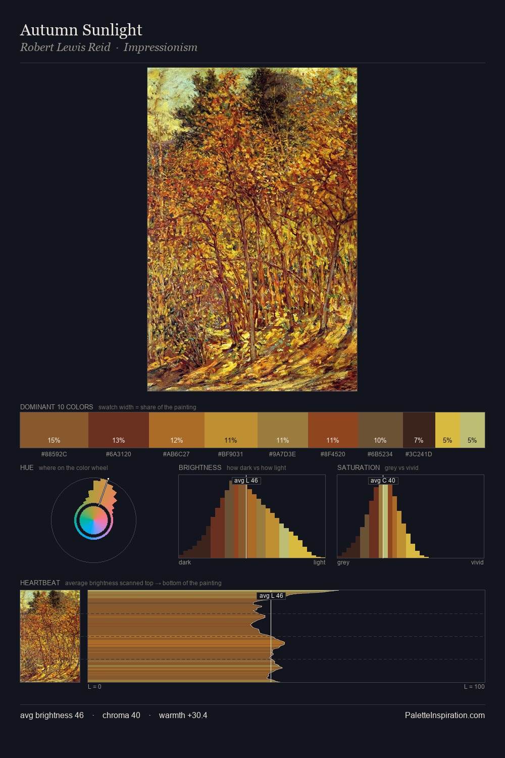
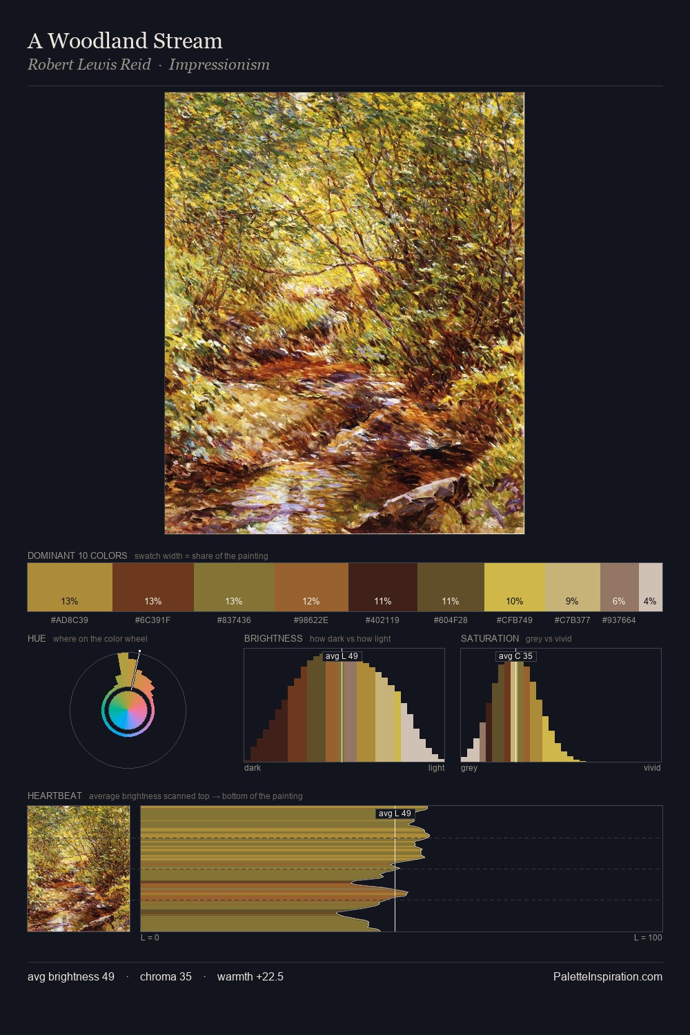
Fyodor Rokotov occupies the comfortable middle of the value scale, avoiding both extremes to hold the eye in a sustained middle grey. Warm and cool are kept in productive tension, creating the kind of chromatic harmony that sustains the eye. A restrained, mid-chroma palette: every hue is present and legible, but nothing shouts. The saturated accent, #754520, registers at 8.9% - sparse enough to feel like a deliberate surprise. At 44 units across the value scale, the palette keeps contrast readable without letting it dominate. The palette reads as an Impressionist one - light-biased, chromatically direct, and built on temperature contrast rather than value opposition. This is palette 2 of Fyodor Rokotov's sequence - a single chapter in a chromatic story told across many works.
Example use cases
- theater design
- jewelry brands
- tobacco-adjacent retail
- event branding
- film & entertainment
I Love This!
Copy, export, or download for your project