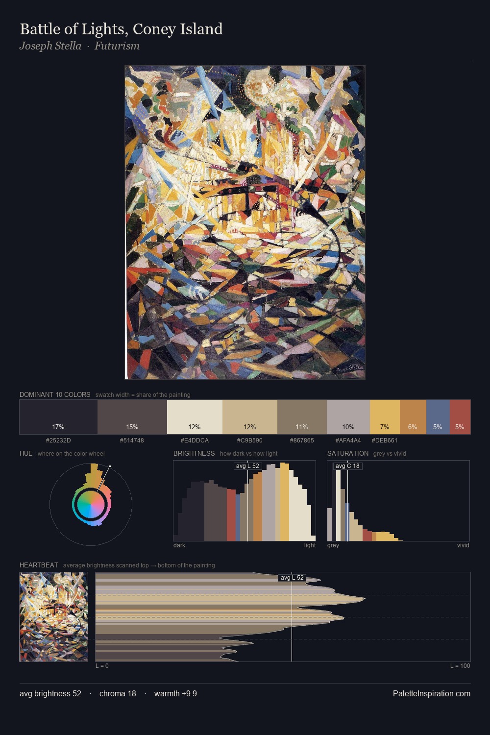
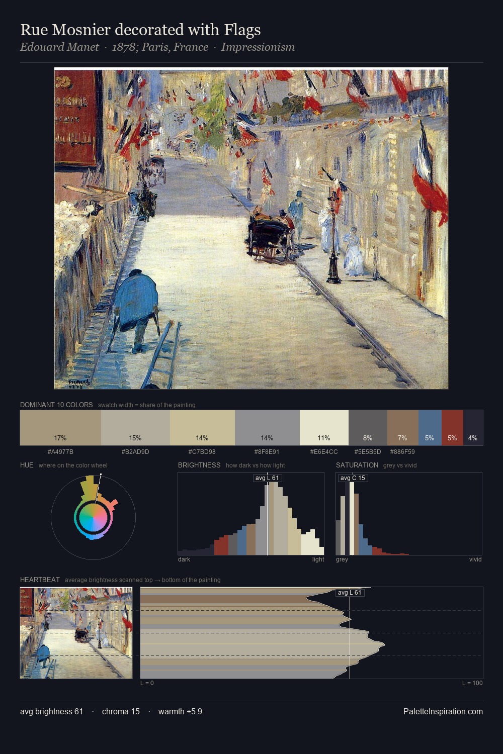
Futurism Palette 7
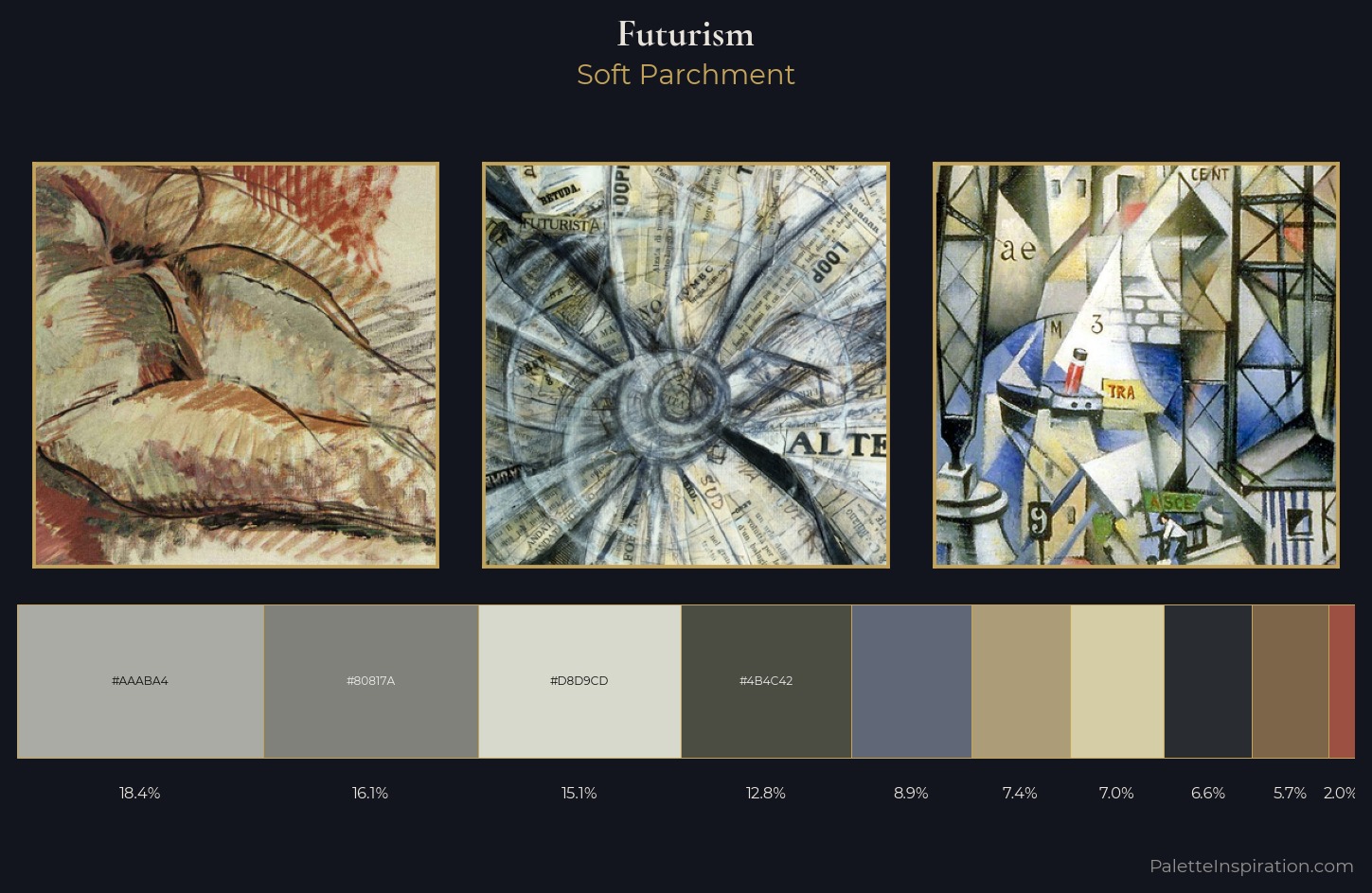
Soft Parchment
Soft Low-contrast, gentle chroma - mid-key values and low saturation, approachable and calm.
Parchment Aged warm neutral - the color of old manuscript parchment, tan and slightly yellowed.
Palette Analysis
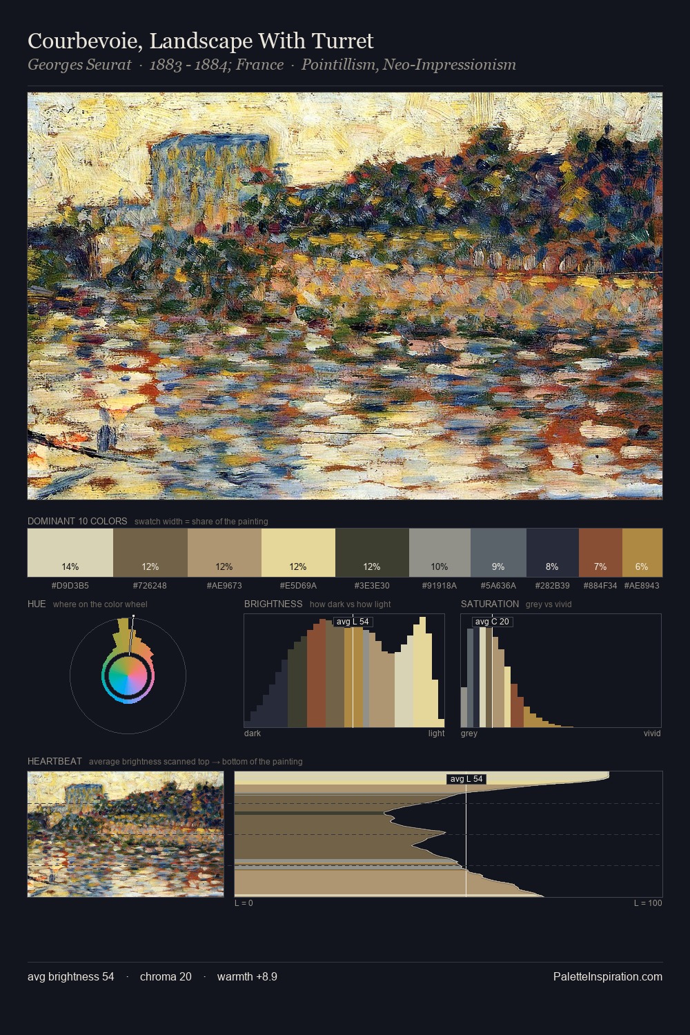
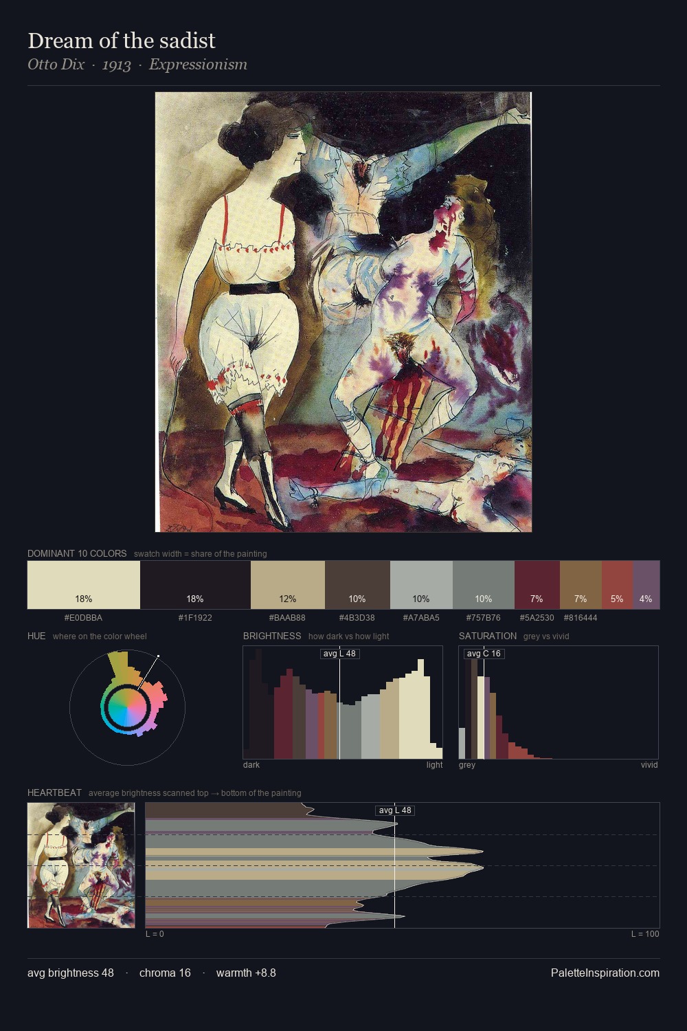
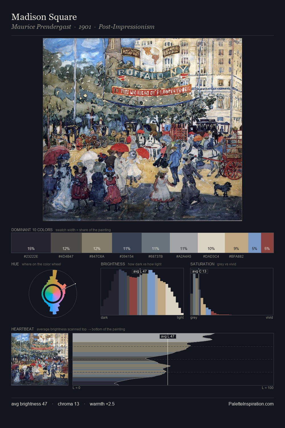
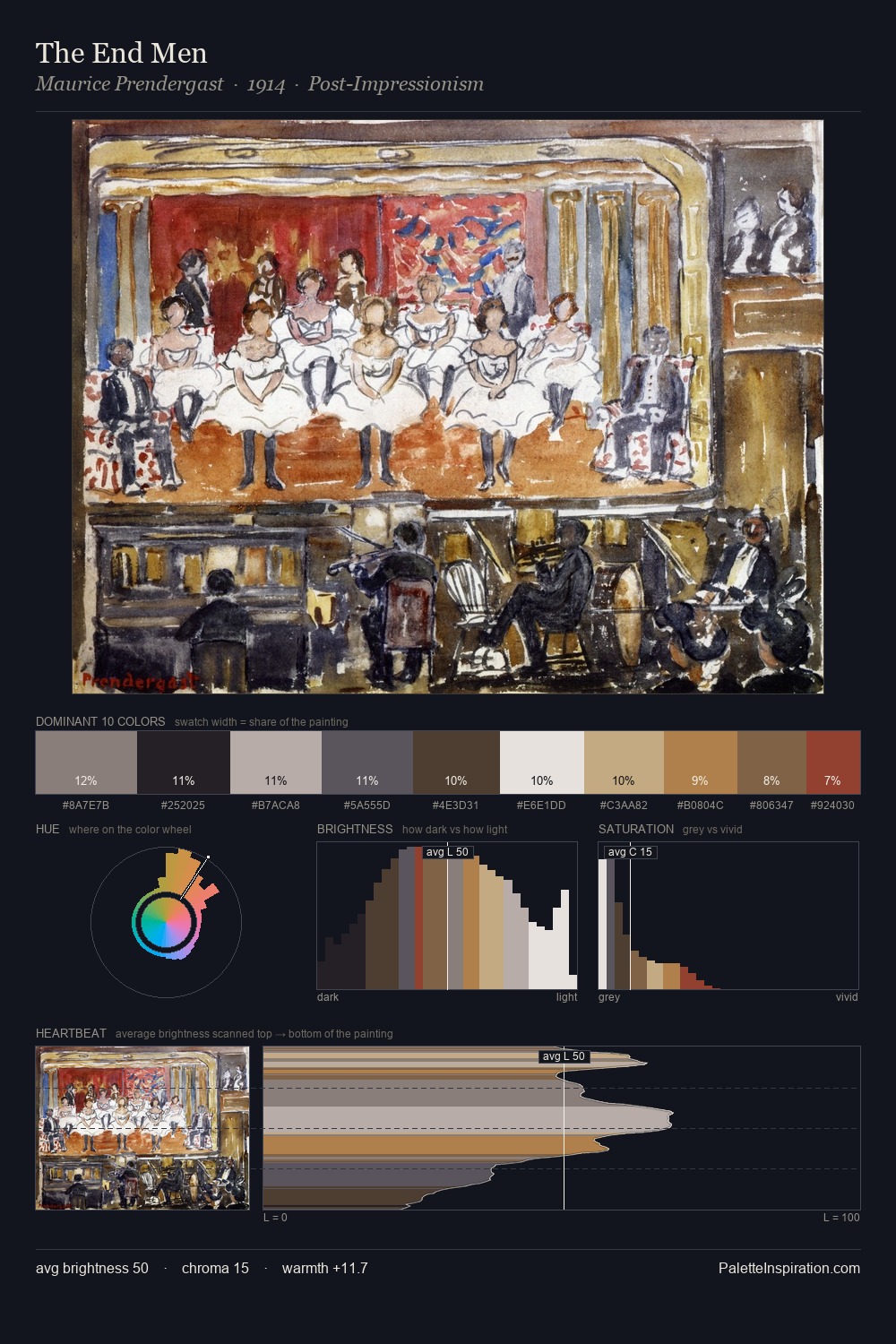
Futurism distributes its values across the middle register, creating harmony without high contrast. Temperature is cool-dominant, with blue and green families claiming the largest areas. Muted throughout, the palette achieves its effects through value and temperature rather than chromatic force. The highest-chroma note - #7C6549 - appears at just 5.7%, deployed as a precision accent against the quieter ground. At 58 units of value range, the palette has the tonal breadth to sustain complex spatial readings. The mid-to-high key, cool bias, and moderate chroma point to outdoor observation - sky and diffused daylight as the dominant light source.
Example use cases
- exhibition design
- foundation branding
- estate management
- art education
- museums & galleries
I Love This!
Use This Palette
Copy, export, or download for your project
Copy, export, or download for your project
Copy:
Download:
Share: