Fujishima Takeji Palette 9

Palette Analysis
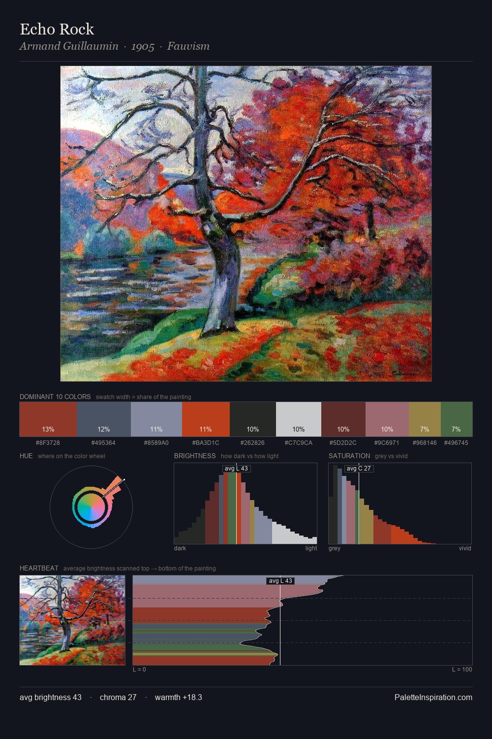
Values in Fujishima Takeji tilt decisively toward white, giving the palette its luminous character. Fujishima Takeji tilts toward cool - blues and silver-greys carry the structural weight. Muted throughout, the palette achieves its effects through value and temperature rather than chromatic force. #DAD7D3 at 29.2% of the palette: an overwhelming presence that pulls all other colours into its gravitational field. The highest-chroma note - #571F1C - appears at just 3.0%, deployed as a precision accent against the quieter ground. The full value range is 67 units: broad enough to build convincing three-dimensional form. High luminosity and cool temperature suggest the plein-air condition: unfiltered daylight and open sky. This is palette 9 of Fujishima Takeji's sequence - a single chapter in a chromatic story told across many works.
Example use cases
- exhibition design
- foundation branding
- estate management
- art education
- museums & galleries
I Love This!
Copy, export, or download for your project