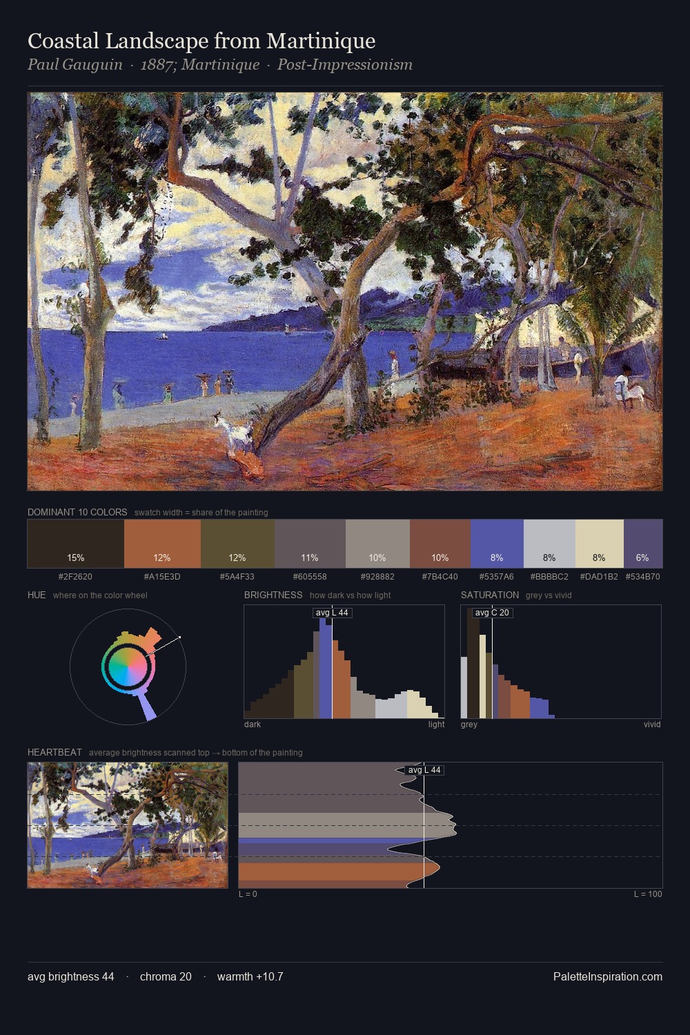
Frederick William Burton Master Palette
Muted Tawny
Muted Deliberately desaturated - chroma pulled toward gray, the restraint of tonal painting.
Tawny Warm orange-brown - a traditional term for the color of tanned leather or lion fur.

Palette Analysis
Frederick William Burton distributes its values across the middle register, creating harmony without high contrast. Warm hues command this palette; Frederick William Burton favours the reds, oranges, and yellows of firelight and earth. Chroma is kept low across all colours, producing the soft, enveloping quality that characterises tonal painting. The saturated accent, #592A2B, registers at 10.0% - sparse enough to feel like a deliberate surprise. From deepest dark to palest light, the palette traverses 57 units of the value scale - a span that creates natural depth. This is the light Frederick William Burton preferred, made measurable.
Example use cases
- ceramics & pottery
- boutique hospitality
- menswear
- heritage food brands
- craft & artisan brands
I Love This!
Use This Palette
Copy, export, or download for your project
Copy, export, or download for your project
Copy:
Download:
Share: