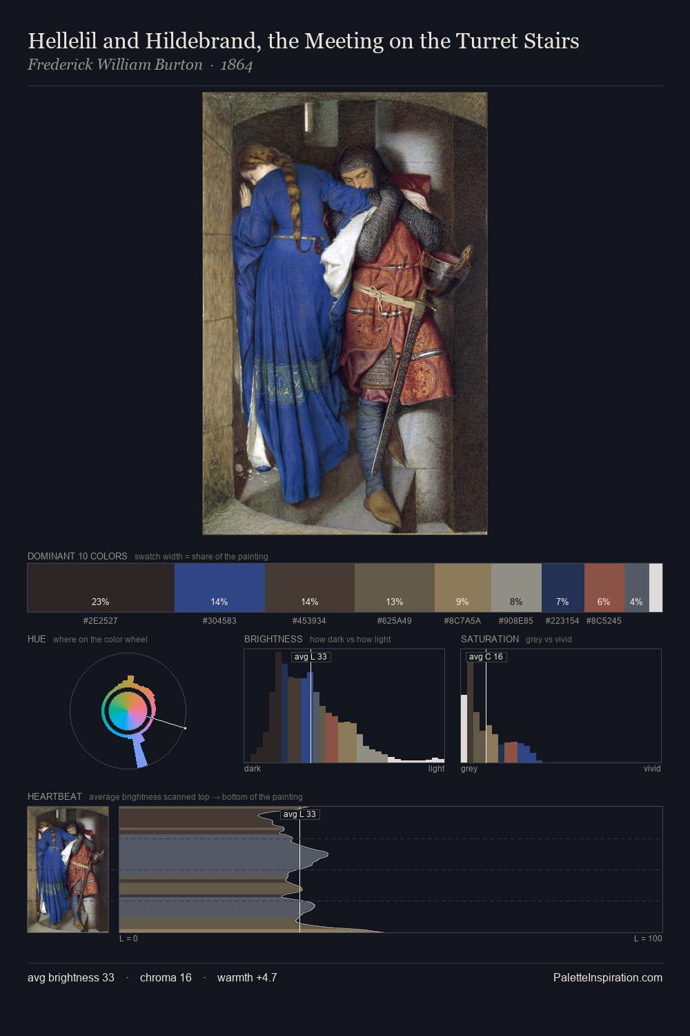
Frederick William Burton Palette 4
Somber Pewter
Somber Subdued and serious - low-key, low-chroma, emotionally weighted toward gravity.
Pewter Mid-tone warm gray - the color of pewter alloy, between silver and lead.

Palette Analysis
Frederick William Burton occupies the comfortable middle of the value scale, avoiding both extremes to hold the eye in a sustained middle grey. Frederick William Burton orchestrates warmth above all else - reds, ambers, and siennas take the lead. Saturation is deliberately withheld - the beauty here lies in the near-monochromatic gradations rather than colour difference. The most saturated colour, #5B3031, covers 5.2% of the surface: too much to call an accent, too strong to ignore. The full value range is 65 units: broad enough to build convincing three-dimensional form. This is palette 4 of Frederick William Burton's sequence - a single chapter in a chromatic story told across many works.
Example use cases
- food packaging
- leather accessories
- travel & outdoor
- natural cosmetics
- interior design
I Love This!
Use This Palette
Copy, export, or download for your project
Copy, export, or download for your project
Copy:
Download:
Share: