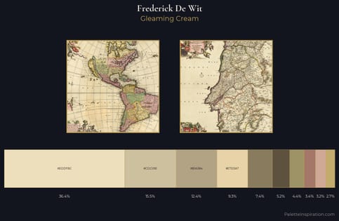
Frederick De Wit Master Palette
Palette Analysis
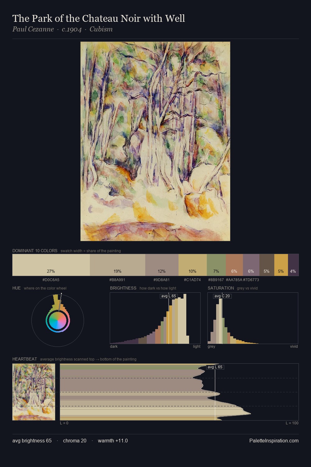
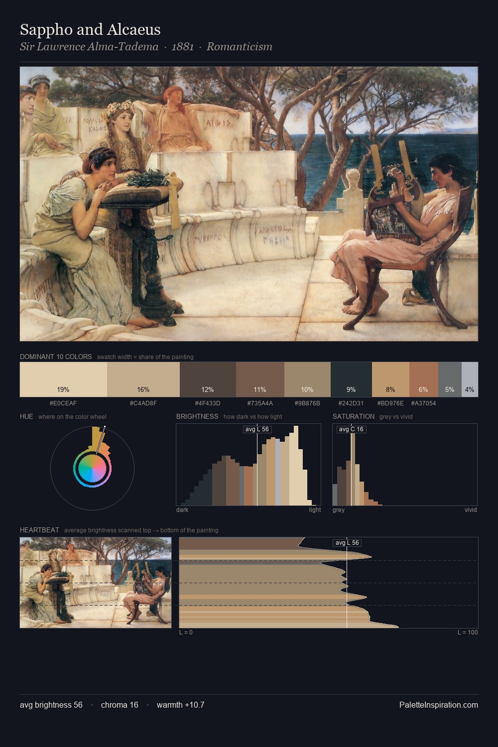
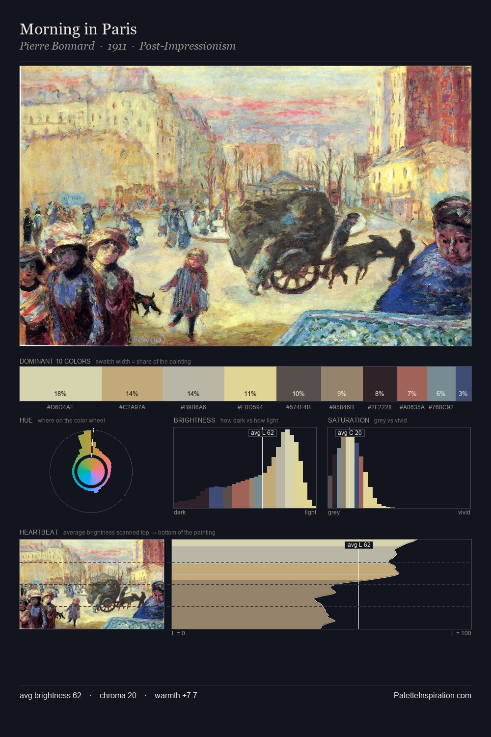
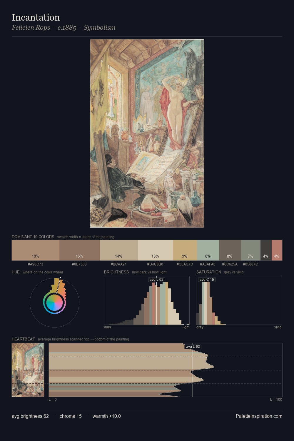
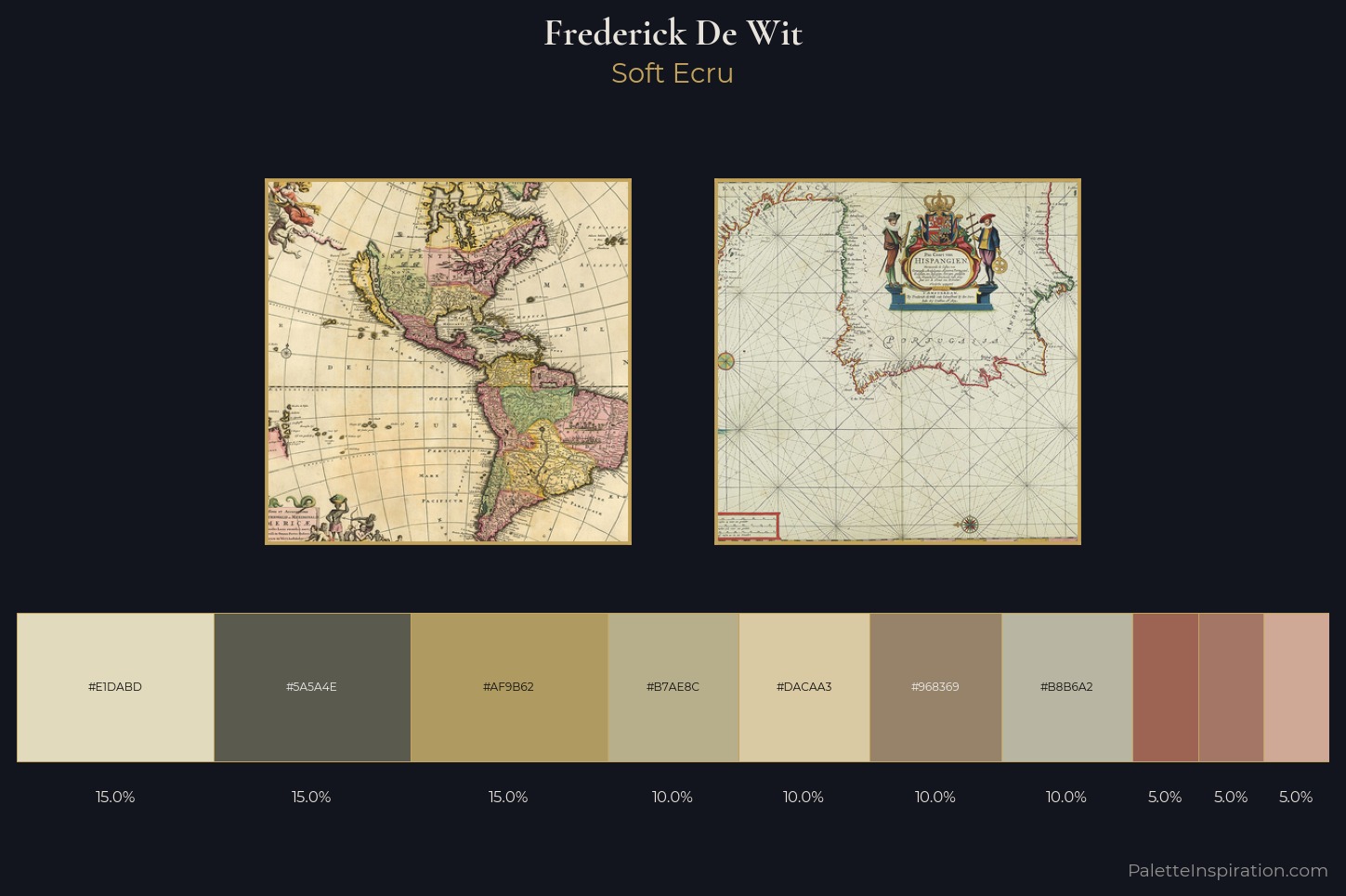
Frederick De Wit is high in key: pale, luminous, and filled with optical air. Cool tones set the register here - the blues and greens easily outweigh any warm accents. Chroma hovers near zero; colour declares itself through subtle shifts in hue rather than outright saturation. The most saturated colour, #D0A996, covers 5.0% of the surface: too much to call an accent, too strong to ignore. 43 units of value spread create a palette that is varied but unified - contrast in the service of harmony. The palette has the character of outdoor light: cool, mid-bright, with colour rendered faithfully rather than expressively. Taken together, these qualities constitute Frederick De Wit's chromatic voice - distinctive enough to be read across an entire body of work.
Example use cases
- ceramics & pottery
- boutique hospitality
- menswear
- heritage food brands
- craft & artisan brands
I Love This!
Copy, export, or download for your project