Frederick Carl Frieseke Palette 4
Dimmed Pewter
Dimmed Moderate shadow - values pulled toward mid-dark, as if a light source has been reduced.
Pewter Mid-tone warm gray - the color of pewter alloy, between silver and lead.

Palette Analysis
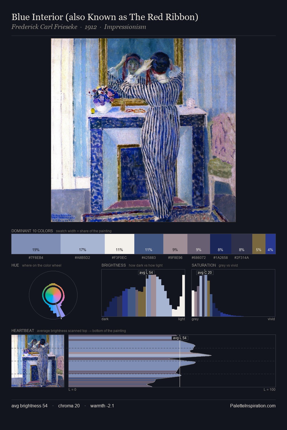
Frederick Carl Frieseke sits in the centre of the value range, lending the palette a sense of even, sustained light. Frederick Carl Frieseke tilts toward cool - blues and silver-greys carry the structural weight. Every colour is desaturated; the palette proceeds through near-neutrals and gently-coloured greys. #27388D functions as the palette's exclamation mark: highest chroma, lowest percentage (4.7%). At 66 units of value range, the palette has the tonal breadth to sustain complex spatial readings. High luminosity and cool temperature suggest the plein-air condition: unfiltered daylight and open sky. This is palette 4 of Frederick Carl Frieseke's sequence - a single chapter in a chromatic story told across many works.
Example use cases
- publishing
- corporate identity
- consumer apps
- hospitality
- design agencies
I Love This!
Use This Palette
Copy, export, or download for your project
Copy, export, or download for your project
Copy:
Download:
Share: