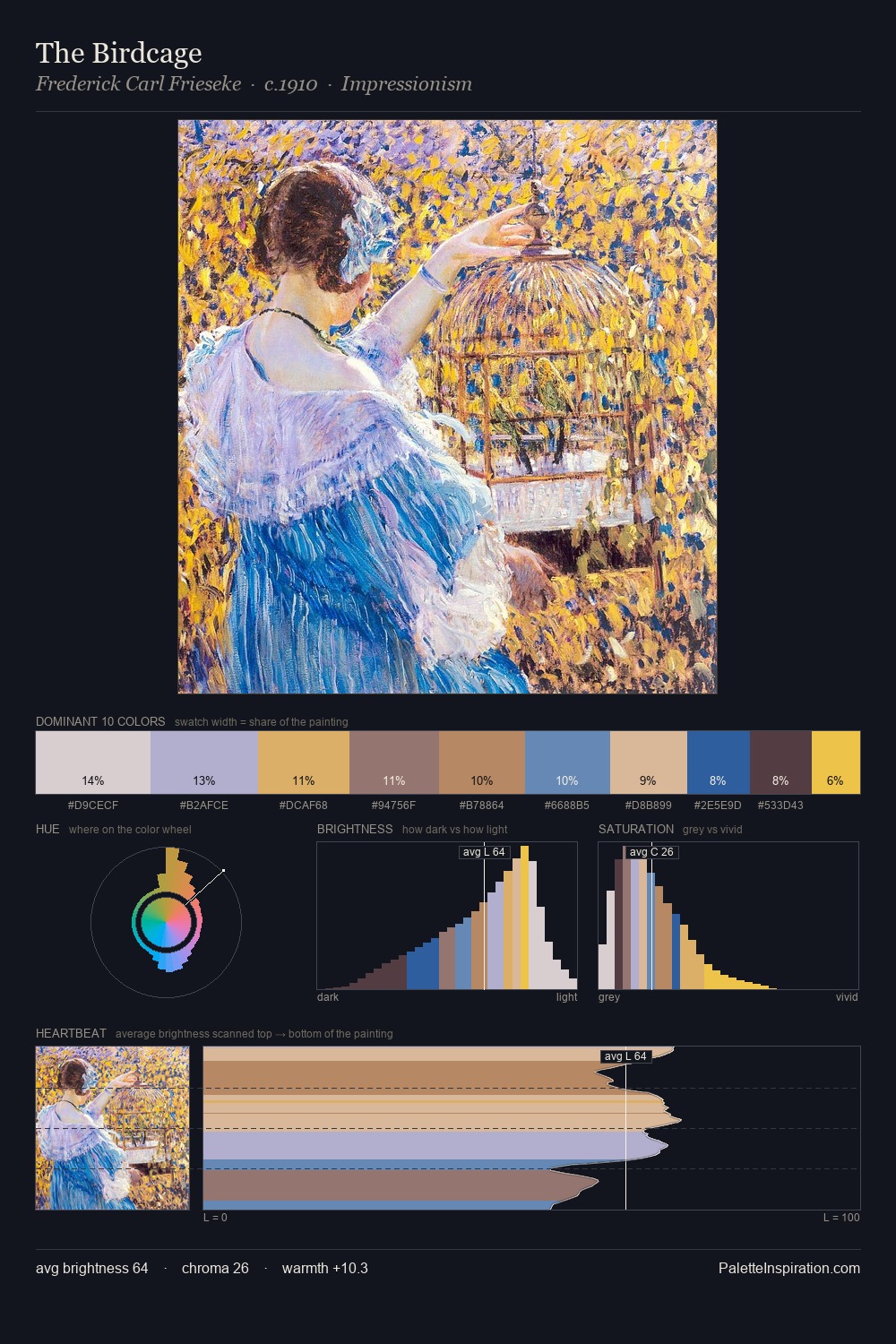
Frederick Carl Frieseke Palette 1
Pale Ivory
Pale High-key and low-chroma - delicate, bleached, washed with light.
Ivory Warm creamy white - the color of natural ivory, warmer than pure white.

Palette Analysis
The high-key values of Frederick Carl Frieseke give it an effulgent, almost bleached quality. Warm and cool tones are held in careful balance - neither family dominates, creating tension and resolution simultaneously. The absence of saturated colour is itself an expressive choice: this is a palette of restraint and atmosphere. The saturated accent, #C89966, registers at 7.7% - sparse enough to feel like a deliberate surprise. The palette spans 41 value units: a measured range that delivers coherence over drama. In the context of Frederick Carl Frieseke's full range of palettes, group 1 represents one movement in an ongoing chromatic dialogue.
Example use cases
- exhibition design
- foundation branding
- estate management
- art education
- museums & galleries
I Love This!
Use This Palette
Copy, export, or download for your project
Copy, export, or download for your project
Copy:
Download:
Share: