Franz Matsch Master Palette

Palette Analysis
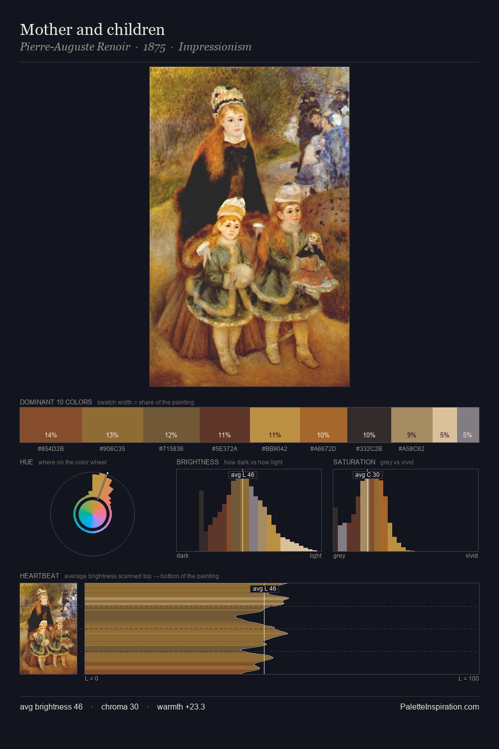
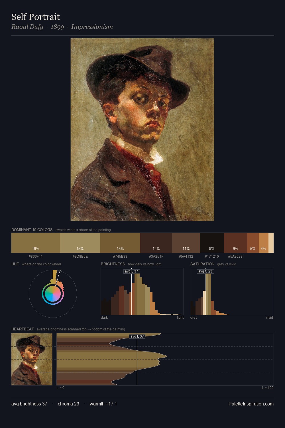
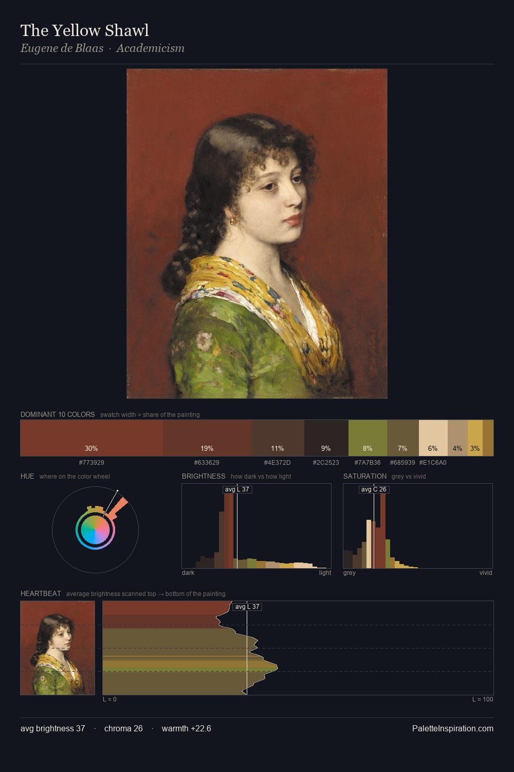
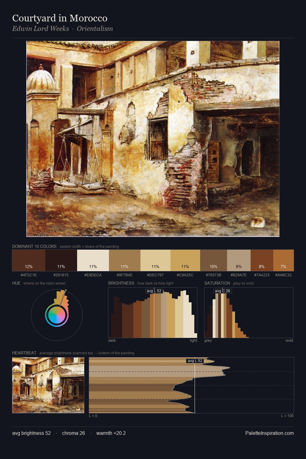
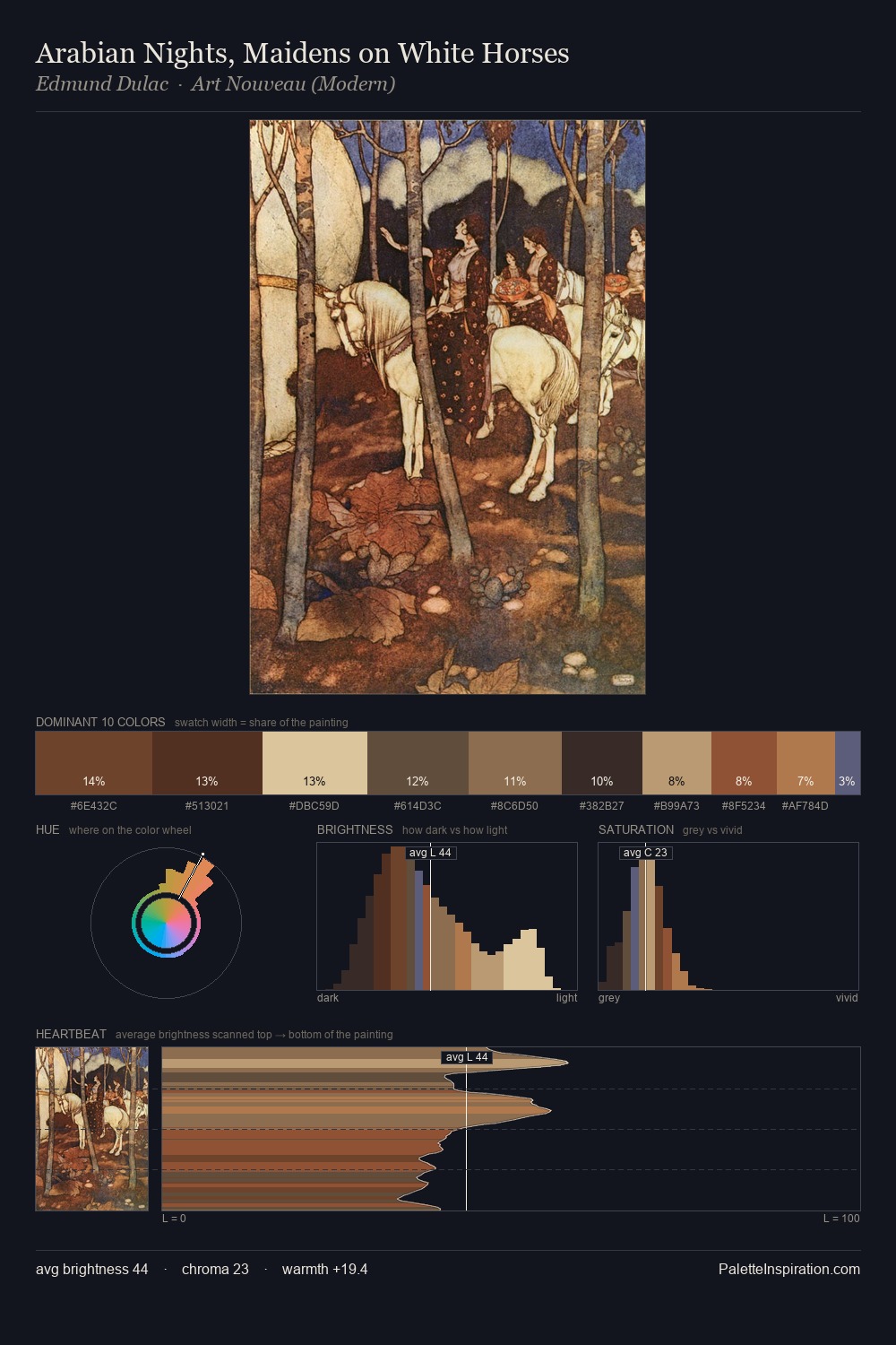
Franz Matsch occupies the comfortable middle of the value scale, avoiding both extremes to hold the eye in a sustained middle grey. Neither warm nor cool has the upper hand here; the equilibrium between the two generates the palette's visual energy. Mid-saturation across the board: the palette has colour character without chromatic excess. The most saturated colour, #B67843, is reserved to 5.0% of the surface, where it acts as a focal punctuation. The palette spans 53 value units: a measured range that delivers coherence over drama. The palette reads as an Impressionist one - light-biased, chromatically direct, and built on temperature contrast rather than value opposition. The palette is recognisably Franz Matsch's own: particular in its temperature, chroma, and the economy of its brightest note.
Example use cases
- ceramics & pottery
- boutique hospitality
- menswear
- heritage food brands
- craft & artisan brands
I Love This!
Copy, export, or download for your project