Franz Kaisermann Palette 2

Palette Analysis
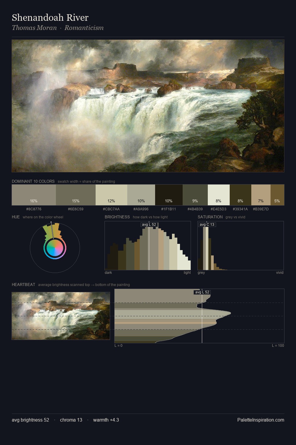
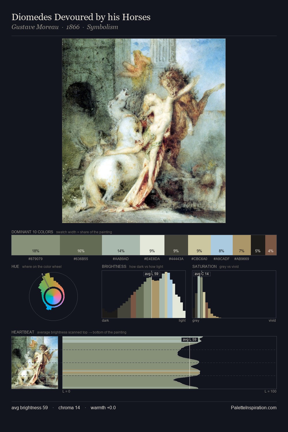
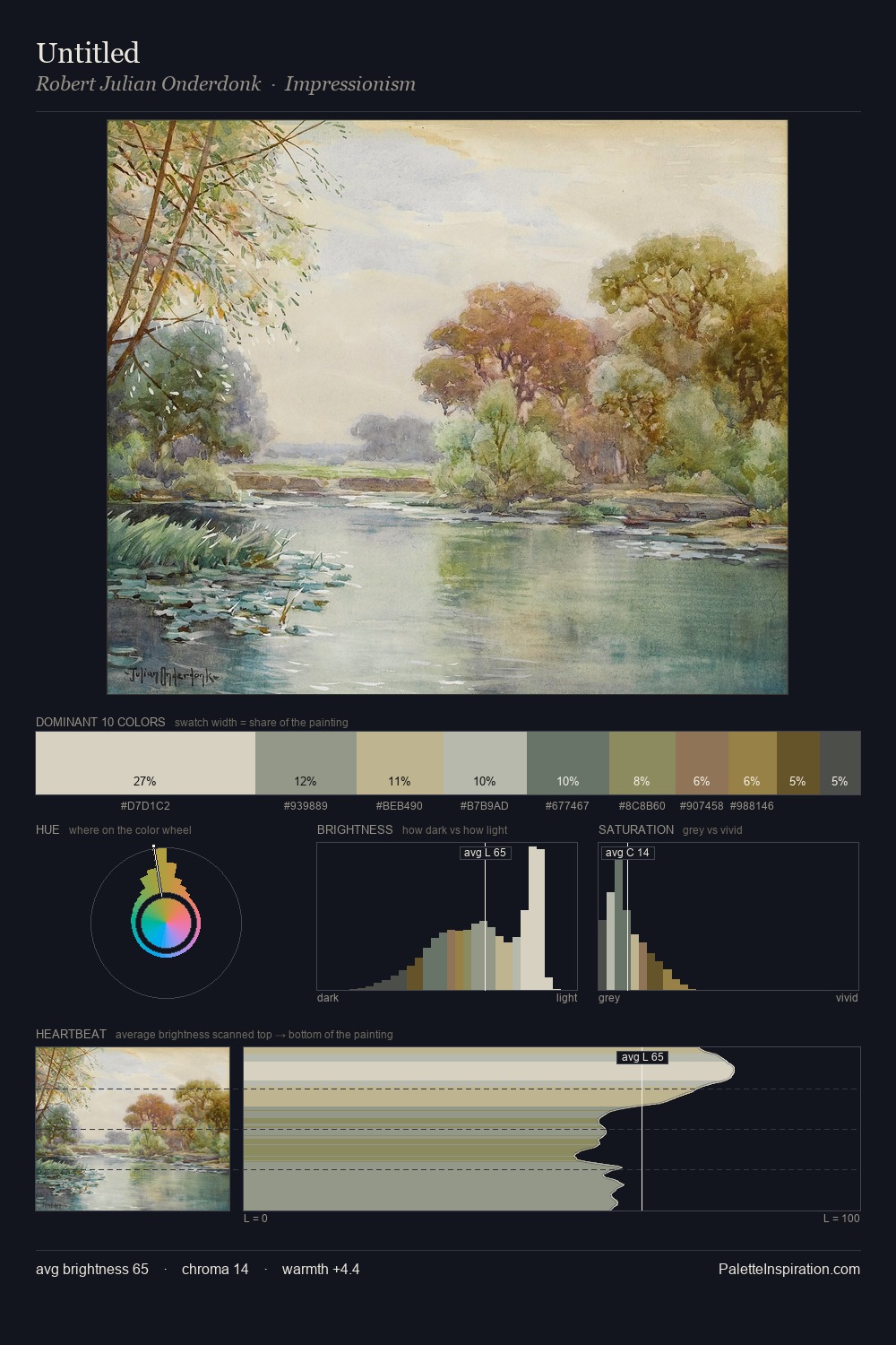
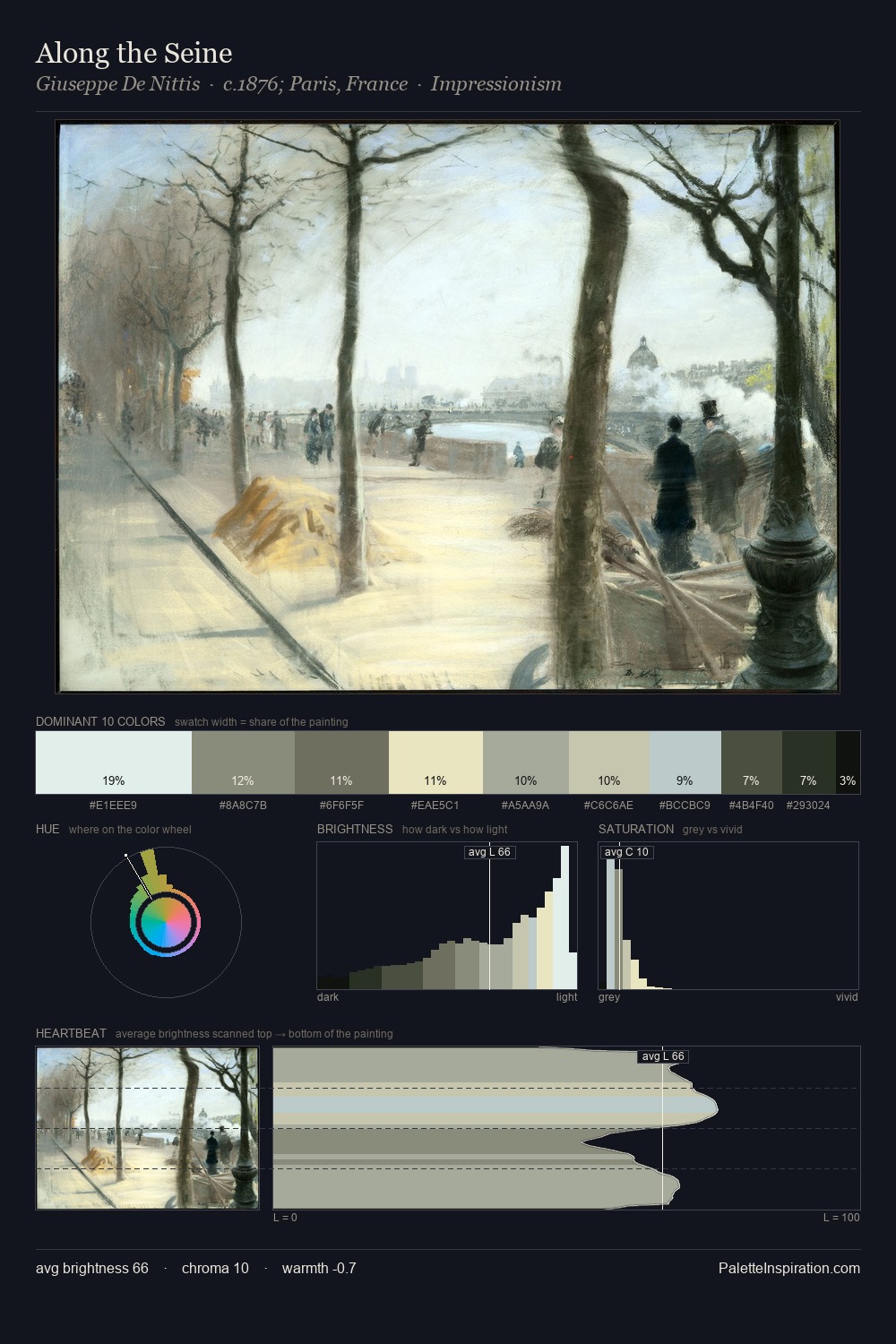
Franz Kaisermann is strongly light-biased - shadow is suggested rather than declared. Franz Kaisermann tilts toward cool - blues and silver-greys carry the structural weight. Saturation is deliberately withheld - the beauty here lies in the near-monochromatic gradations rather than colour difference. #D6E2DA claims 26.8% of the surface, functioning as the work's tonal foundation. The highest-chroma note - #BAAD85 - appears at just 4.5%, deployed as a precision accent against the quieter ground. Value range is moderate at 50 units - enough contrast for legibility, not so much as to fragment the tonal unity. High luminosity and cool temperature suggest the plein-air condition: unfiltered daylight and open sky. In the context of Franz Kaisermann's full range of palettes, group 2 represents one movement in an ongoing chromatic dialogue.
Example use cases
- florist branding
- event design
- real estate
- jewelry retail
- hospitality branding
I Love This!
Copy, export, or download for your project