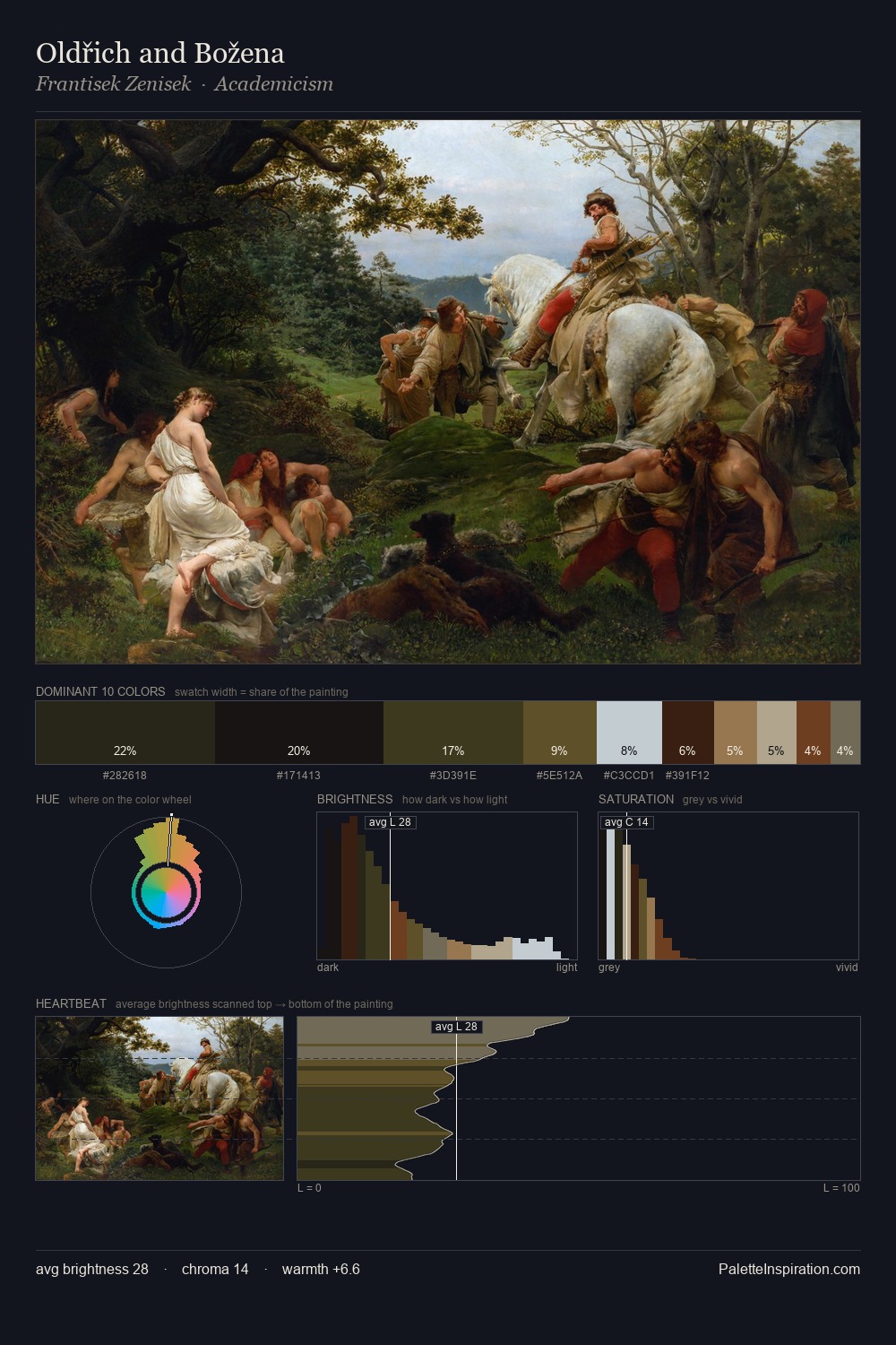
Frantisek Zenisek Palette 2
Tenebrous Bister
Tenebrous Dark and murky - low-key values with obscured form, Baroque in temperament.
Bister Dark warm brown - a traditional ink and wash pigment made from wood soot.

Palette Analysis
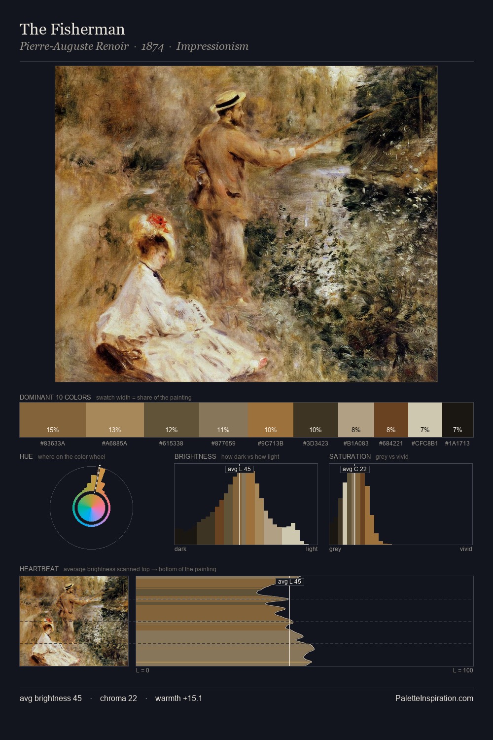
Frantisek Zenisek distributes its values across the middle register, creating harmony without high contrast. Frantisek Zenisek keeps warm and cool in parity, a balance that lends the work a perceptual shimmer. All colours lean toward grey, building depth through value rather than colour punch. 30.3% of the palette belongs to #0A090A, a concentration that makes it the unmistakable visual centre. The saturated accent, #764D2A, registers at 4.6% - sparse enough to feel like a deliberate surprise. At 68 units of value range, the palette has the tonal breadth to sustain complex spatial readings. Palette 2 sits within the larger chromatic argument that Frantisek Zenisek's complete body of work advances.
Example use cases
- theater design
- jewelry brands
- tobacco-adjacent retail
- event branding
- film & entertainment
I Love This!
Use This Palette
Copy, export, or download for your project
Copy, export, or download for your project
Copy:
Download:
Share: