Frank Paton Palette 1
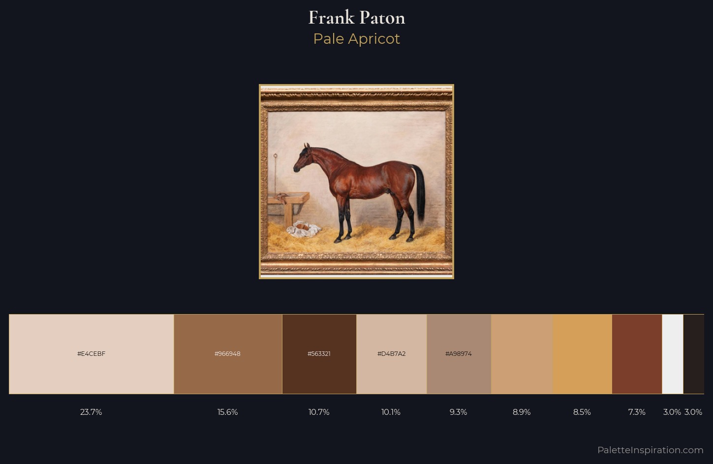
Pale Apricot
Pale High-key and low-chroma - delicate, bleached, washed with light.
Apricot Soft warm orange - peach-adjacent, the color of ripe stone fruit.
Palette Analysis
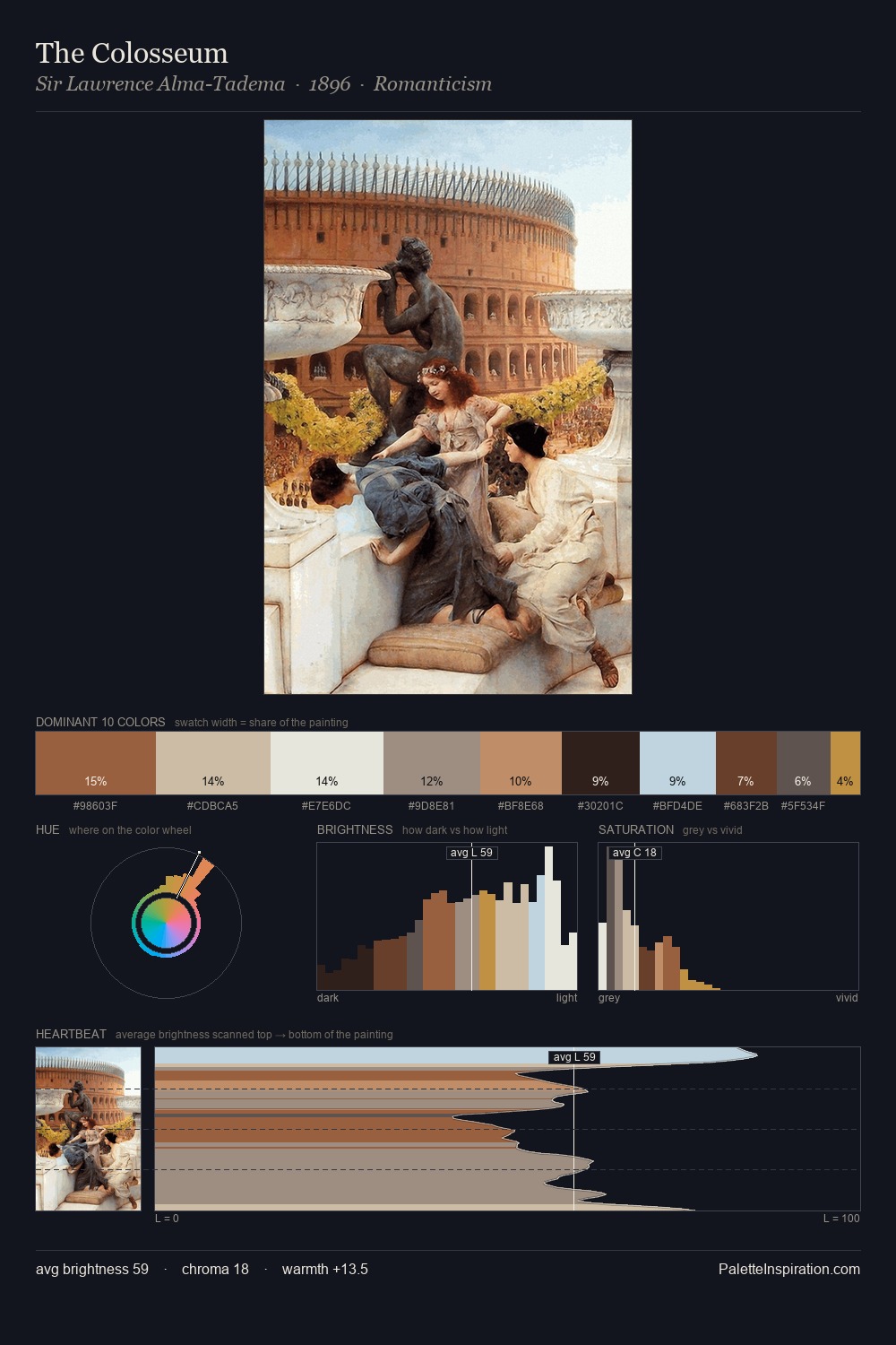
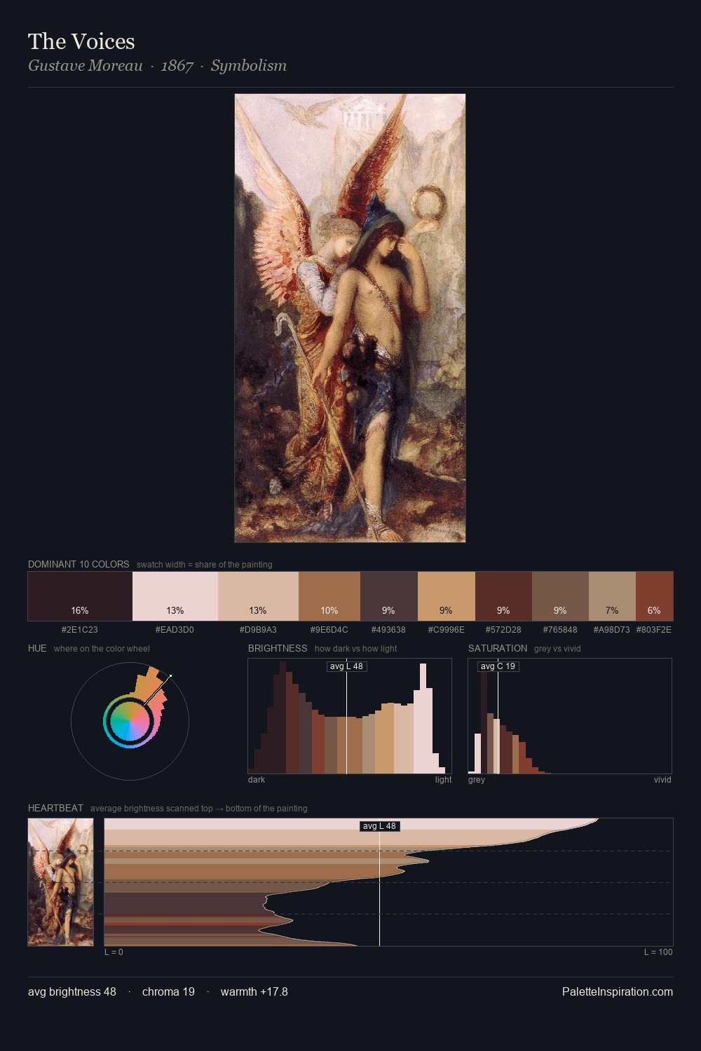
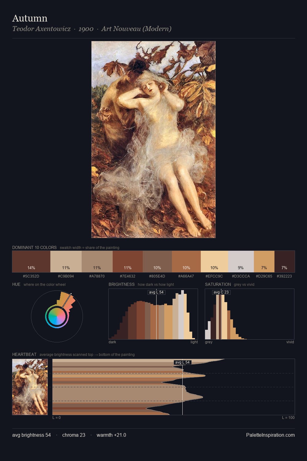
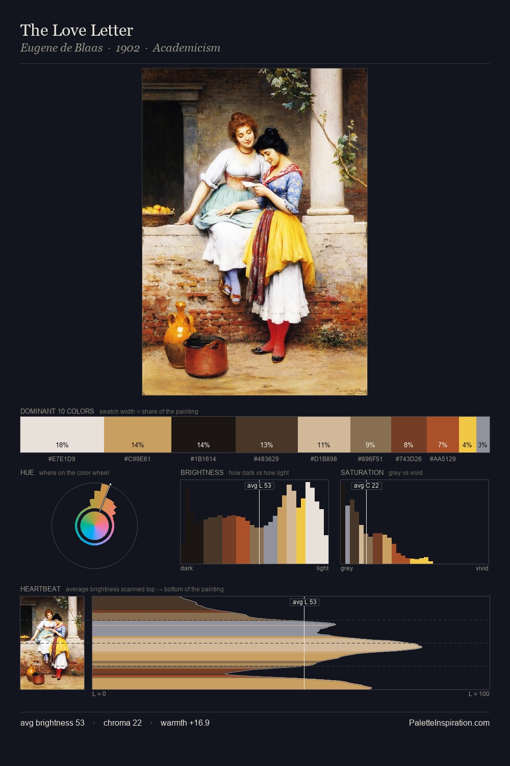
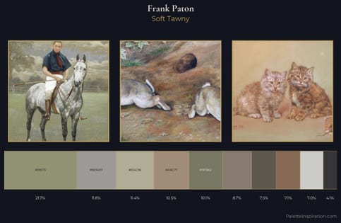
Light floods Frank Paton; the palette keeps values pale and airy across its range. Warmth dominates - the palette of Frank Paton leans heavily on the yellow-orange-red arc of the colour wheel. Every colour is desaturated; the palette proceeds through near-neutrals and gently-coloured greys. The most saturated colour, #CC9F75, is reserved to 8.9% of the surface, where it acts as a focal punctuation. At 70 units of value range, the palette has the tonal breadth to sustain complex spatial readings. Palette 1 sits within the larger chromatic argument that Frank Paton's complete body of work advances.
Example use cases
- ceramics & pottery
- boutique hospitality
- menswear
- heritage food brands
- craft & artisan brands
I Love This!
Use This Palette
Copy, export, or download for your project
Copy, export, or download for your project
Copy:
Download:
Share: