Frank Bramley Palette 2

Palette Analysis
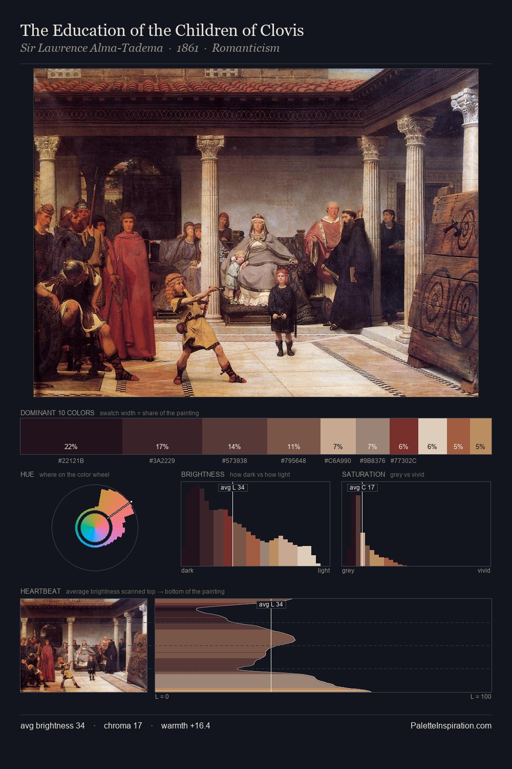
Frank Bramley works almost entirely in the lower half of the value scale, privileging depth over brilliance. Yellow, ochre, sienna: warm hues that Frank Bramley deploys as the palette's primary energy. The absence of saturated colour is itself an expressive choice: this is a palette of restraint and atmosphere. At 26.7%, #201520 functions less as a colour accent and more as a complete atmospheric environment. The saturated accent, #8A6050, registers at 1.7% - sparse enough to feel like a deliberate surprise. At 67 units of value range, the palette has the tonal breadth to sustain complex spatial readings. This tonal restraint is characteristic of the Frank Bramley approach: colour serves light, not the reverse. Palette 2 sits within the larger chromatic argument that Frank Bramley's complete body of work advances.
Example use cases
- theater design
- jewelry brands
- tobacco-adjacent retail
- event branding
- film & entertainment
I Love This!
Copy, export, or download for your project