Francis Picabia Palette 4

Palette Analysis
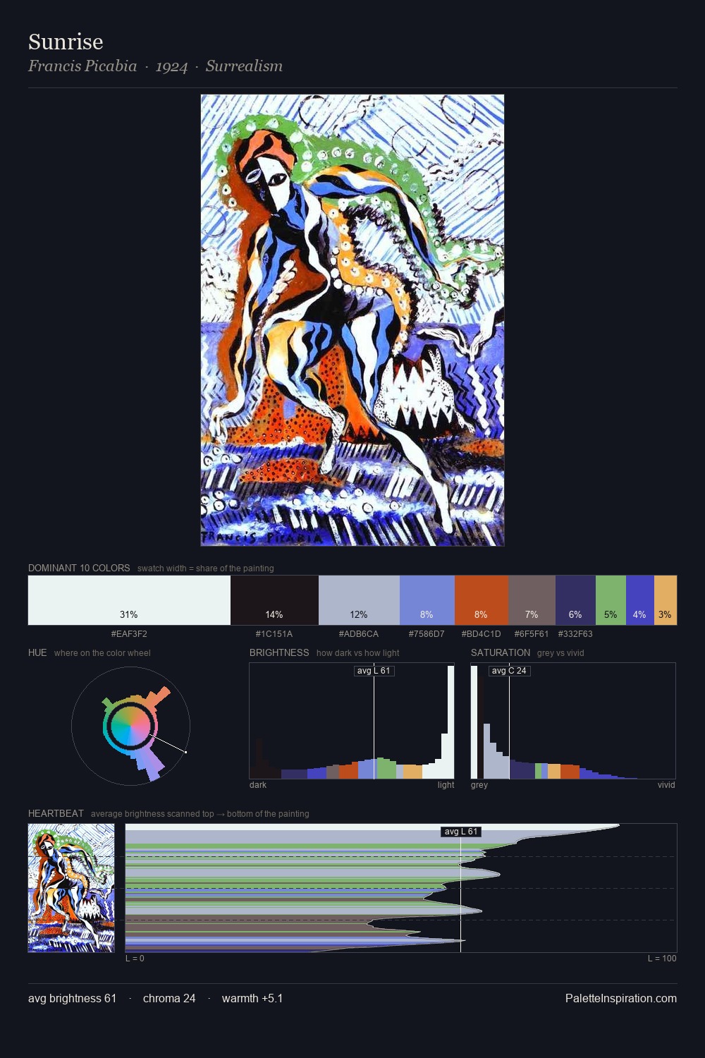
The value structure of Francis Picabia is mid-key: quiet, controlled, and cohesive. A distinctly cool atmosphere runs through this palette: sky, water, and mist given colour form. Saturation is deliberately withheld - the beauty here lies in the near-monochromatic gradations rather than colour difference. The dominant colour, #21161B, takes 26.2% of the total area, establishing the overall mood before any other hue is introduced. #9F4C27 functions as the palette's exclamation mark: highest chroma, lowest percentage (3.1%). 74 units of value range underpin the palette's structural clarity: the eye always knows where light falls. High luminosity and cool temperature suggest the plein-air condition: unfiltered daylight and open sky. This is palette 4 of Francis Picabia's sequence - a single chapter in a chromatic story told across many works.
Example use cases
- design agencies
- product brands
- e-commerce
- editorial sites
- publishing
I Love This!
Copy, export, or download for your project