Francesco Paolo Michetti Palette 1

Palette Analysis
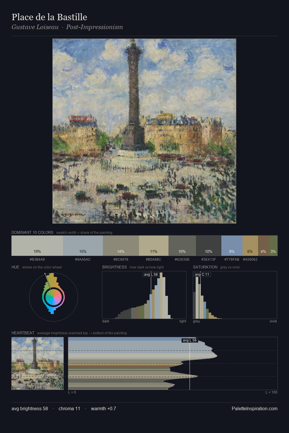
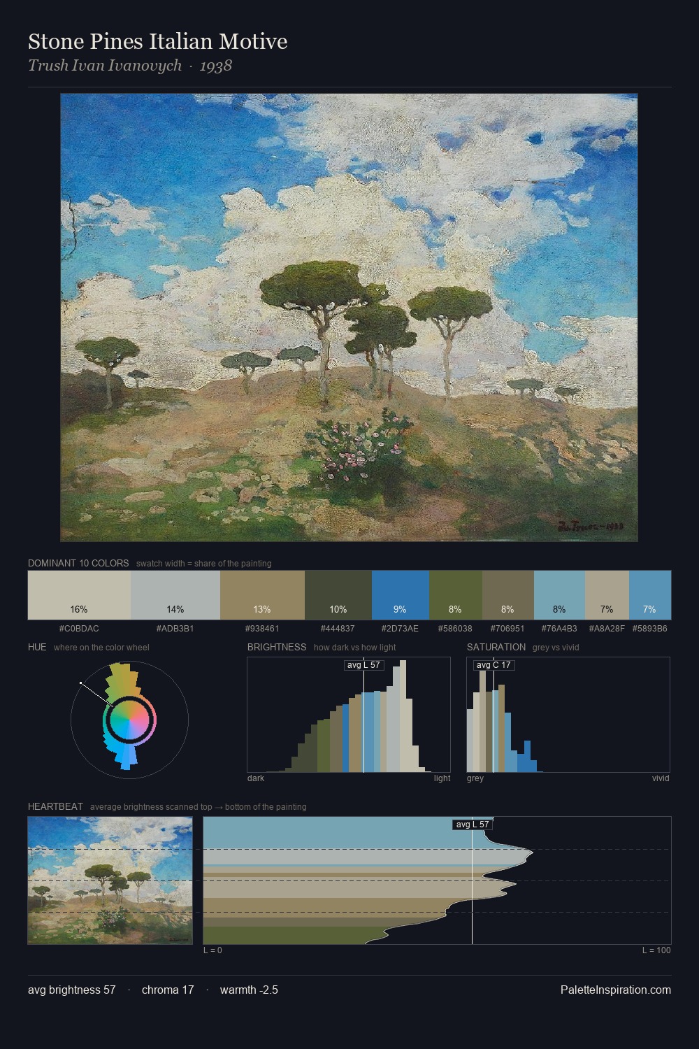
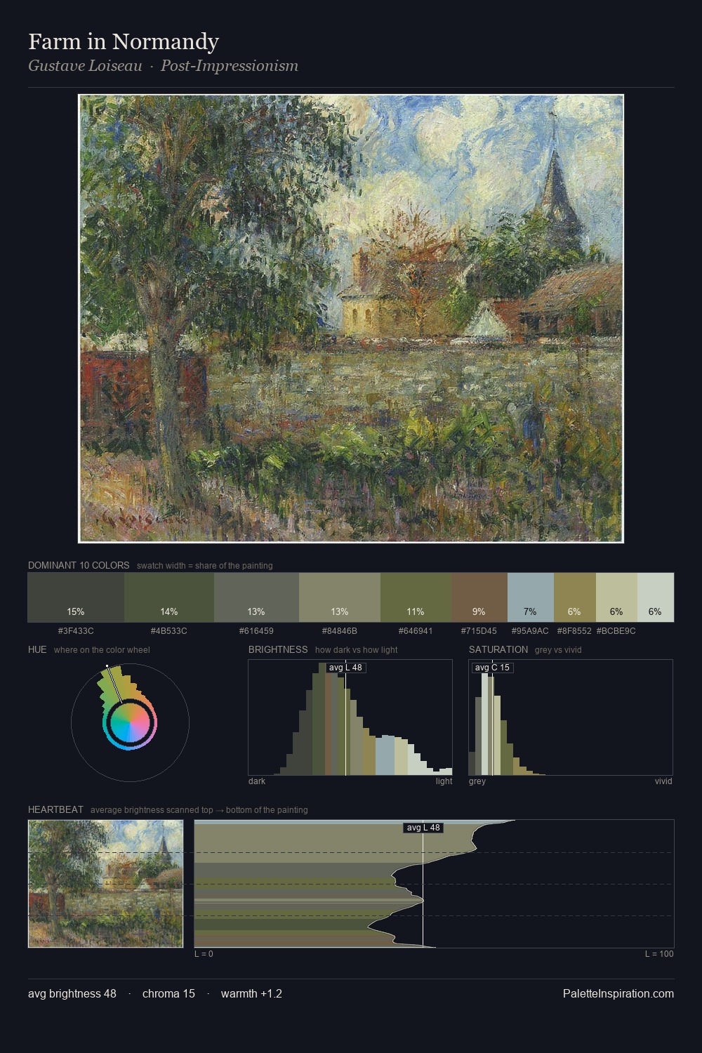
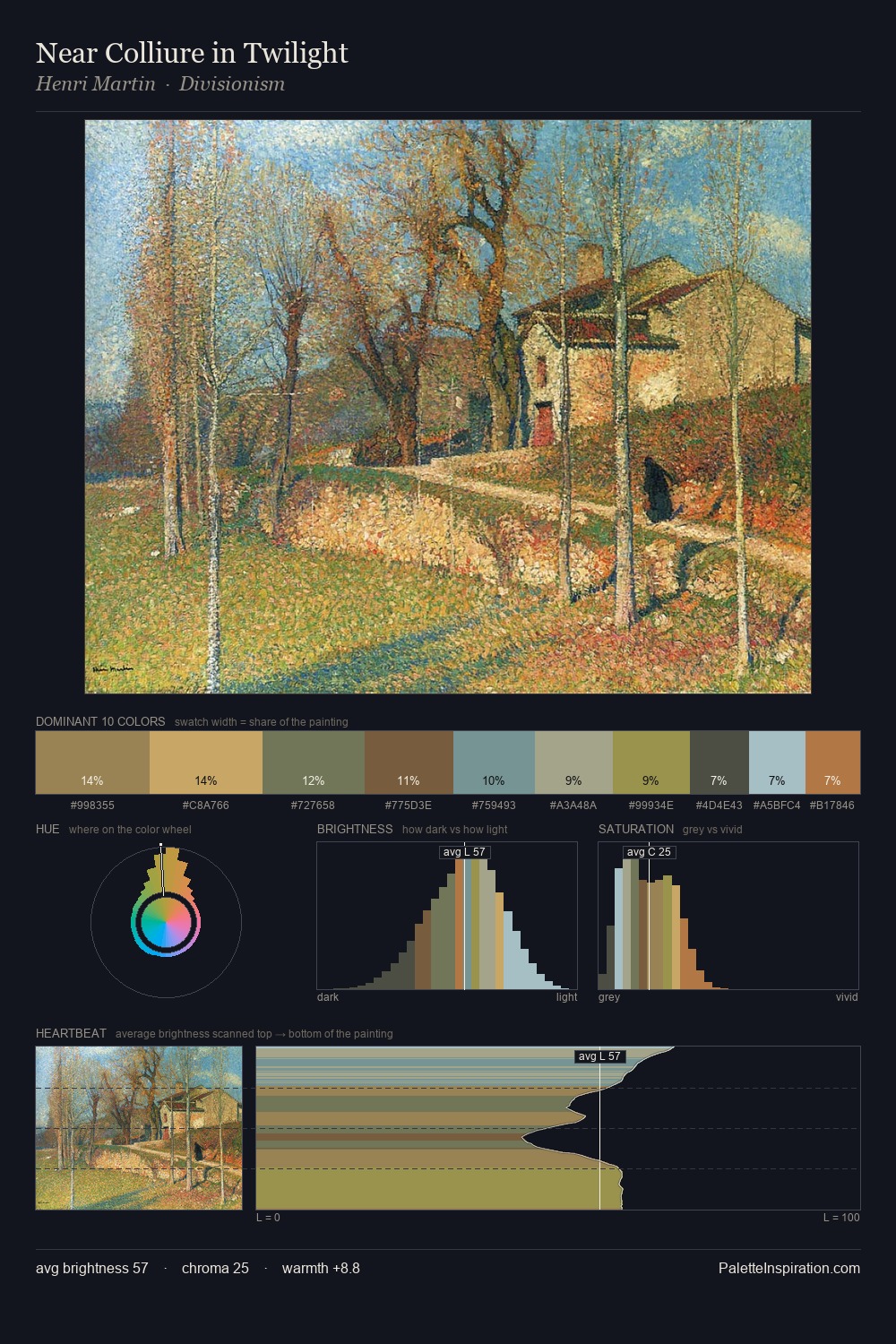
Francesco Paolo Michetti is strongly light-biased - shadow is suggested rather than declared. Francesco Paolo Michetti builds on cool foundations: the palette favours the blue-cyan-green arc. All colours lean toward grey, building depth through value rather than colour punch. At 34.6%, #87B2BB functions less as a colour accent and more as a complete atmospheric environment. #79644D delivers the chromatic peak at only 3.7% - a small shot of colour with outsized visual impact. The palette spans 39 value units: a measured range that delivers coherence over drama. The palette has the character of outdoor light: cool, mid-bright, with colour rendered faithfully rather than expressively. In the context of Francesco Paolo Michetti's full range of palettes, group 1 represents one movement in an ongoing chromatic dialogue.
Example use cases
- exhibition design
- foundation branding
- estate management
- art education
- museums & galleries
I Love This!
Copy, export, or download for your project