Francesco Botticini Palette 6
Penumbral Bister
Penumbral Partial shadow - the transitional zone between light and full dark, soft-edged.
Bister Dark warm brown - a traditional ink and wash pigment made from wood soot.

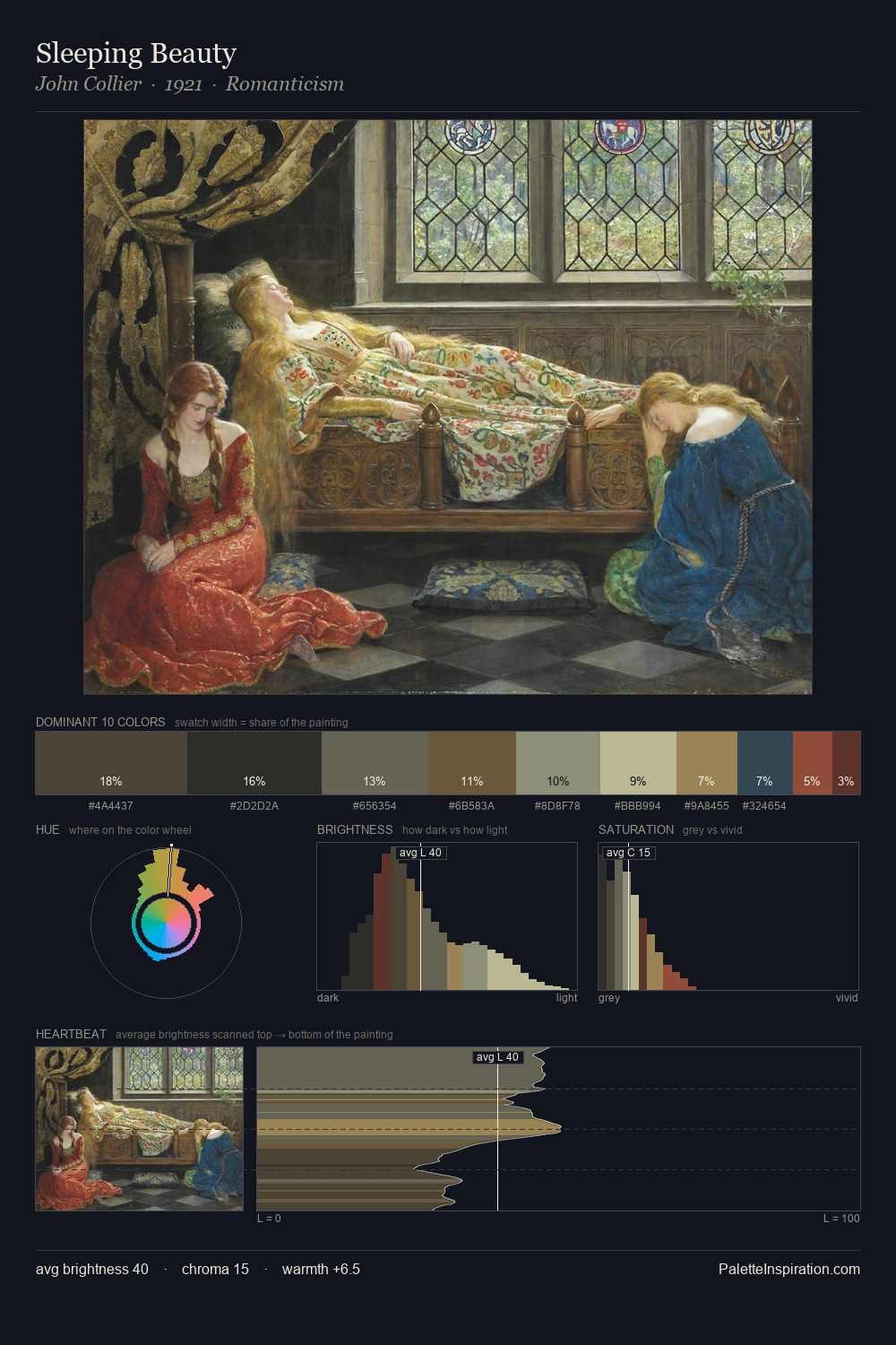
Palette Analysis
Values in Francesco Botticini rest in the mid-range - neither dramatically lit nor steeped in shadow. Warm and cool are kept in productive tension, creating the kind of chromatic harmony that sustains the eye. The absence of saturated colour is itself an expressive choice: this is a palette of restraint and atmosphere. #54312A delivers the chromatic peak at only 3.2% - a small shot of colour with outsized visual impact. At 49 units across the value scale, the palette keeps contrast readable without letting it dominate. Palette 6 sits within the larger chromatic argument that Francesco Botticini's complete body of work advances.
Example use cases
- theater design
- jewelry brands
- tobacco-adjacent retail
- event branding
- film & entertainment
I Love This!
Use This Palette
Copy, export, or download for your project
Copy, export, or download for your project
Copy:
Download:
Share: