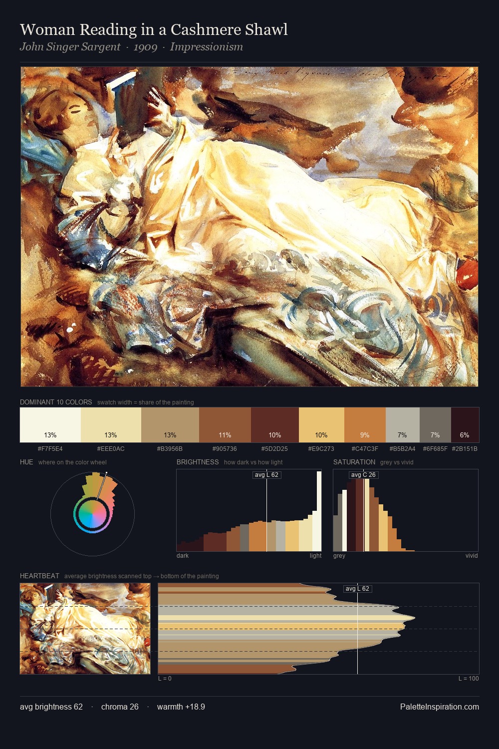
Fra Bartolomeo Master Palette

Palette Analysis
Fra Bartolomeo occupies the comfortable middle of the value scale, avoiding both extremes to hold the eye in a sustained middle grey. Fra Bartolomeo tilts toward cool - blues and silver-greys carry the structural weight. Chroma is kept low across all colours, producing the soft, enveloping quality that characterises tonal painting. The most saturated colour, #8B3D2B, is reserved to 9.8% of the surface, where it acts as a focal punctuation. 71 units of value range underpin the palette's structural clarity: the eye always knows where light falls. The mid-to-high key, cool bias, and moderate chroma point to outdoor observation - sky and diffused daylight as the dominant light source. Fra Bartolomeo arrived at this balance through long practice; the palette carries the weight of that experience.
Example use cases
- ceramics & pottery
- boutique hospitality
- menswear
- heritage food brands
- craft & artisan brands
I Love This!
Copy, export, or download for your project