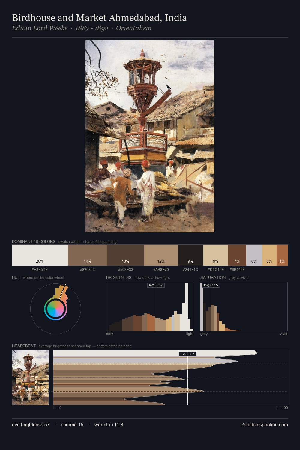
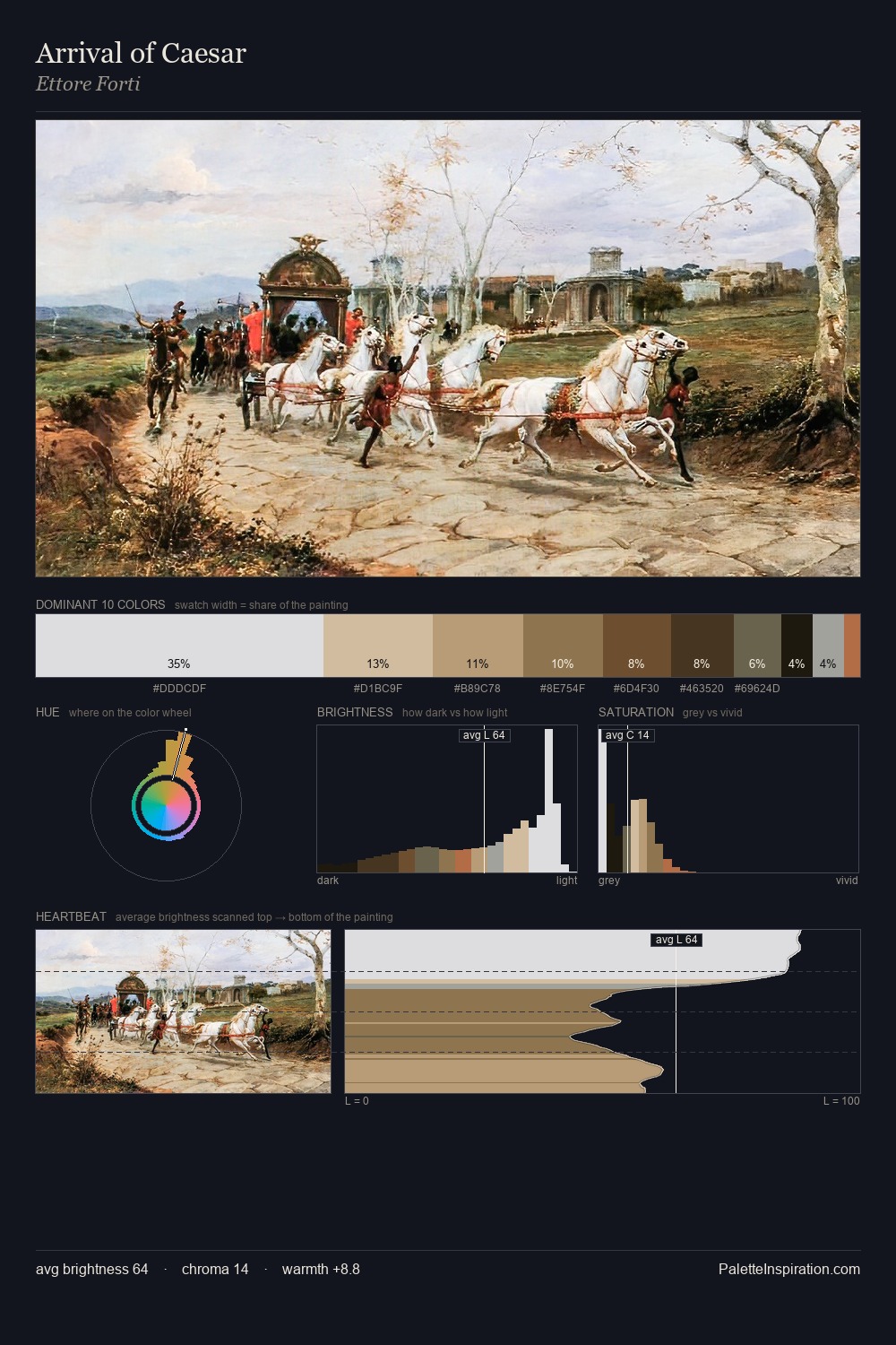
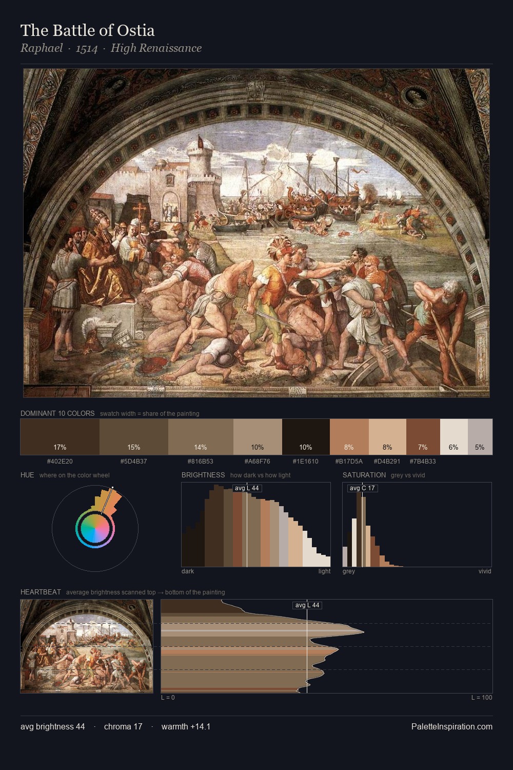
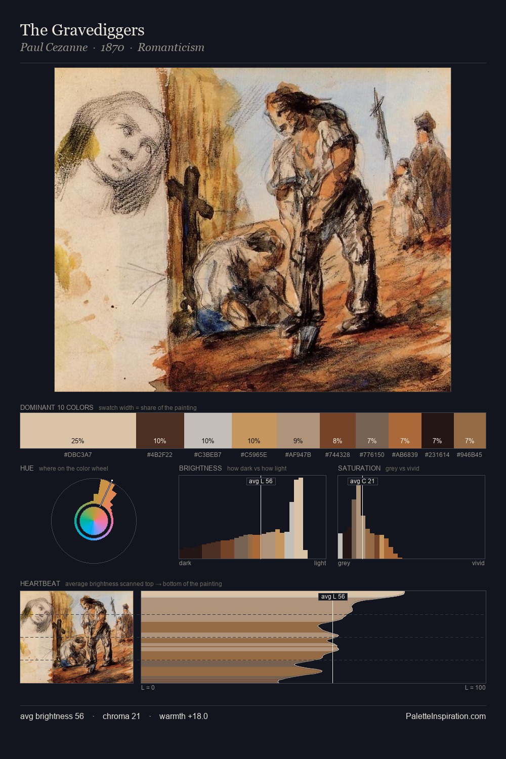
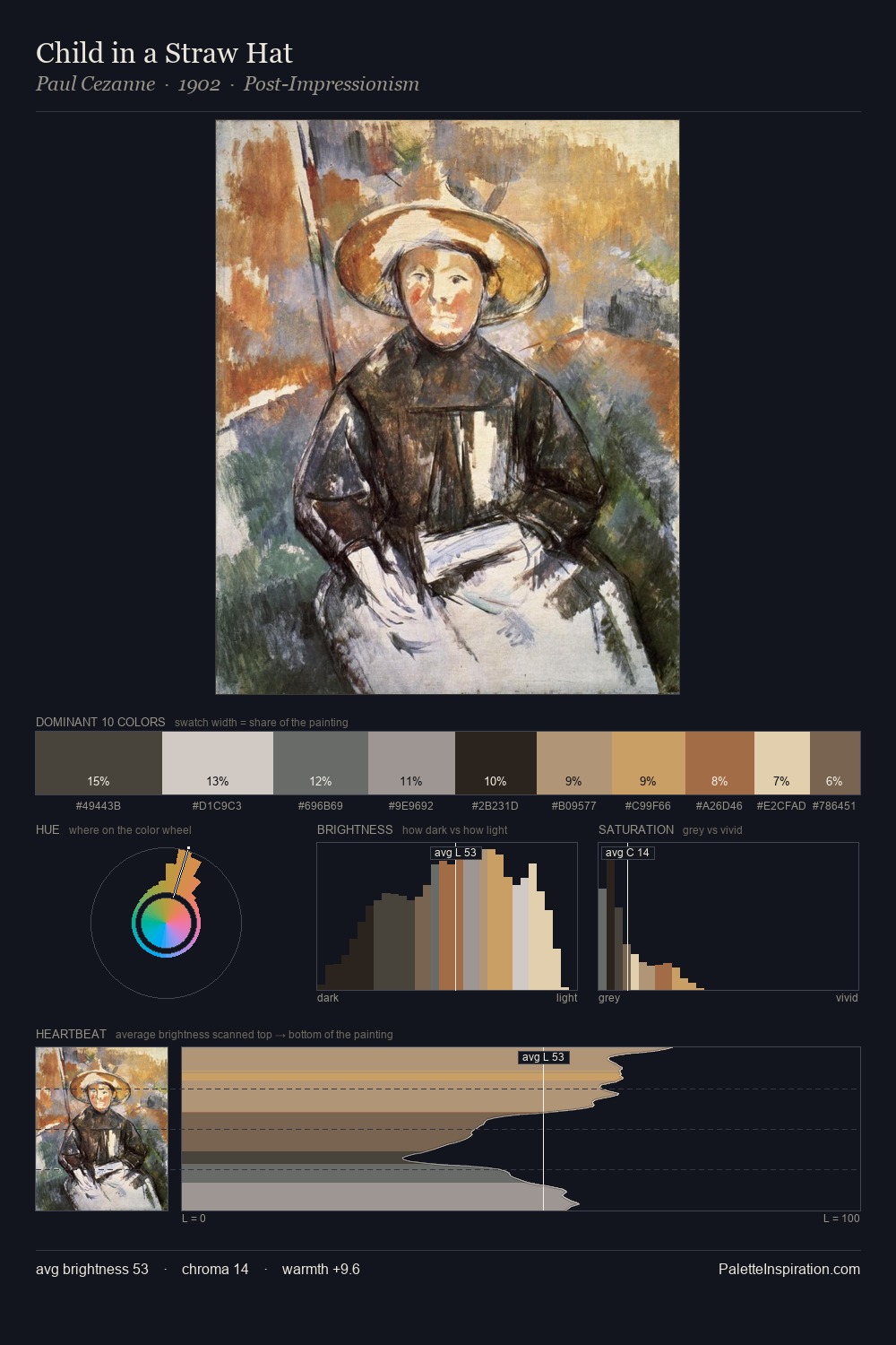
Fortunino Matania Master Palette
Veiled Tawny
Veiled Partially obscured light - mid-dark with a hazy, scrim-filtered quality.
Tawny Warm orange-brown - a traditional term for the color of tanned leather or lion fur.

Palette Analysis
Fortunino Matania sits in the centre of the value range, lending the palette a sense of even, sustained light. Warmth dominates - the palette of Fortunino Matania leans heavily on the yellow-orange-red arc of the colour wheel. Saturation is deliberately withheld - the beauty here lies in the near-monochromatic gradations rather than colour difference. The most saturated colour, #D8C29F, is reserved to 10.0% of the surface, where it acts as a focal punctuation. A value spread of 64 units gives the palette both depth and air - shadows are genuinely dark, lights genuinely light. These proportions encode Fortunino Matania's instinctive sense of how much of each quality the eye can hold.
Example use cases
- ceramics & pottery
- boutique hospitality
- menswear
- heritage food brands
- craft & artisan brands
I Love This!
Use This Palette
Copy, export, or download for your project
Copy, export, or download for your project
Copy:
Download:
Share: