Filippo Palizzi Palette 2

Palette Analysis
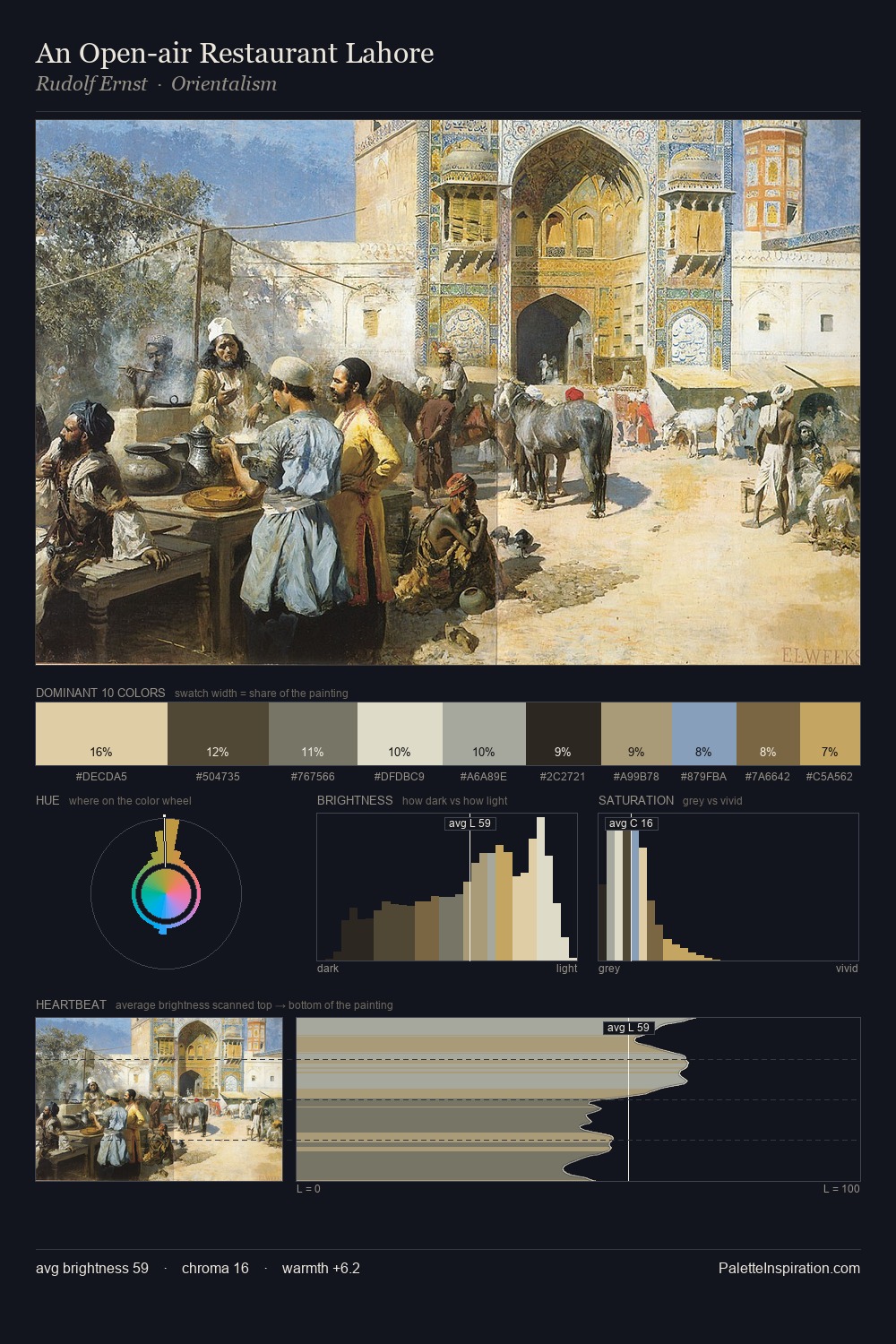
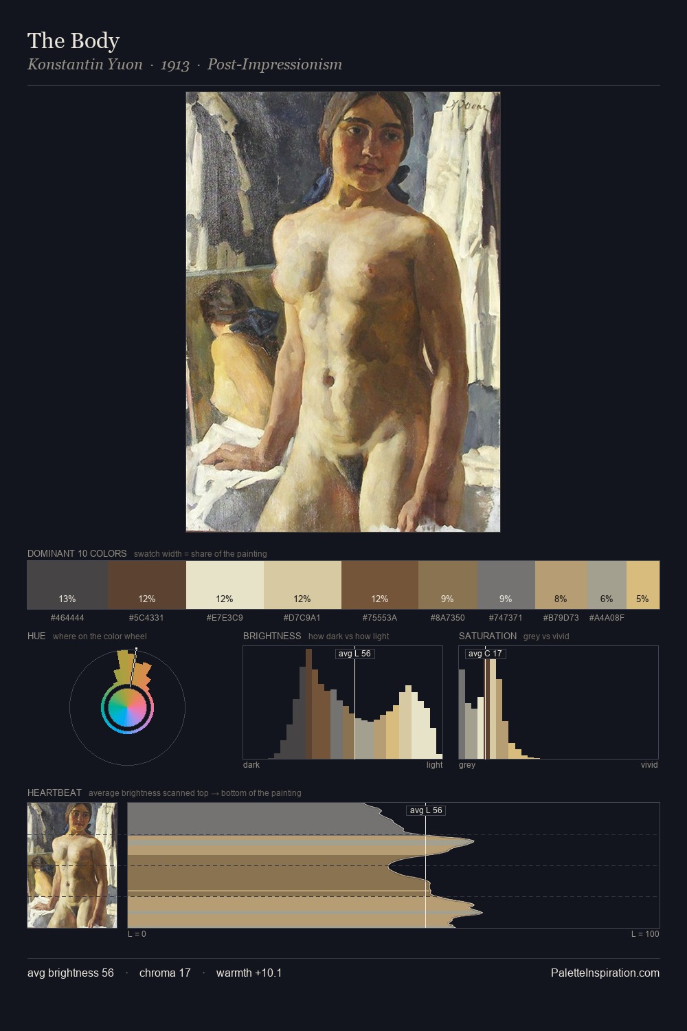
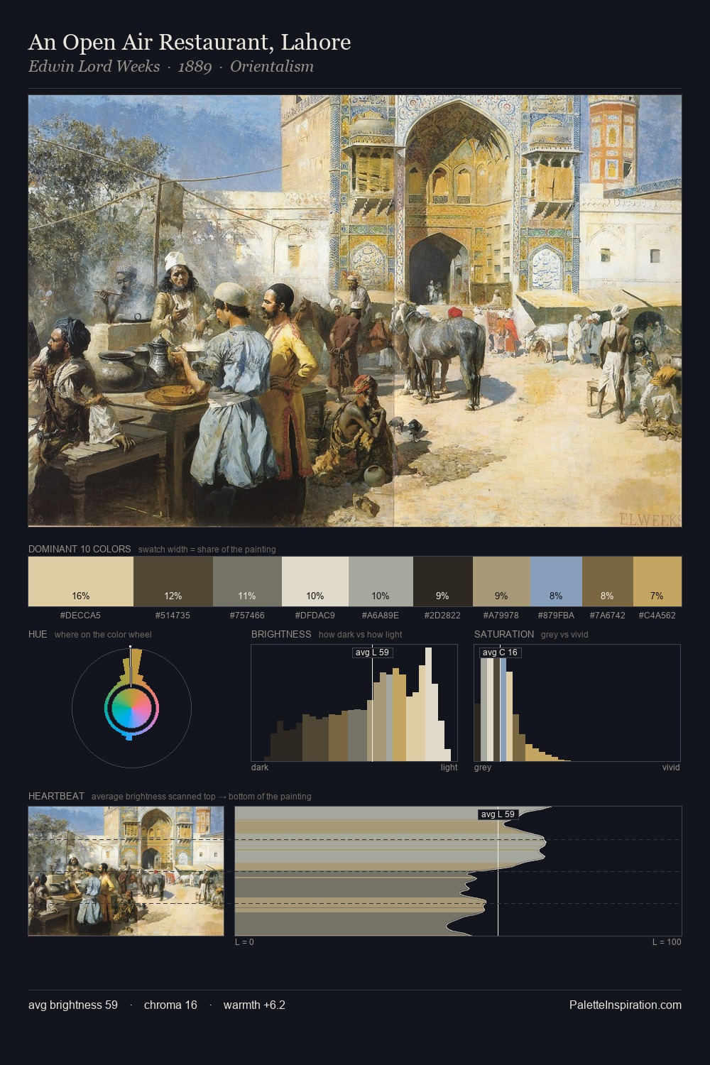
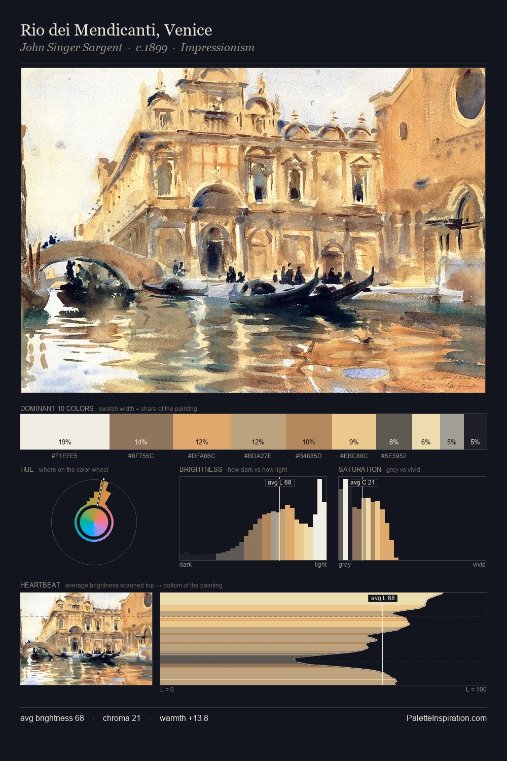
Filippo Palizzi is strongly light-biased - shadow is suggested rather than declared. Filippo Palizzi tilts toward cool - blues and silver-greys carry the structural weight. Chroma is kept low across all colours, producing the soft, enveloping quality that characterises tonal painting. At 31.3%, #F8F7E3 functions less as a colour accent and more as a complete atmospheric environment. #C7BD99 functions as the palette's exclamation mark: highest chroma, lowest percentage (7.0%). 53 units of value spread create a palette that is varied but unified - contrast in the service of harmony. High luminosity and cool temperature suggest the plein-air condition: unfiltered daylight and open sky. Filippo Palizzi's palette 2 carries its own internal logic while remaining in conversation with the artist's broader colour intelligence.
Example use cases
- art galleries
- creative studios
- consumer goods
- lifestyle media
- professional services
I Love This!
Copy, export, or download for your project