Figurative Palette 4
Soft Ivory
Soft Low-contrast, gentle chroma - mid-key values and low saturation, approachable and calm.
Ivory Warm creamy white - the color of natural ivory, warmer than pure white.

Palette Analysis
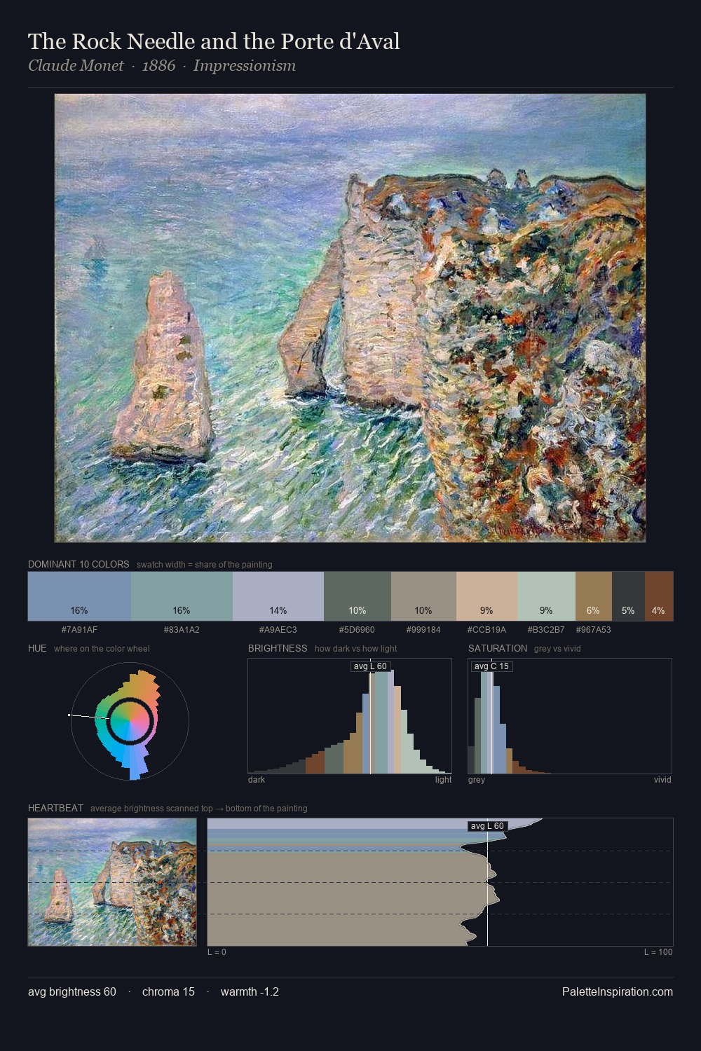
figurative is high in key: pale, luminous, and filled with optical air. The palette tilts toward cool - blues and silver-greys carry the structural weight. Saturation is deliberately withheld - the beauty here lies in the near-monochromatic gradations rather than colour difference. The most saturated colour, #C7A293, is reserved to 5.9% of the surface, where it acts as a focal punctuation. At 54 units across the value scale, the palette keeps contrast readable without letting it dominate. The mid-to-high key, cool bias, and moderate chroma point to outdoor observation - sky and diffused daylight as the dominant light source.
Example use cases
- nonprofit identity
- public libraries
- historical sites
- literary journals
- archival print
I Love This!
Use This Palette
Copy, export, or download for your project
Copy, export, or download for your project
Copy:
Download:
Share: