Figurative Palette 12
Veiled Tawny
Veiled Partially obscured light - mid-dark with a hazy, scrim-filtered quality.
Tawny Warm orange-brown - a traditional term for the color of tanned leather or lion fur.

Palette Analysis
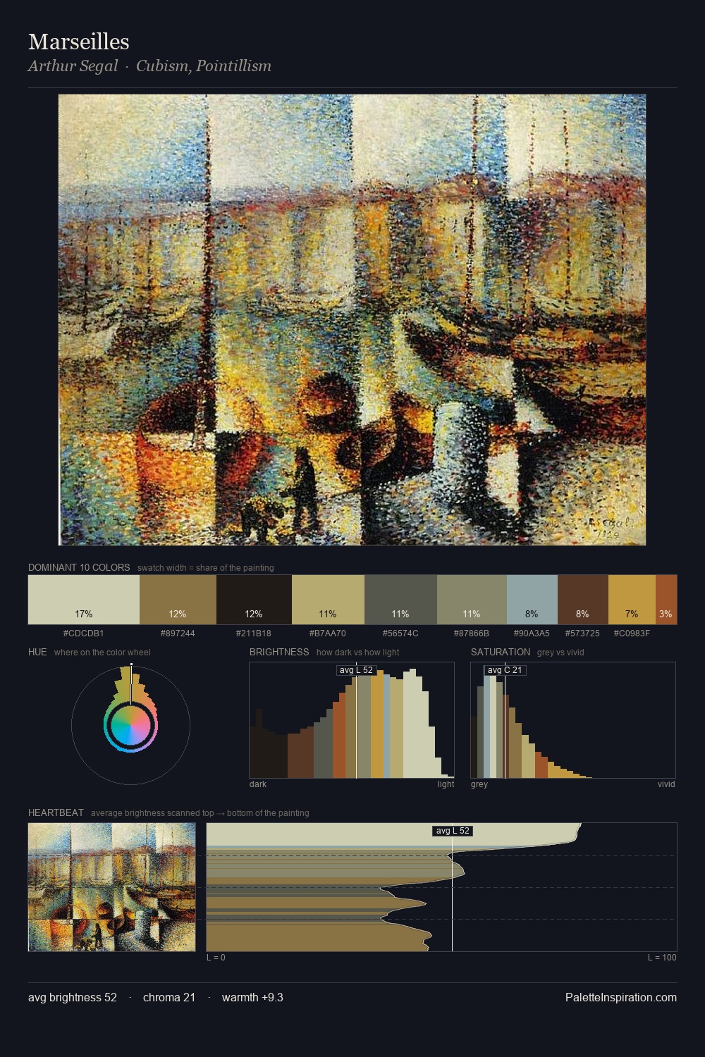
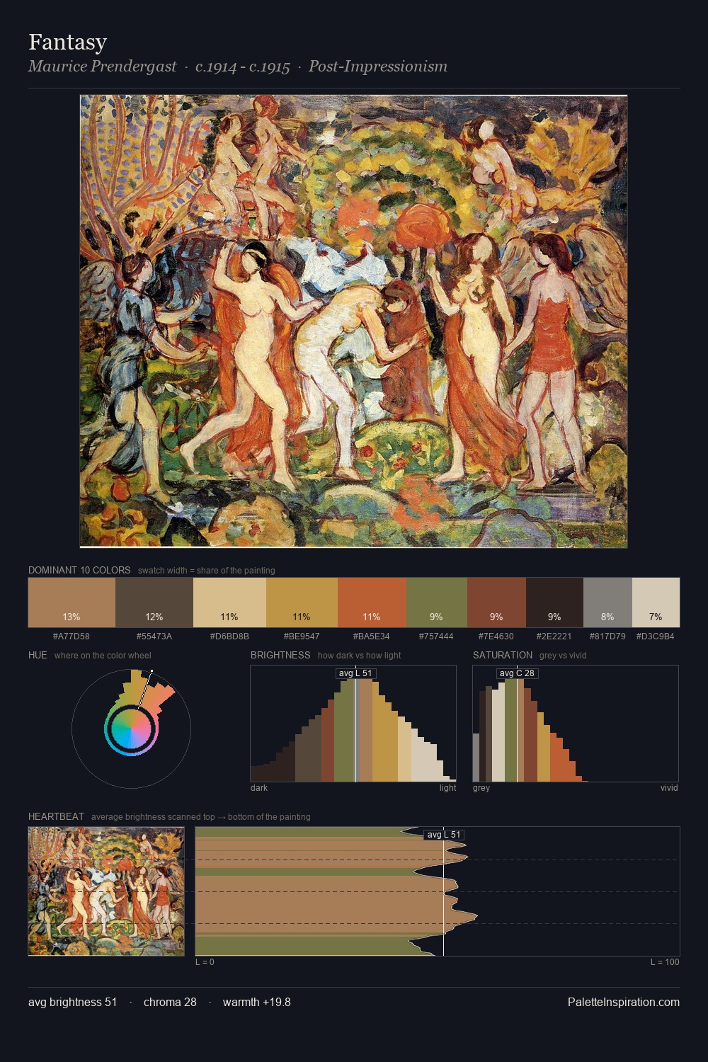
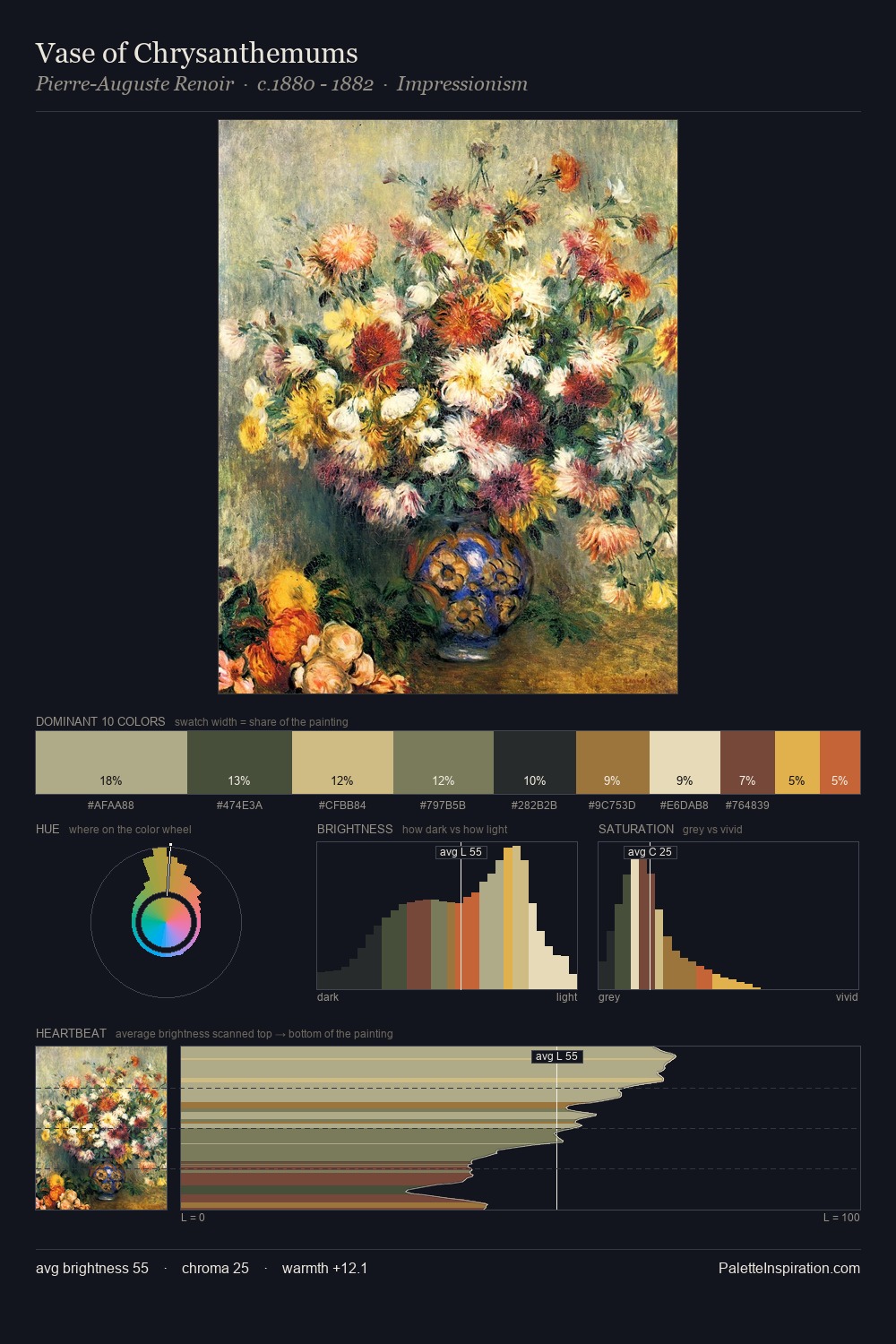
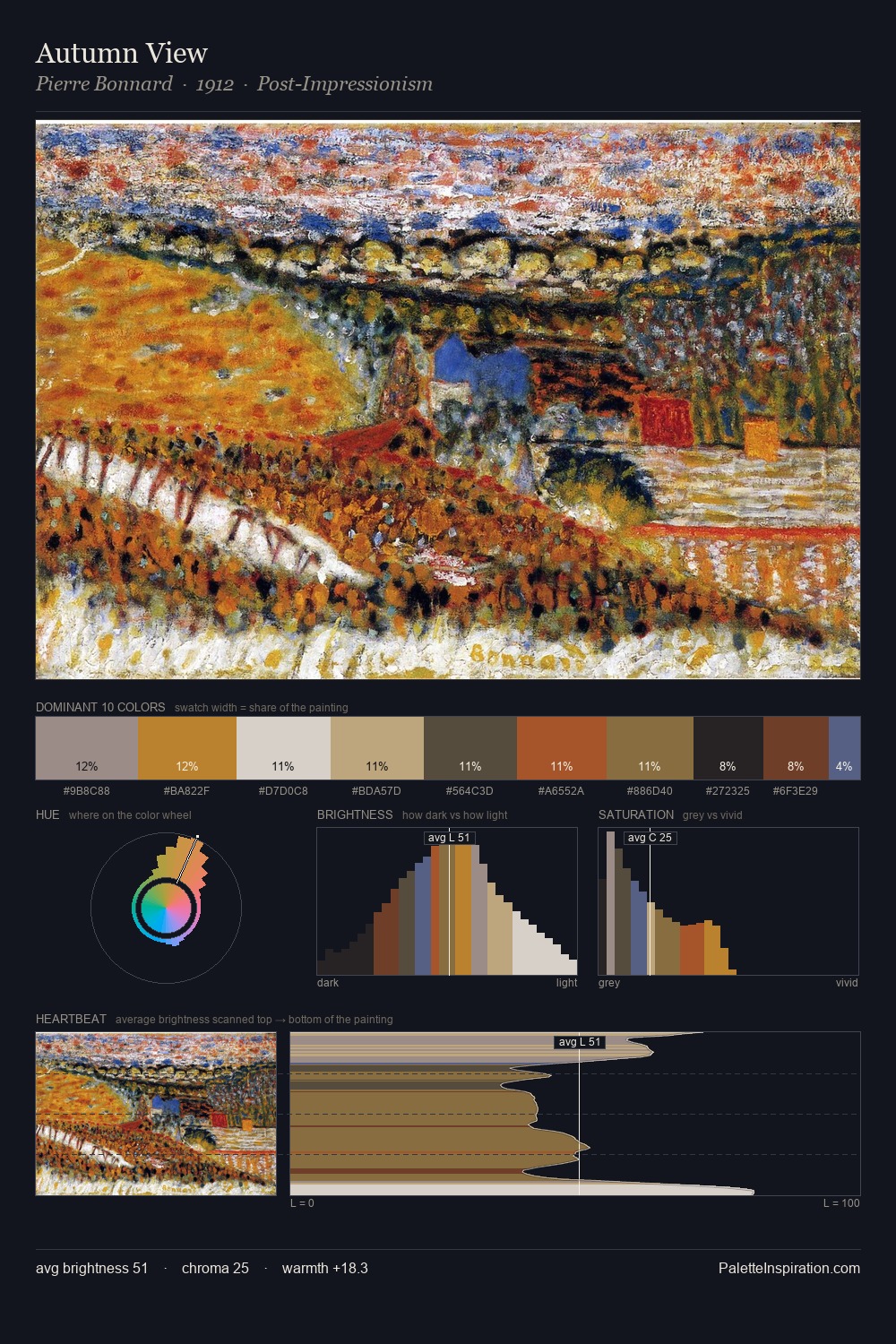
figurative occupies the comfortable middle of the value scale, avoiding both extremes to hold the eye in a sustained middle grey. Warm and cool are kept in productive tension, creating the kind of chromatic harmony that sustains the eye. All colours lean toward grey, building depth through value rather than colour punch. The most saturated colour, #AB522F, is reserved to 3.5% of the surface, where it acts as a focal punctuation. A value spread of 62 units gives the palette both depth and air - shadows are genuinely dark, lights genuinely light.
Example use cases
- food packaging
- leather accessories
- travel & outdoor
- natural cosmetics
- interior design
I Love This!
Use This Palette
Copy, export, or download for your project
Copy, export, or download for your project
Copy:
Download:
Share: