Fernand Combes Palette 4

Palette Analysis
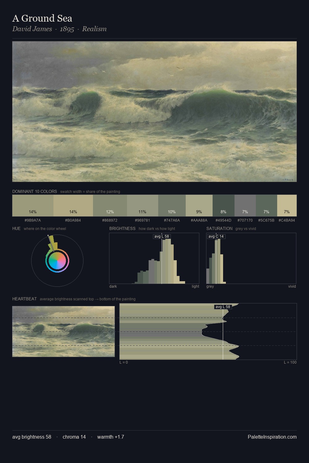
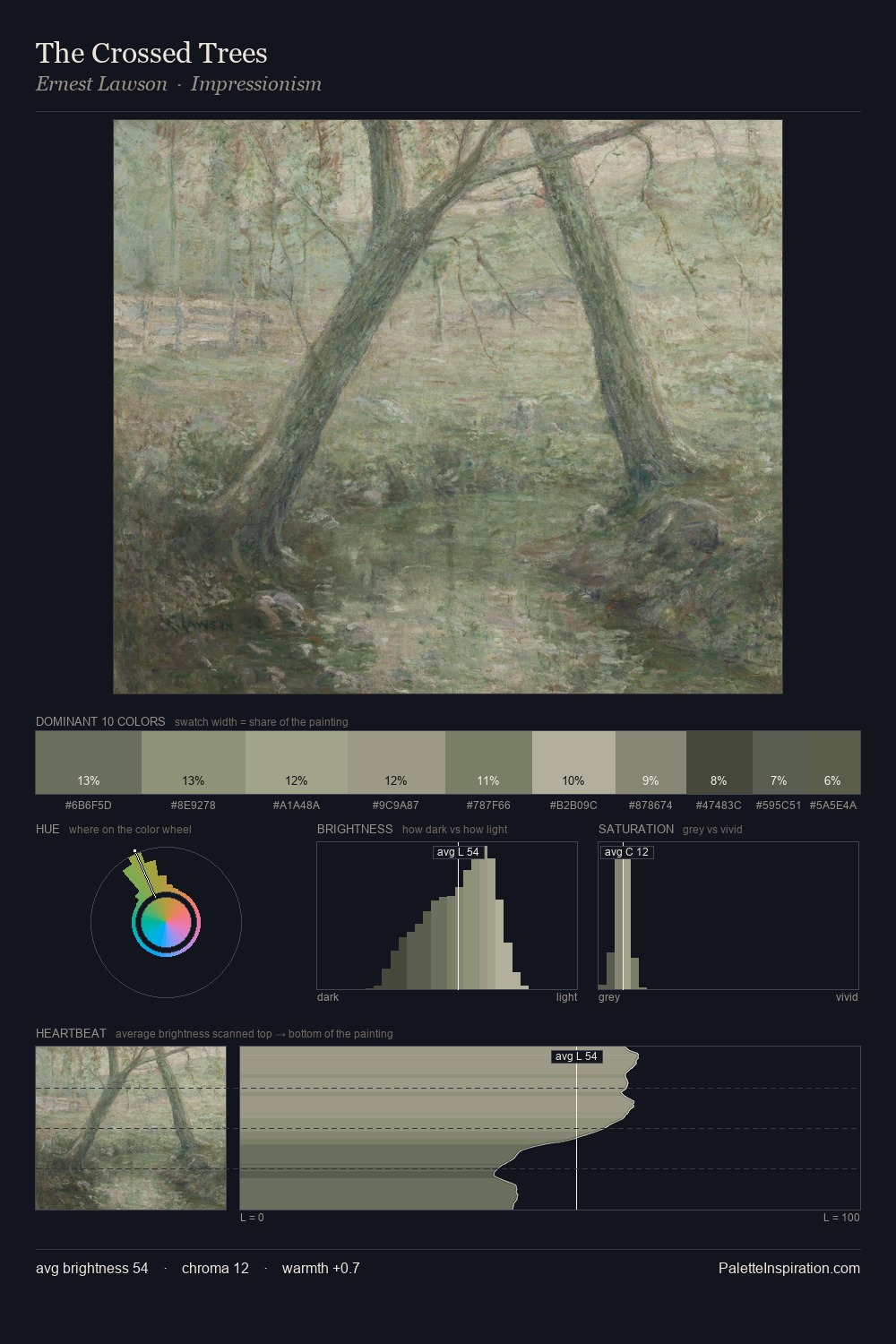
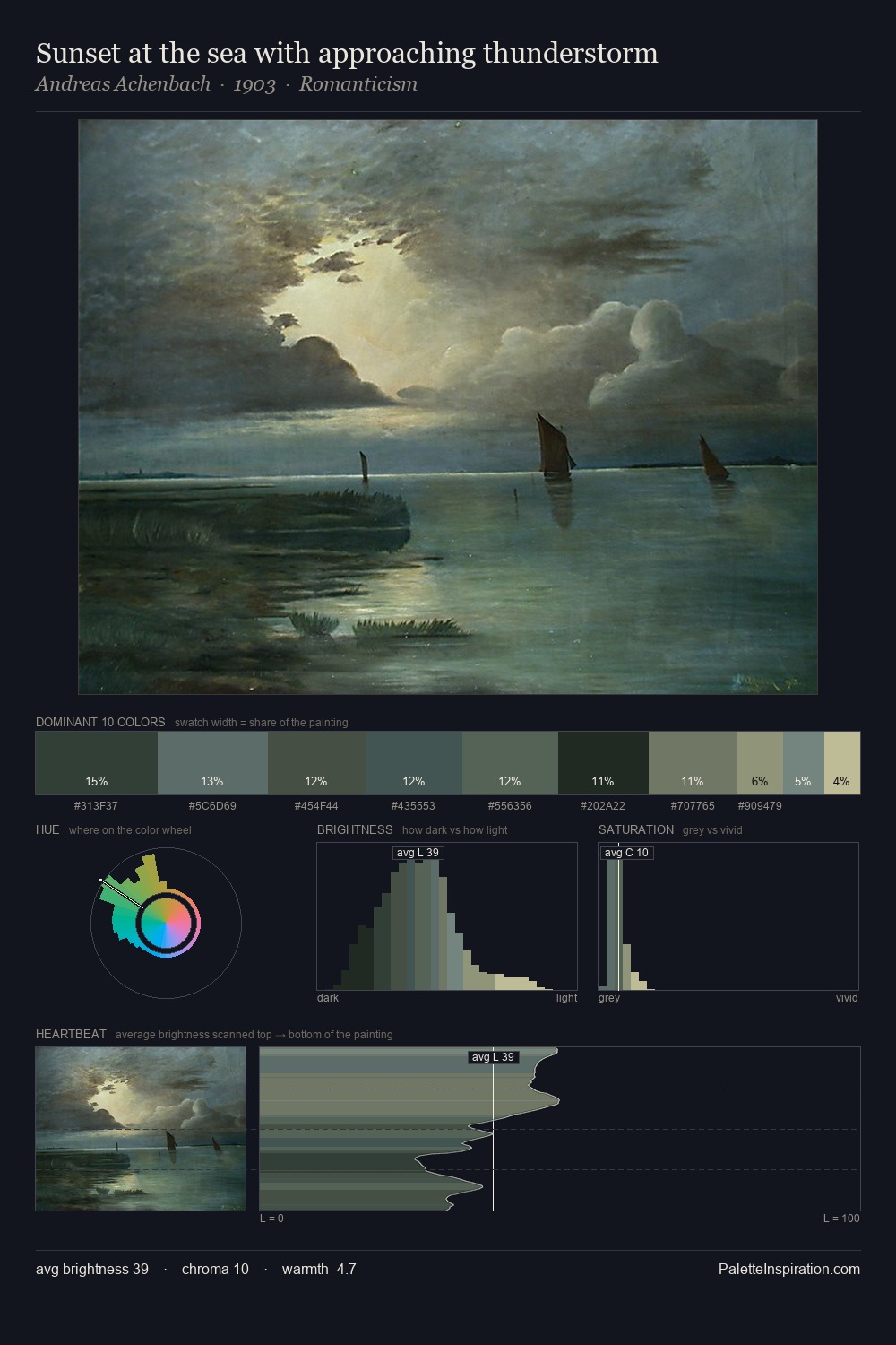
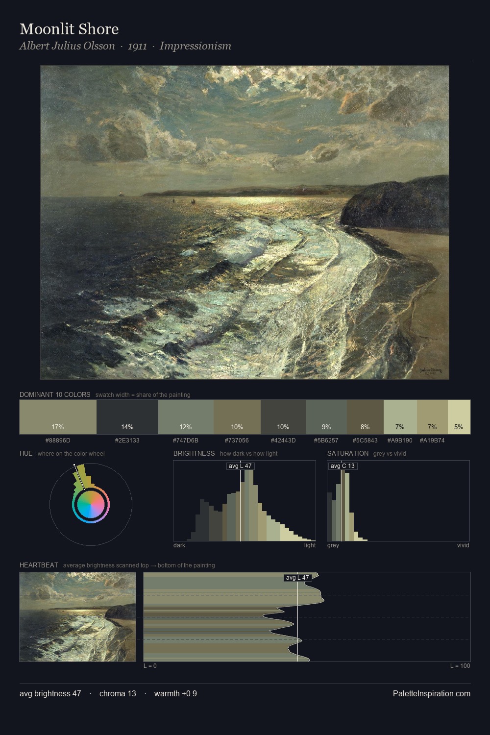
Fernand Combes distributes its values across the middle register, creating harmony without high contrast. Blues and teal-greys govern the palette, lending it an aquatic or atmospheric quality. Saturation is deliberately withheld - the beauty here lies in the near-monochromatic gradations rather than colour difference. The highest-chroma note - #AAAB8B - appears at just 3.4%, deployed as a precision accent against the quieter ground. At 36 units across the value scale, the palette keeps contrast readable without letting it dominate. The mid-to-high key, cool bias, and moderate chroma point to outdoor observation - sky and diffused daylight as the dominant light source. Palette 4 sits within the larger chromatic argument that Fernand Combes's complete body of work advances.
Example use cases
- exhibition design
- foundation branding
- estate management
- art education
- museums & galleries
I Love This!
Copy, export, or download for your project