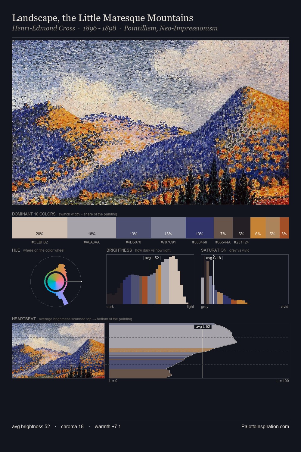
Fern Coppedge Palette 4

Palette Analysis
Fern Coppedge keeps values measured and balanced, a hallmark of tonal restraint. Fern Coppedge builds on cool foundations: the palette favours the blue-cyan-green arc. Saturation is deliberately withheld - the beauty here lies in the near-monochromatic gradations rather than colour difference. #52342F delivers the chromatic peak at only 8.9% - a small shot of colour with outsized visual impact. At 61 units of value range, the palette has the tonal breadth to sustain complex spatial readings. The mid-to-high key, cool bias, and moderate chroma point to outdoor observation - sky and diffused daylight as the dominant light source. Fern Coppedge's palette 4 carries its own internal logic while remaining in conversation with the artist's broader colour intelligence.
Example use cases
- exhibition design
- foundation branding
- estate management
- art education
- museums & galleries
I Love This!
Copy, export, or download for your project