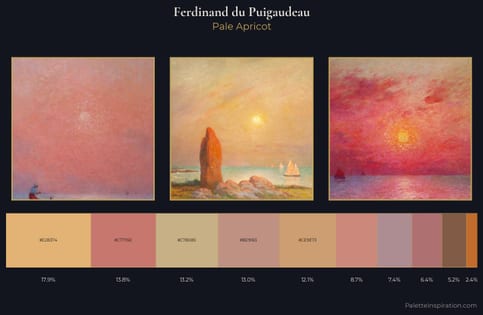
Ferdinand du Puigaudeau Palette 2
Soft Ivory
Soft Low-contrast, gentle chroma - mid-key values and low saturation, approachable and calm.
Ivory Warm creamy white - the color of natural ivory, warmer than pure white.
Palette Analysis
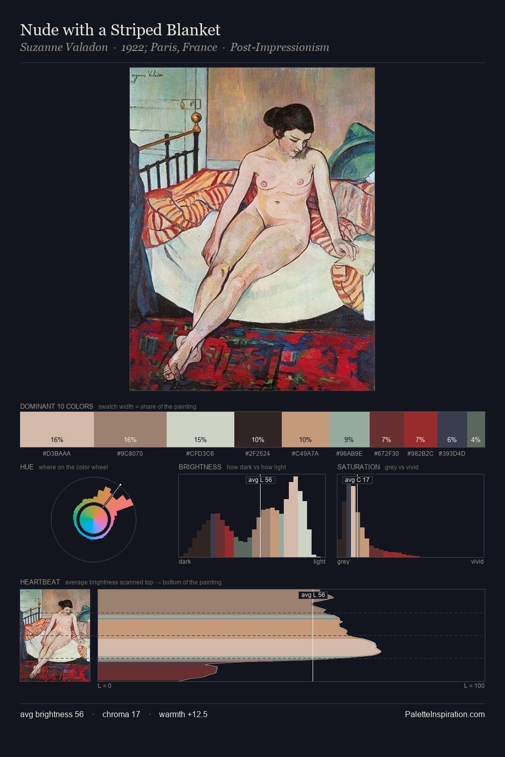
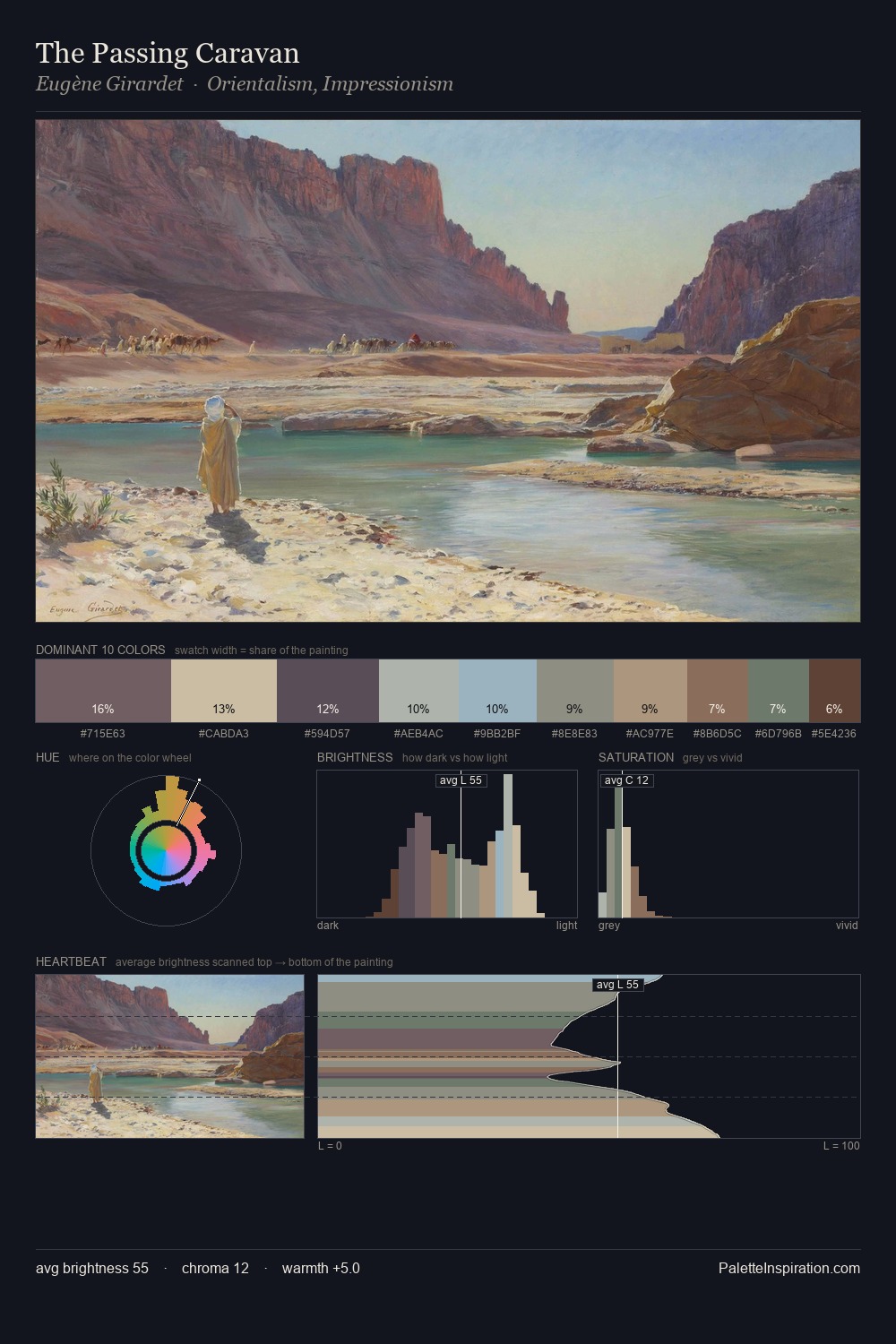
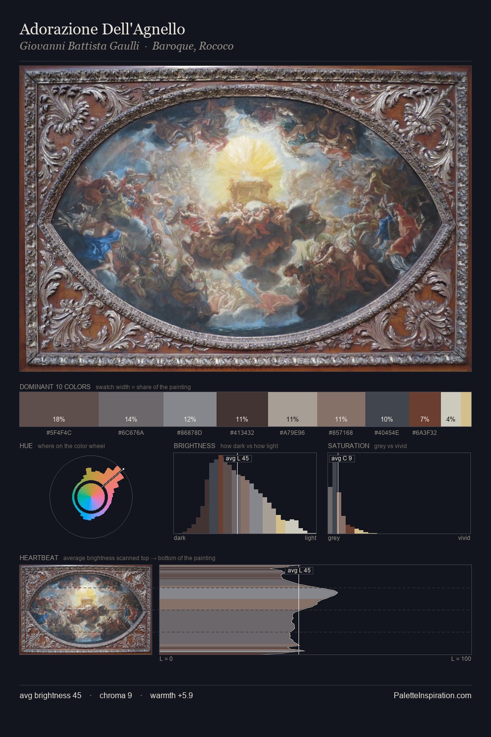
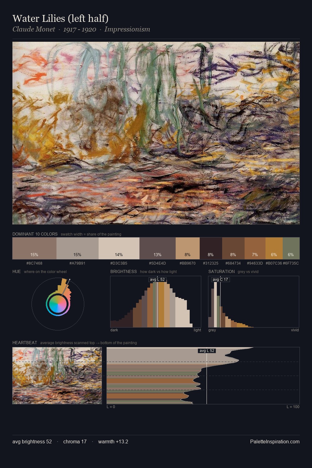
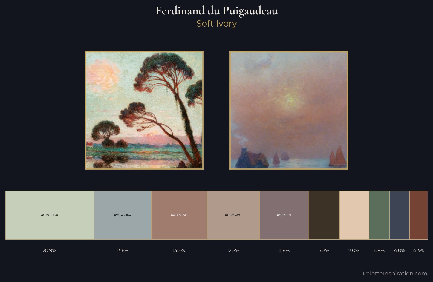
Values in Ferdinand du Puigaudeau tilt decisively toward white, giving the palette its luminous character. The palette achieves thermal balance - reds and blues, ochres and greens, each holding the other in check. Every colour is desaturated; the palette proceeds through near-neutrals and gently-coloured greys. Only 7.3% is devoted to #3D3226, yet that small allocation delivers the palette's entire chromatic tension. 52 units of value spread create a palette that is varied but unified - contrast in the service of harmony. In the context of Ferdinand du Puigaudeau's full range of palettes, group 2 represents one movement in an ongoing chromatic dialogue.
Example use cases
- exhibition design
- foundation branding
- estate management
- art education
- museums & galleries
I Love This!
Use This Palette
Copy, export, or download for your project
Copy, export, or download for your project
Copy:
Download:
Share: