Expressionism Palette 9
Pale Vermillion
Pale High-key and low-chroma - delicate, bleached, washed with light.
Vermillion Brilliant red-orange - the classic mercury sulfide pigment, vivid and warm.

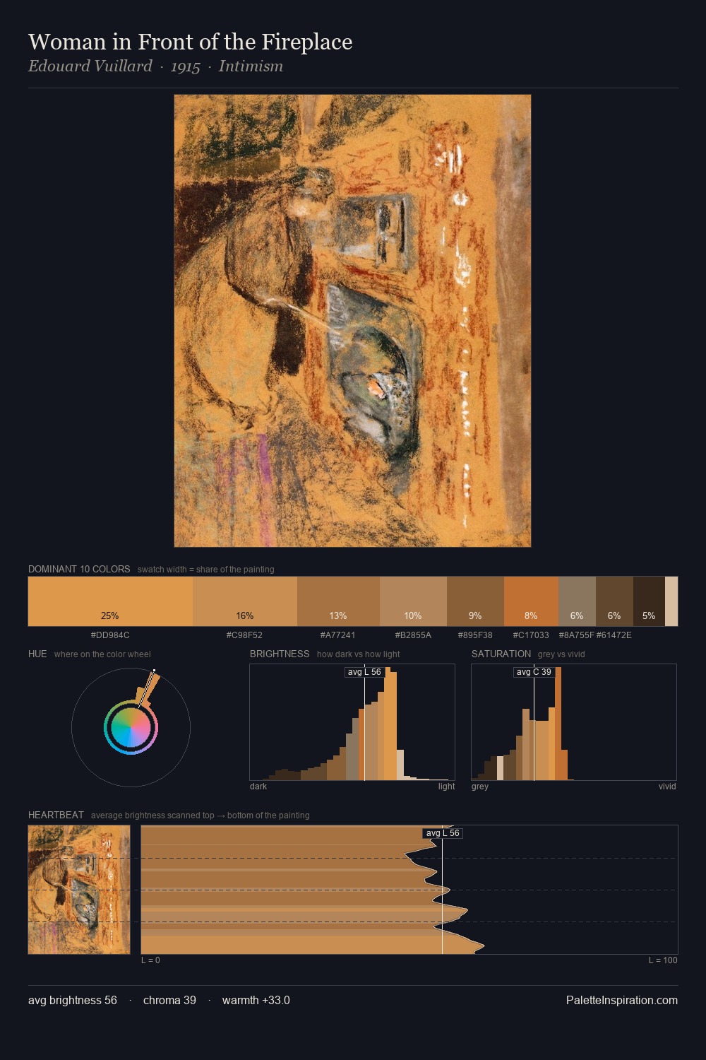
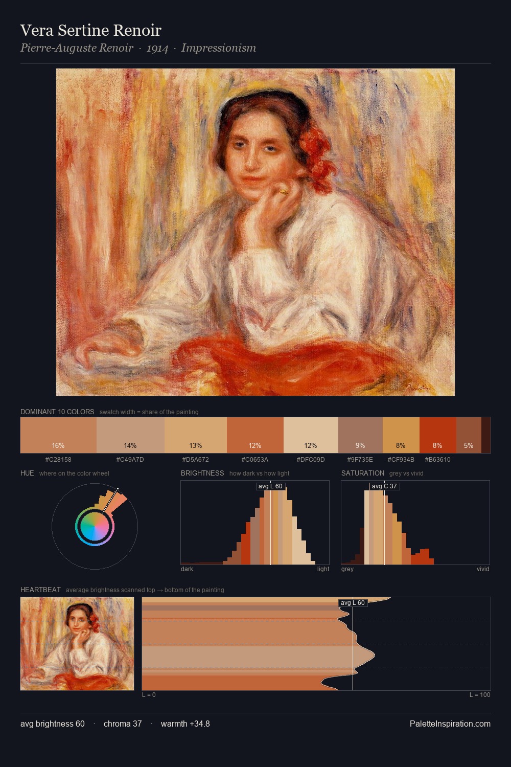
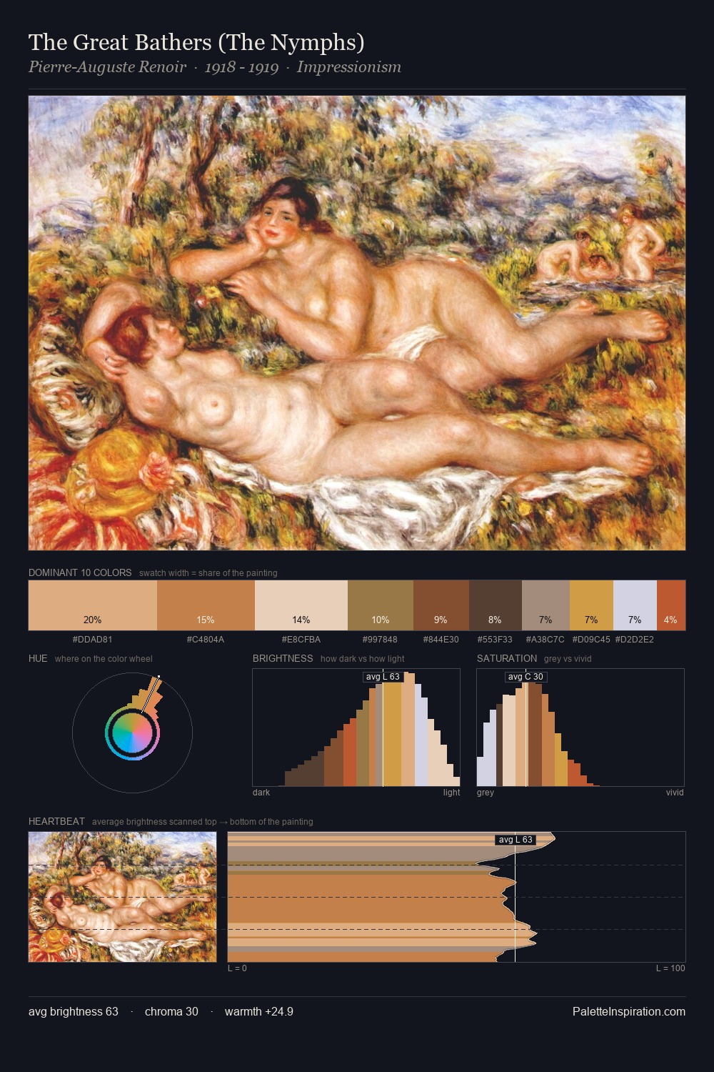
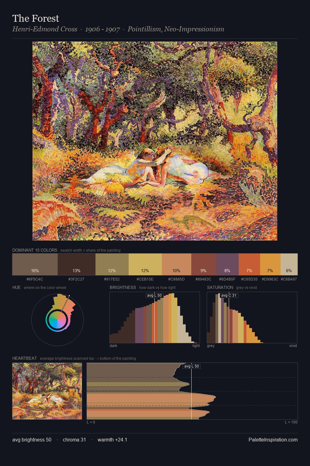
Palette Analysis
Expressionism occupies the comfortable middle of the value scale, avoiding both extremes to hold the eye in a sustained middle grey. The dominant temperature is warm, with earth tones and fire-hues setting the emotional key. Chroma is moderate: colours carry enough saturation to be read as colour, but the palette stops well short of garish intensity. #D07E49 delivers the chromatic peak at only 13.3% - a small shot of colour with outsized visual impact. The palette spans 49 value units: a measured range that delivers coherence over drama.
Example use cases
- publishing
- corporate identity
- consumer apps
- hospitality
- design agencies
I Love This!
Use This Palette
Copy, export, or download for your project
Copy, export, or download for your project
Copy:
Download:
Share: