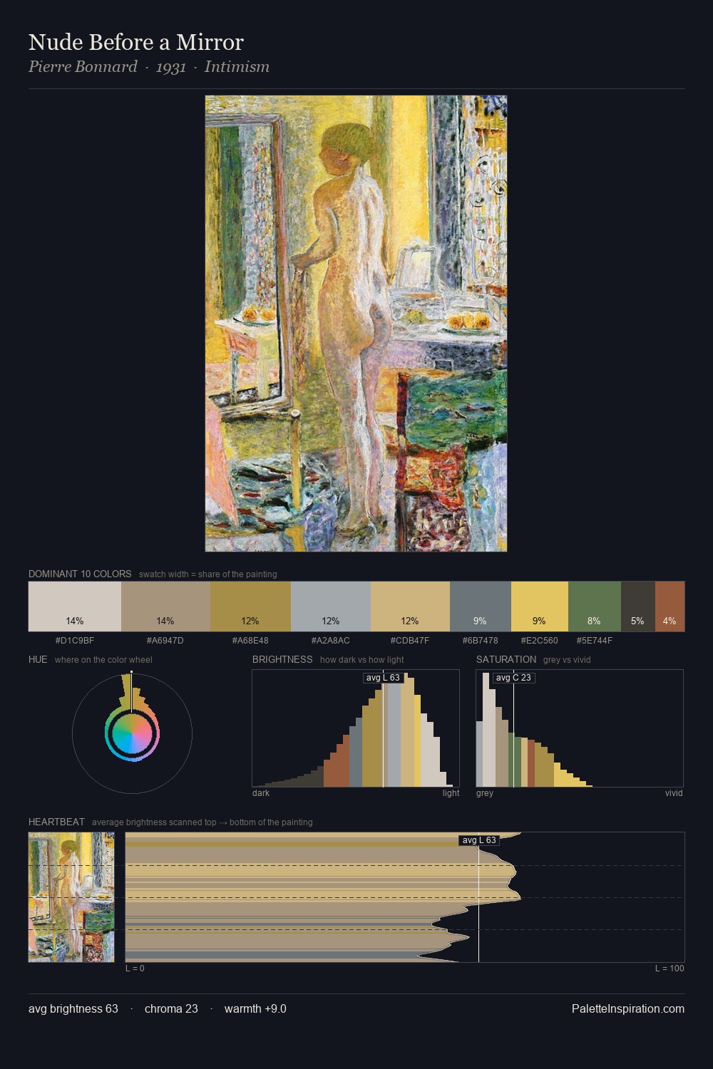
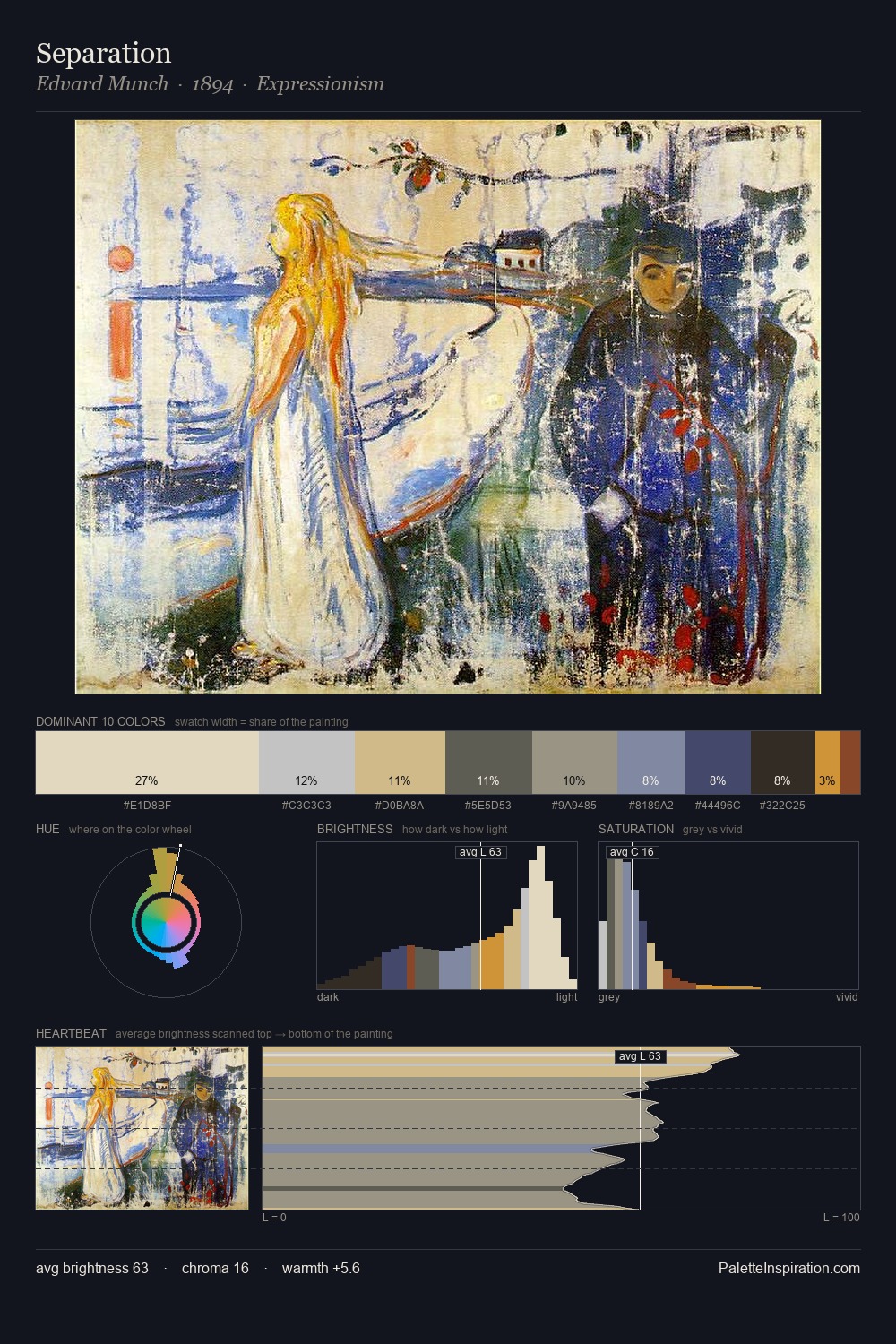
Expressionism Palette 3
Soft Ivory
Soft Low-contrast, gentle chroma - mid-key values and low saturation, approachable and calm.
Ivory Warm creamy white - the color of natural ivory, warmer than pure white.

Palette Analysis
Light floods Expressionism; the palette keeps values pale and airy across its range. The palette achieves thermal balance - reds and blues, ochres and greens, each holding the other in check. Chroma hovers near zero; colour declares itself through subtle shifts in hue rather than outright saturation. #9E5244 delivers the chromatic peak at only 2.6% - a small shot of colour with outsized visual impact. The full value range is 58 units: broad enough to build convincing three-dimensional form.
Example use cases
- florist branding
- event design
- real estate
- jewelry retail
- hospitality branding
I Love This!
Use This Palette
Copy, export, or download for your project
Copy, export, or download for your project
Copy:
Download:
Share: