Expressionism Palette 13
Veiled Vellum
Veiled Partially obscured light - mid-dark with a hazy, scrim-filtered quality.
Vellum Smooth pale tan - the color of prepared calf-skin vellum, warmer than parchment.

Palette Analysis
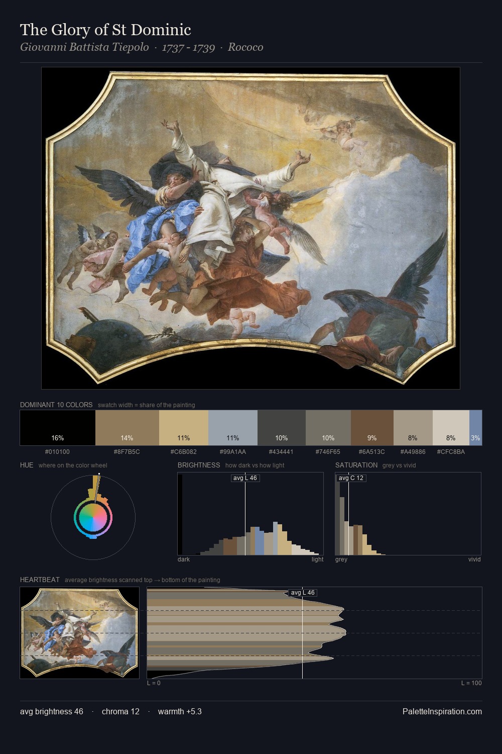
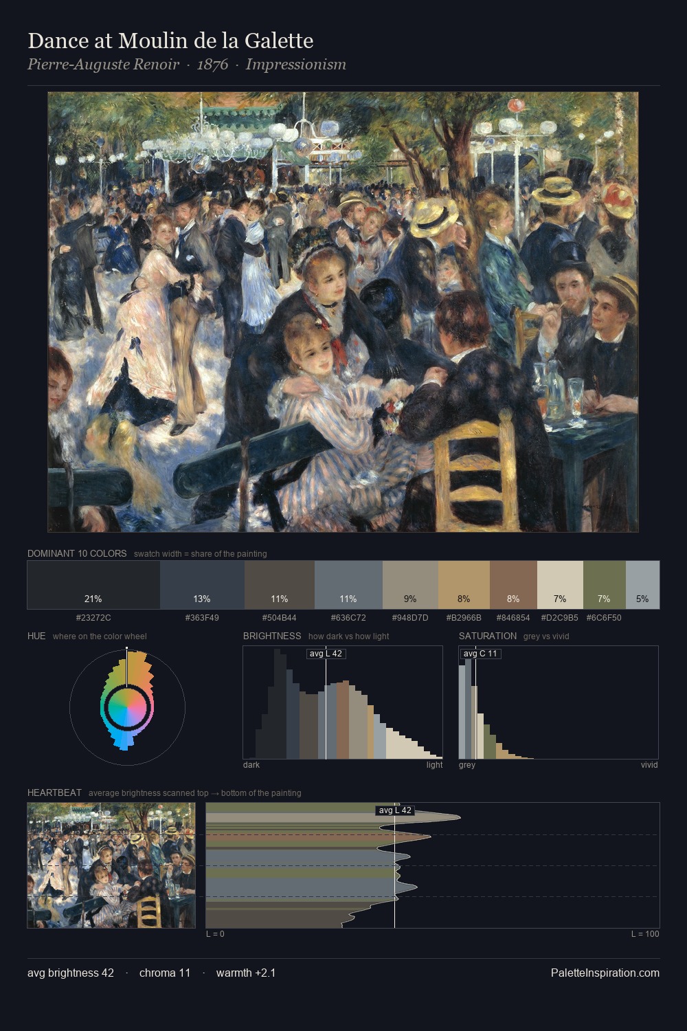
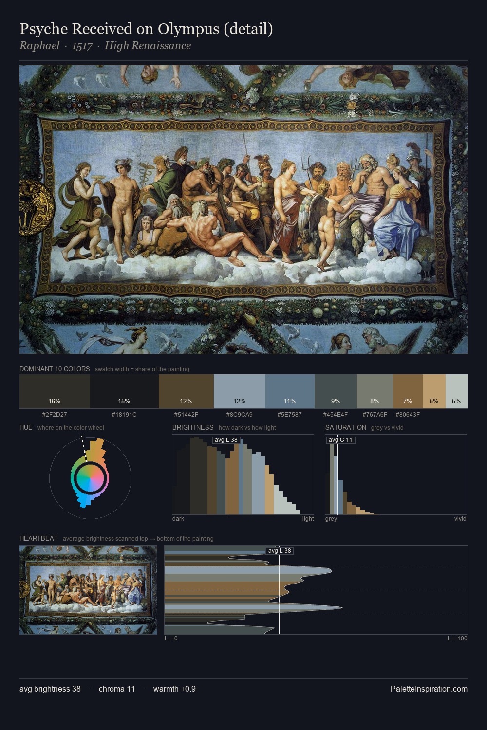
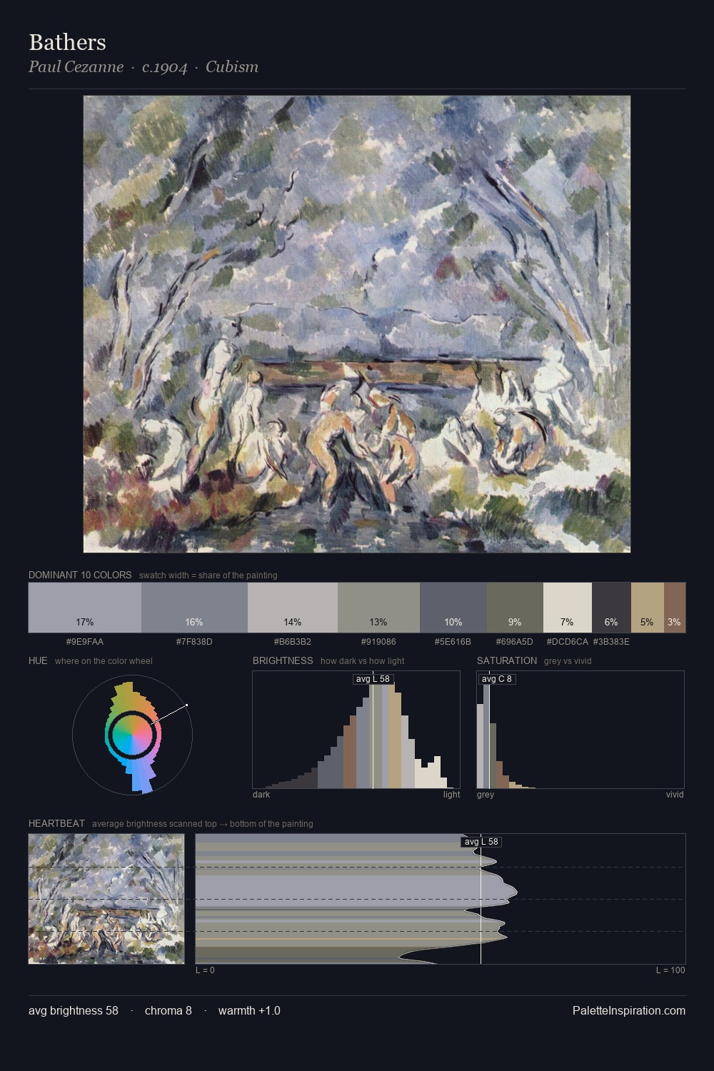
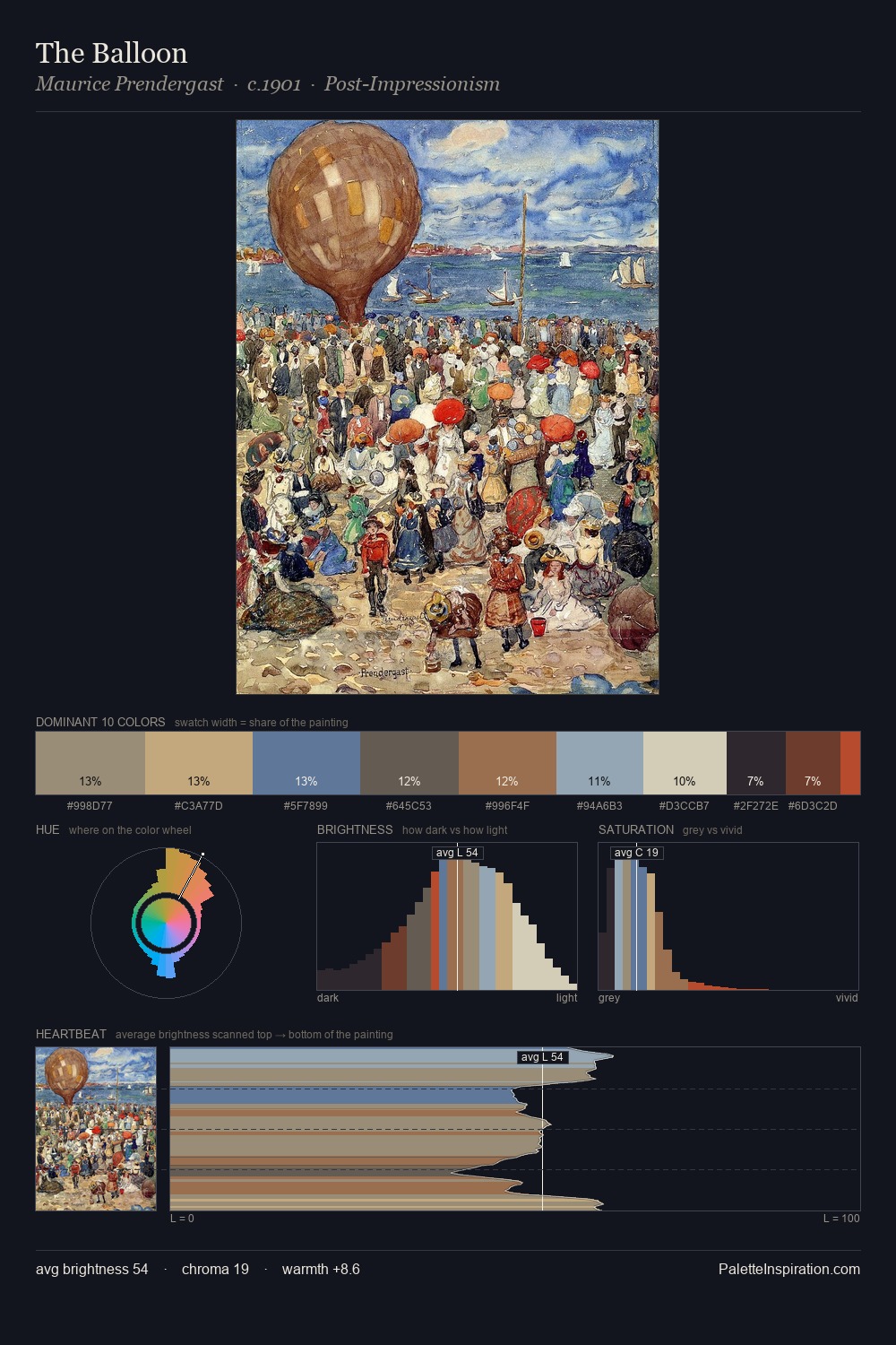
Expressionism occupies the comfortable middle of the value scale, avoiding both extremes to hold the eye in a sustained middle grey. The palette tilts toward cool - blues and silver-greys carry the structural weight. The absence of saturated colour is itself an expressive choice: this is a palette of restraint and atmosphere. The most saturated colour, #7F5D4A, is reserved to 7.4% of the surface, where it acts as a focal punctuation. 52 units of value spread create a palette that is varied but unified - contrast in the service of harmony. The mid-to-high key, cool bias, and moderate chroma point to outdoor observation - sky and diffused daylight as the dominant light source.
Example use cases
- exhibition design
- foundation branding
- estate management
- art education
- museums & galleries
I Love This!
Use This Palette
Copy, export, or download for your project
Copy, export, or download for your project
Copy:
Download:
Share: