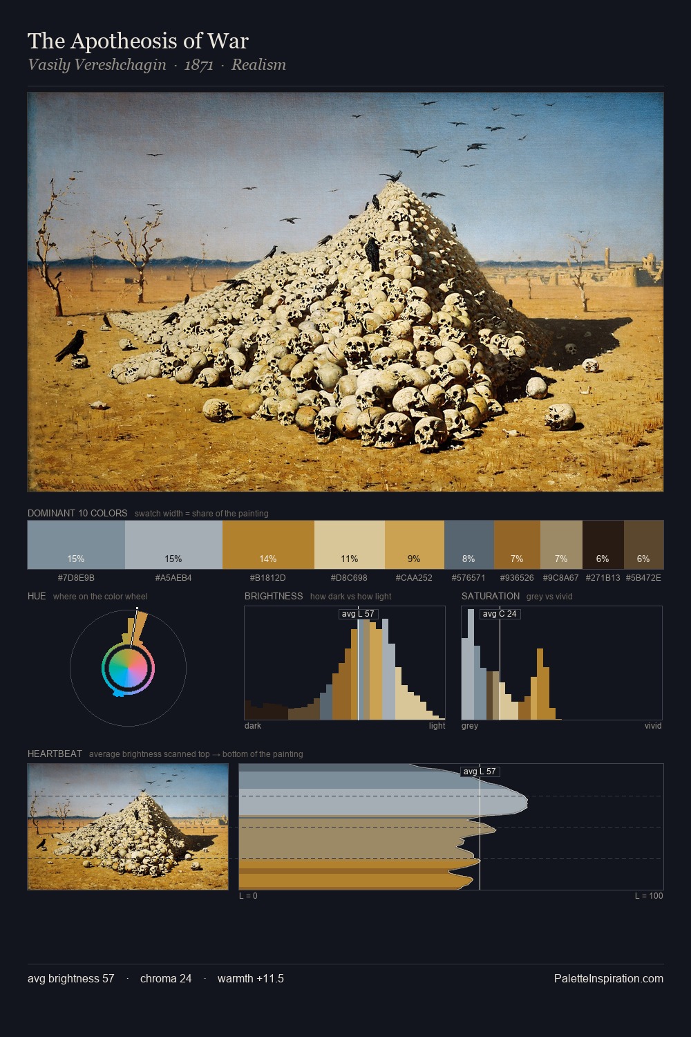
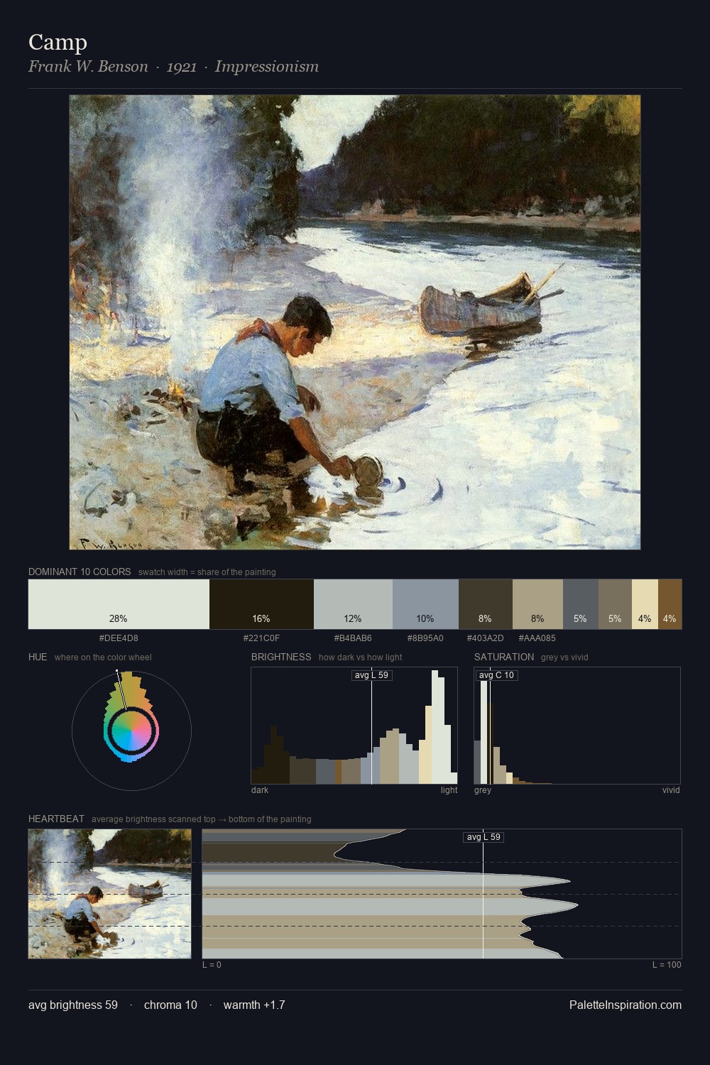
Ettore Tito Palette 4

Palette Analysis
Ettore Tito occupies the comfortable middle of the value scale, avoiding both extremes to hold the eye in a sustained middle grey. Cool tones set the register here - the blues and greens easily outweigh any warm accents. All colours lean toward grey, building depth through value rather than colour punch. The dominant colour, #A8A696, takes 26.5% of the total area, establishing the overall mood before any other hue is introduced. The highest-chroma note - #8B5A28 - appears at just 3.3%, deployed as a precision accent against the quieter ground. The value range spans 63 units across the palette, providing the full gamut from deep shadow to near-white and ensuring clear tonal hierarchy. The palette has the character of outdoor light: cool, mid-bright, with colour rendered faithfully rather than expressively. This is palette 4 of Ettore Tito's sequence - a single chapter in a chromatic story told across many works.
Example use cases
- exhibition design
- foundation branding
- estate management
- art education
- museums & galleries
I Love This!
Copy, export, or download for your project