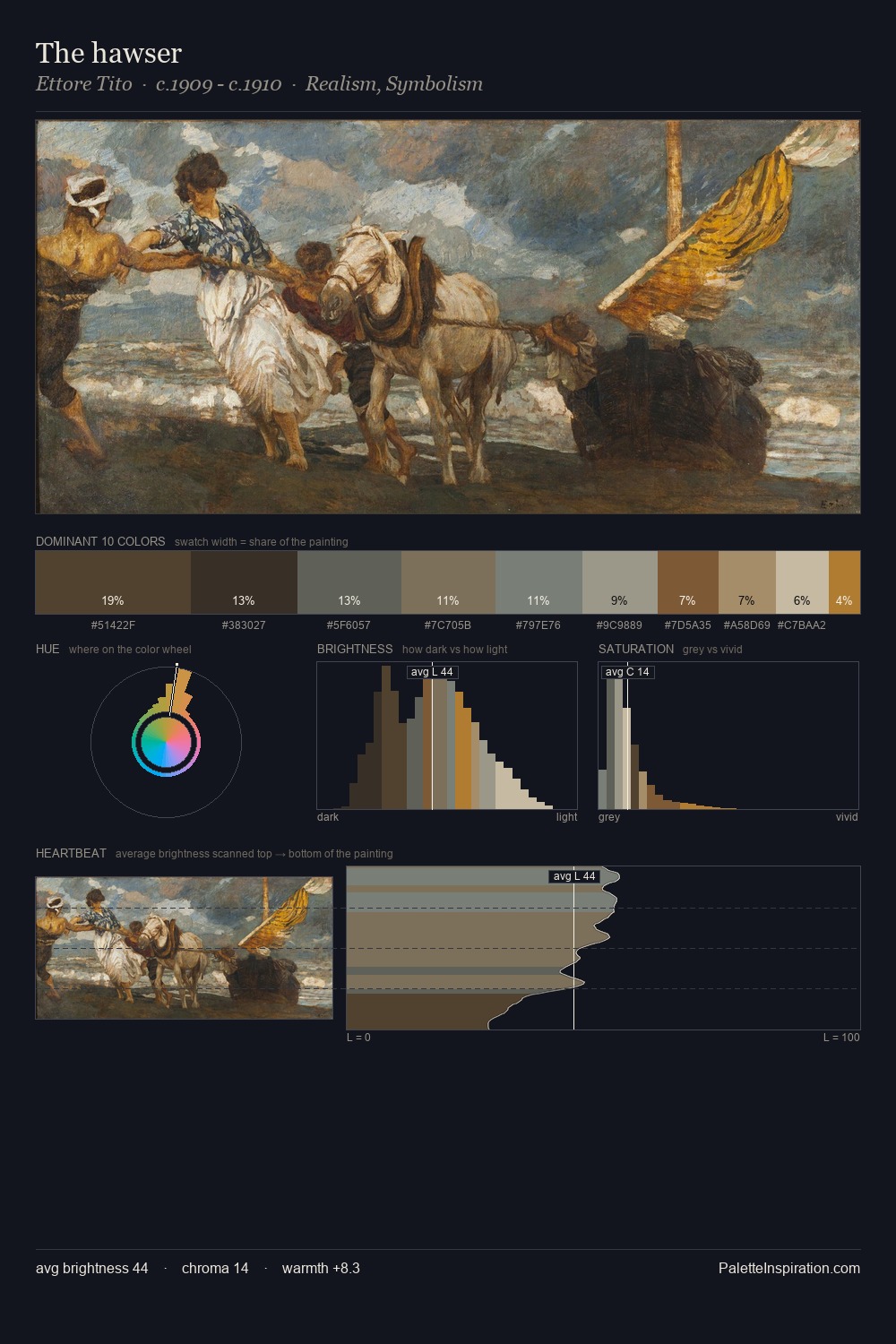
Ettore Tito Palette 1
Veiled Tawny
Veiled Partially obscured light - mid-dark with a hazy, scrim-filtered quality.
Tawny Warm orange-brown - a traditional term for the color of tanned leather or lion fur.

Palette Analysis
Values in Ettore Tito rest in the mid-range - neither dramatically lit nor steeped in shadow. Heat pervades this palette; warm chromatic identities outweigh cool ones at almost every weight. All colours lean toward grey, building depth through value rather than colour punch. The saturated accent, #A07138, registers at 2.3% - sparse enough to feel like a deliberate surprise. From deepest dark to palest light, the palette traverses 56 units of the value scale - a span that creates natural depth. This is palette 1 of Ettore Tito's sequence - a single chapter in a chromatic story told across many works.
Example use cases
- exhibition design
- foundation branding
- estate management
- art education
- museums & galleries
I Love This!
Use This Palette
Copy, export, or download for your project
Copy, export, or download for your project
Copy:
Download:
Share: