Ethel Reed Palette 4
Palette Analysis
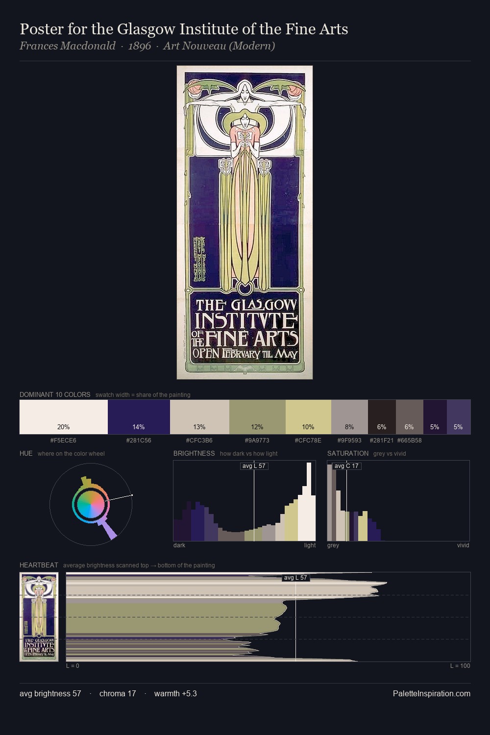
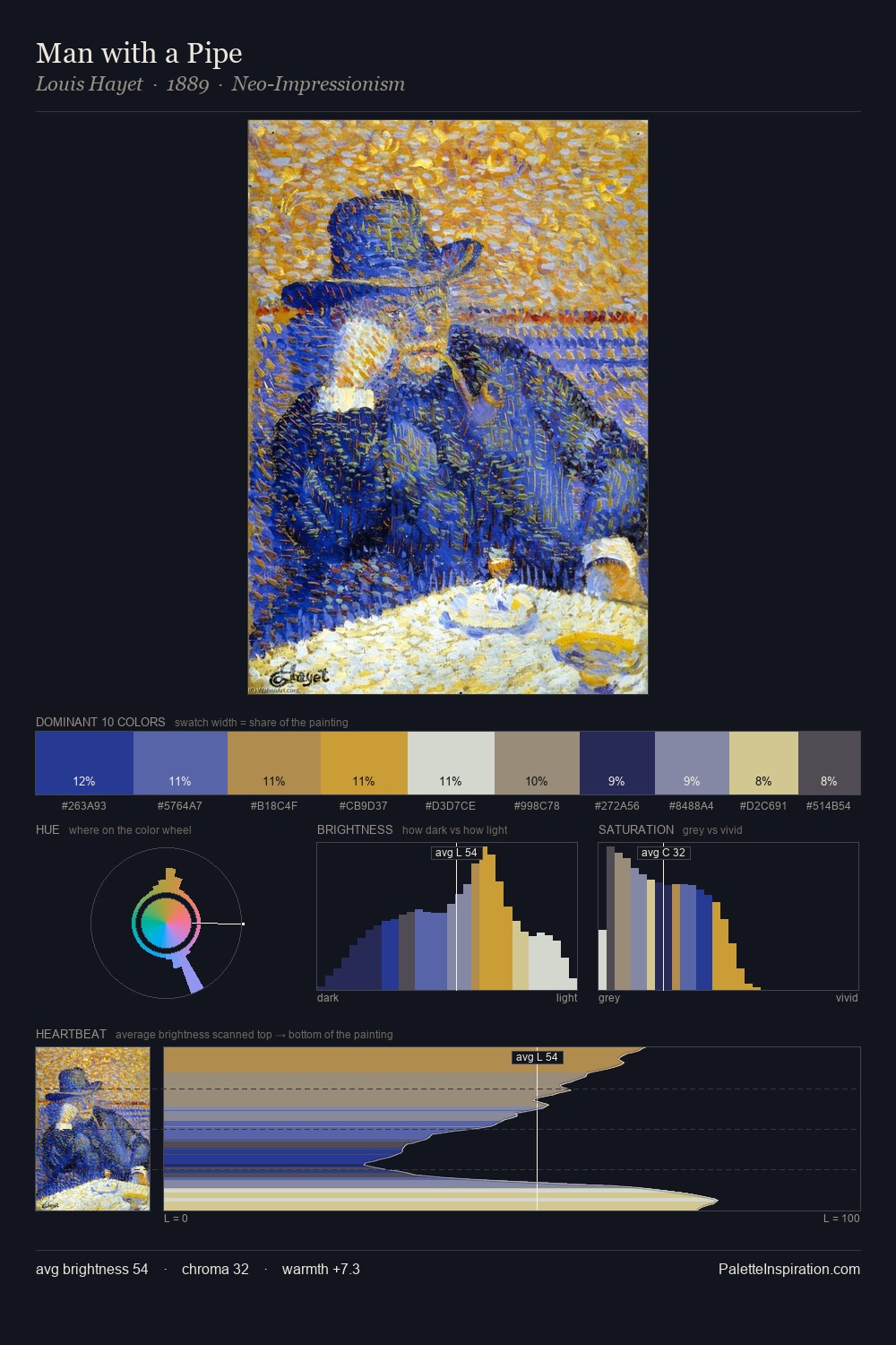
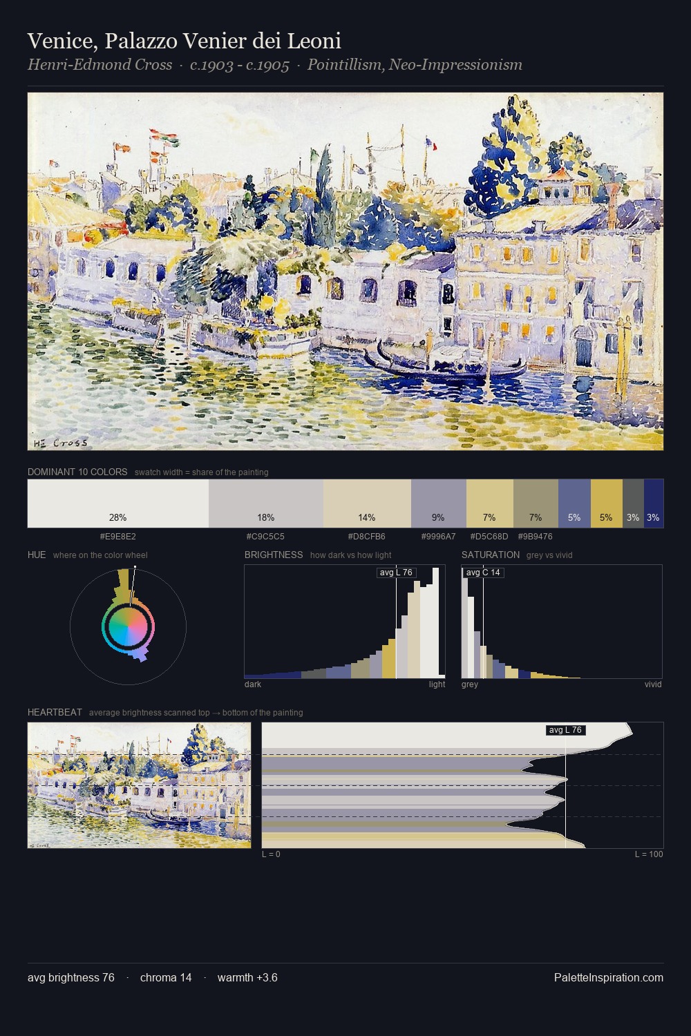
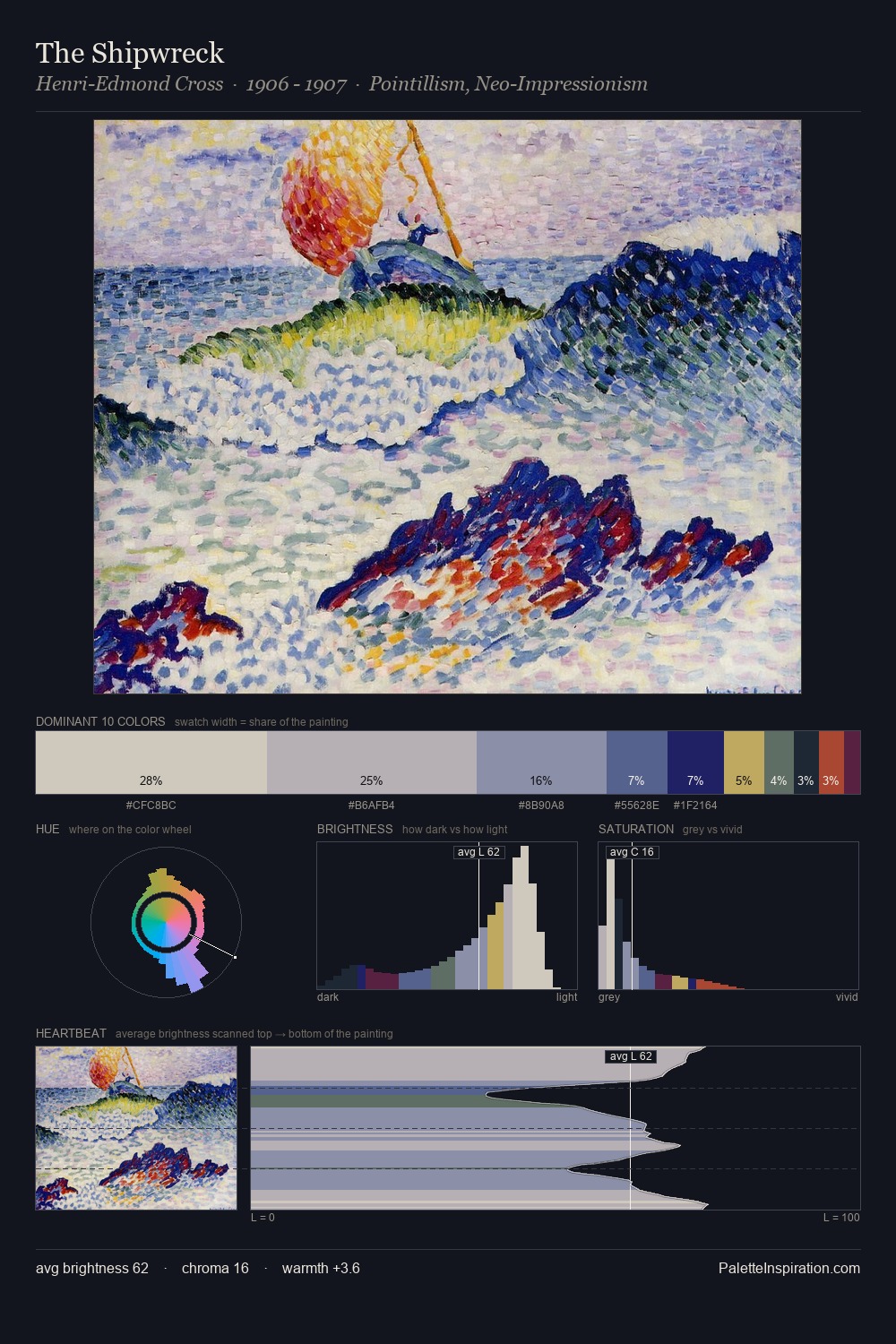
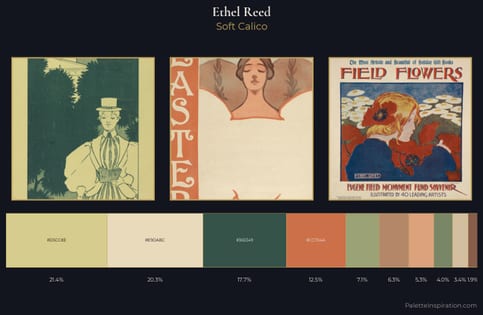
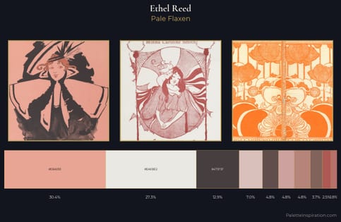
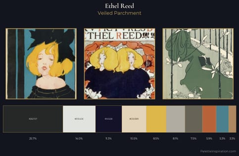
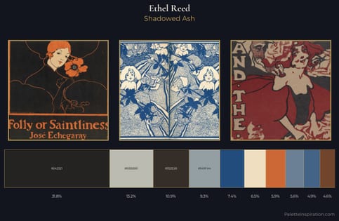
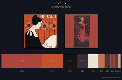
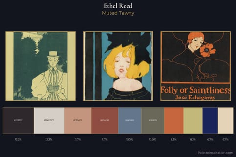
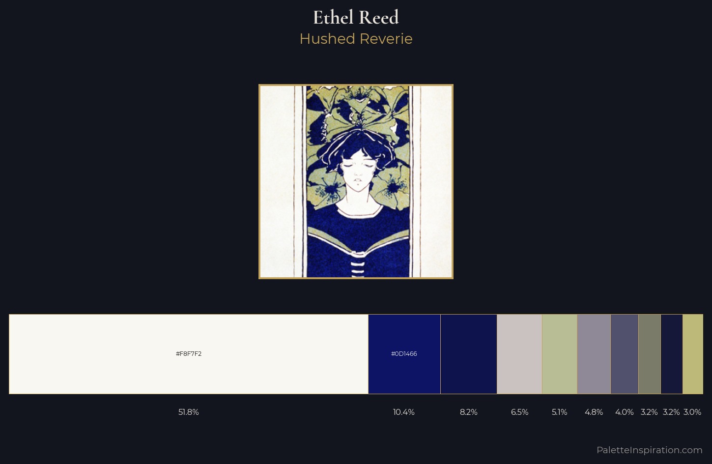
Light floods Ethel Reed; the palette keeps values pale and airy across its range. Ethel Reed tilts toward cool - blues and silver-greys carry the structural weight. Muted throughout, the palette achieves its effects through value and temperature rather than chromatic force. The dominant colour, #F8F7F2, takes 51.7% of the total area, establishing the overall mood before any other hue is introduced. The highest-chroma note - #B9BD96 - appears at just 5.1%, deployed as a precision accent against the quieter ground. The value range spans 75 units across the palette, providing the full gamut from deep shadow to near-white and ensuring clear tonal hierarchy. High luminosity and cool temperature suggest the plein-air condition: unfiltered daylight and open sky. Palette 4 sits within the larger chromatic argument that Ethel Reed's complete body of work advances.
Example use cases
- publishing
- corporate identity
- consumer apps
- hospitality
- design agencies
I Love This!
Copy, export, or download for your project