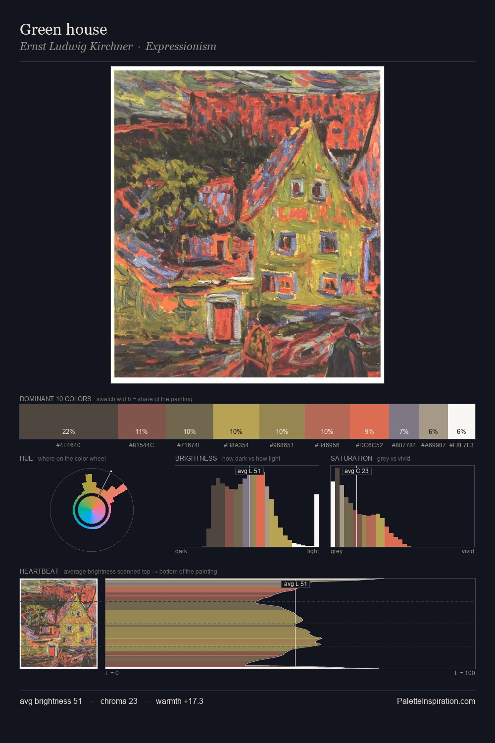
Ernst Ludwig Kirchner Palette 13

Palette Analysis
Ernst Ludwig Kirchner distributes its values across the middle register, creating harmony without high contrast. Yellow, ochre, sienna: warm hues that Ernst Ludwig Kirchner deploys as the palette's primary energy. Saturation is deliberately withheld - the beauty here lies in the near-monochromatic gradations rather than colour difference. #413E3E at 53.8% of the palette: an overwhelming presence that pulls all other colours into its gravitational field. The highest-chroma note - #F2E7CC - appears at just 2.3%, deployed as a precision accent against the quieter ground. A value spread of 56 units gives the palette both depth and air - shadows are genuinely dark, lights genuinely light. Palette 13 sits within the larger chromatic argument that Ernst Ludwig Kirchner's complete body of work advances.
Example use cases
- theater design
- jewelry brands
- tobacco-adjacent retail
- event branding
- film & entertainment
I Love This!
Copy, export, or download for your project