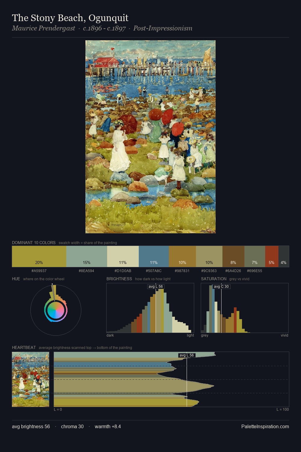
Enrico Prampolini Palette 3

Palette Analysis
Enrico Prampolini sits in the centre of the value range, lending the palette a sense of even, sustained light. Temperature is cool-dominant, with blue and green families claiming the largest areas. Chroma is moderate: colours carry enough saturation to be read as colour, but the palette stops well short of garish intensity. The highest-chroma note - #E5D4B2 - appears at just 9.2%, deployed as a precision accent against the quieter ground. 65 units of value range underpin the palette's structural clarity: the eye always knows where light falls. The palette has the character of outdoor light: cool, mid-bright, with colour rendered faithfully rather than expressively. This is palette 3 of Enrico Prampolini's sequence - a single chapter in a chromatic story told across many works.
Example use cases
- theater design
- jewelry brands
- tobacco-adjacent retail
- event branding
- film & entertainment
I Love This!
Copy, export, or download for your project