Emily Carr Palette 7
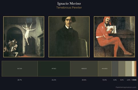
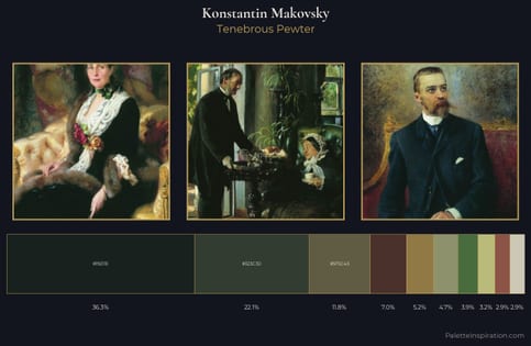
Tenebrous Pewter
Tenebrous Dark and murky - low-key values with obscured form, Baroque in temperament.
Pewter Mid-tone warm gray - the color of pewter alloy, between silver and lead.
Palette Analysis
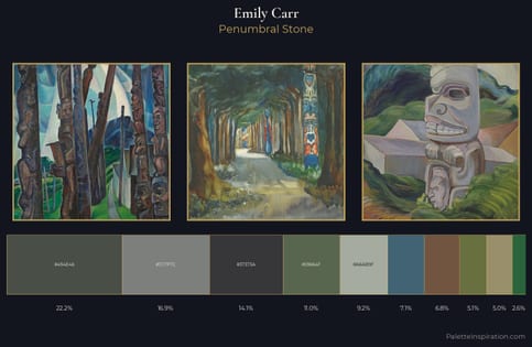
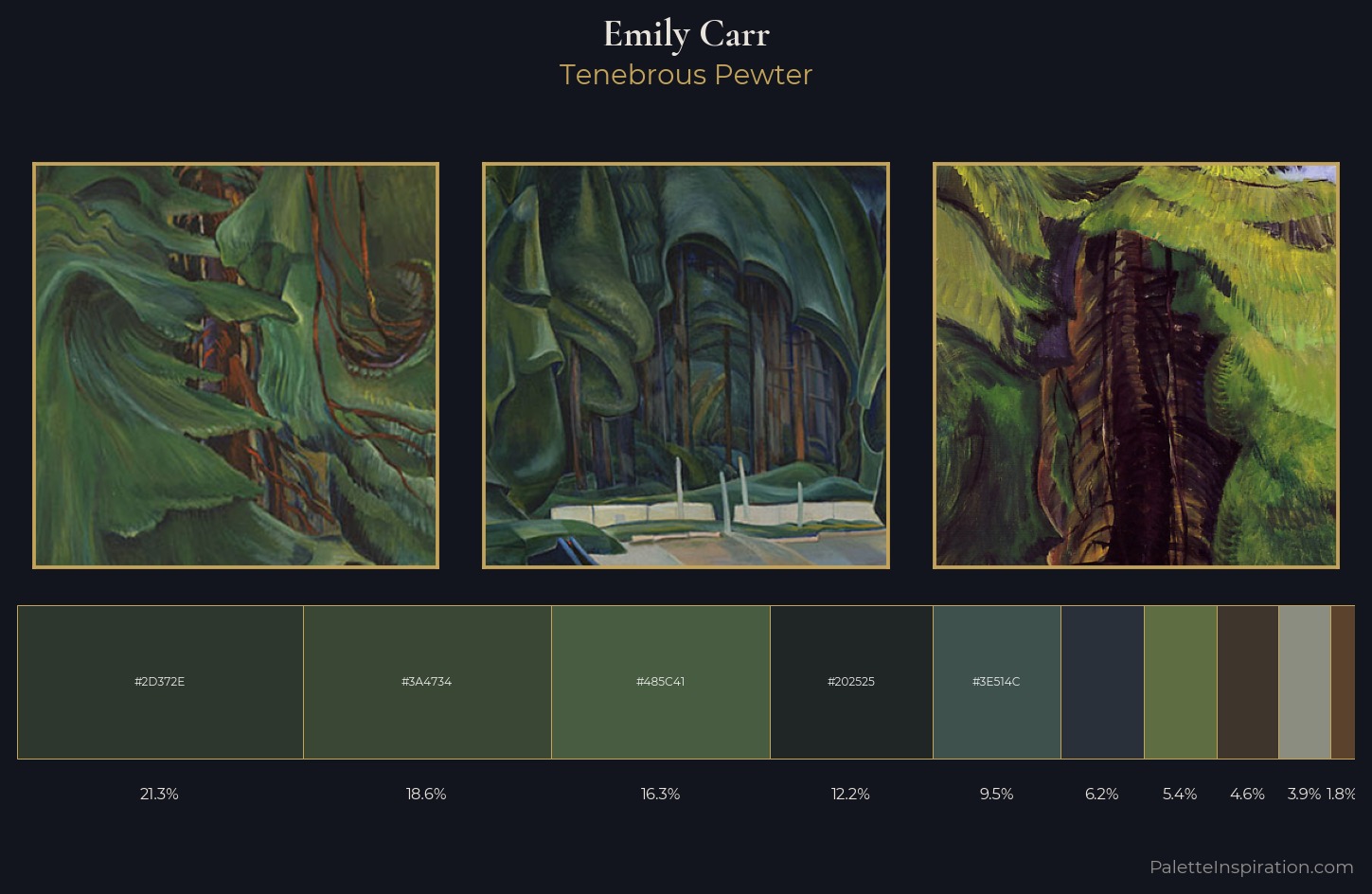
The value structure of Emily Carr is mid-key: quiet, controlled, and cohesive. Cool hues prevail: blues, greens, and greys anchor the palette's emotional temperature. All colours lean toward grey, building depth through value rather than colour punch. #5A422D delivers the chromatic peak at only 1.8% - a small shot of colour with outsized visual impact. 38 units of value spread create a palette that is varied but unified - contrast in the service of harmony. The mid-to-high key, cool bias, and moderate chroma point to outdoor observation - sky and diffused daylight as the dominant light source. In the context of Emily Carr's full range of palettes, group 7 represents one movement in an ongoing chromatic dialogue.
Example use cases
- legal services
- corporate identity
- industrial design
- professional services
- fintech
I Love This!
Use This Palette
Copy, export, or download for your project
Copy, export, or download for your project
Copy:
Download:
Share: