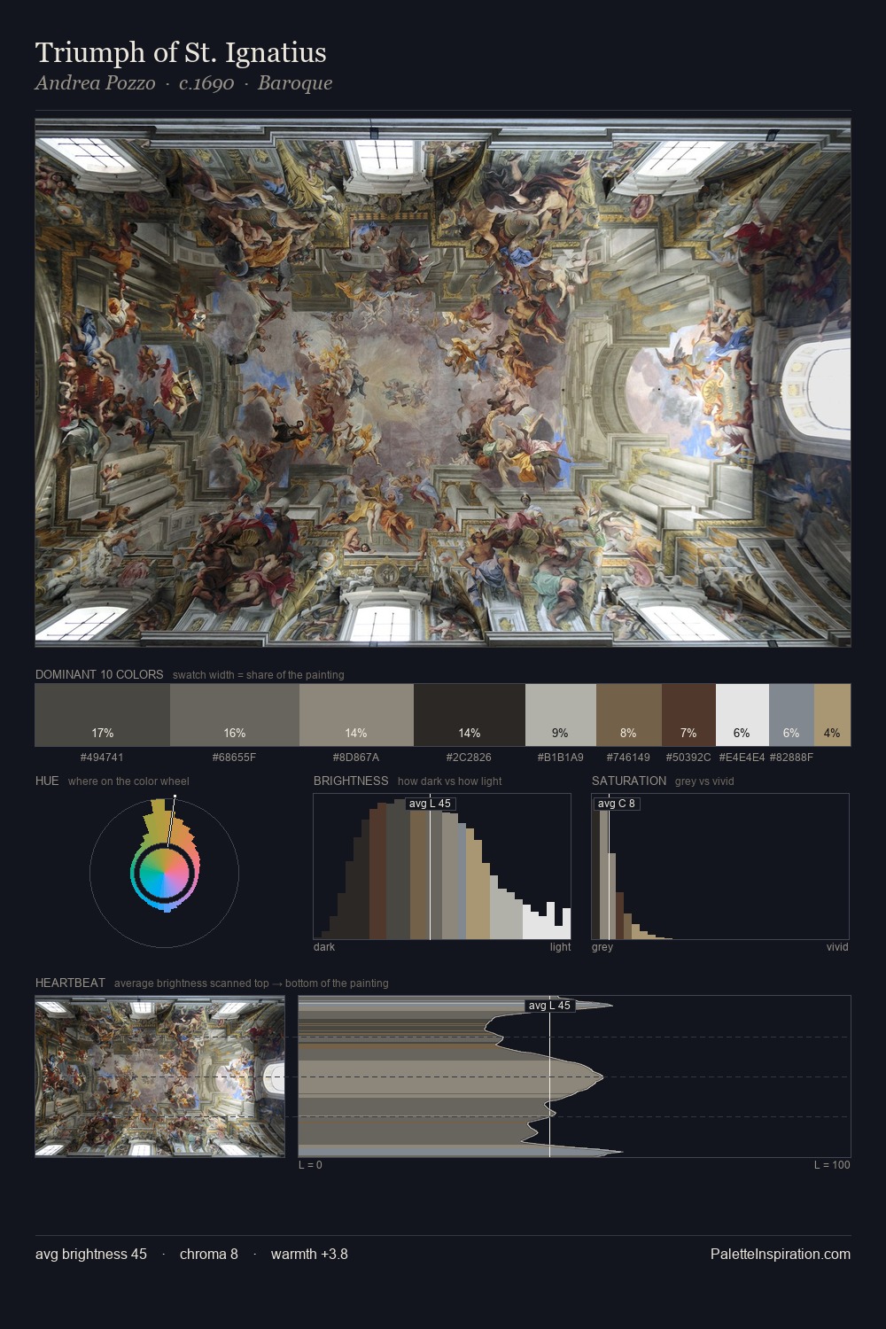
Eliseu Visconti Palette 2

Palette Analysis
Values in Eliseu Visconti tilt decisively toward white, giving the palette its luminous character. Blues and teal-greys govern the palette, lending it an aquatic or atmospheric quality. The absence of saturated colour is itself an expressive choice: this is a palette of restraint and atmosphere. 38.9% of the palette belongs to #FAFAF7, a concentration that makes it the unmistakable visual centre. #AC9B7E functions as the palette's exclamation mark: highest chroma, lowest percentage (3.8%). From deepest dark to palest light, the palette traverses 75 units of the value scale - a span that creates natural depth. The palette has the character of outdoor light: cool, mid-bright, with colour rendered faithfully rather than expressively. Palette 2 sits within the larger chromatic argument that Eliseu Visconti's complete body of work advances.
Example use cases
- florist branding
- event design
- real estate
- jewelry retail
- hospitality branding
I Love This!
Copy, export, or download for your project