Elias Van Nijmegen Palette 1
Nocturnal Bister
Nocturnal Night-register palette - very low values, the world after dark.
Bister Dark warm brown - a traditional ink and wash pigment made from wood soot.

Palette Analysis
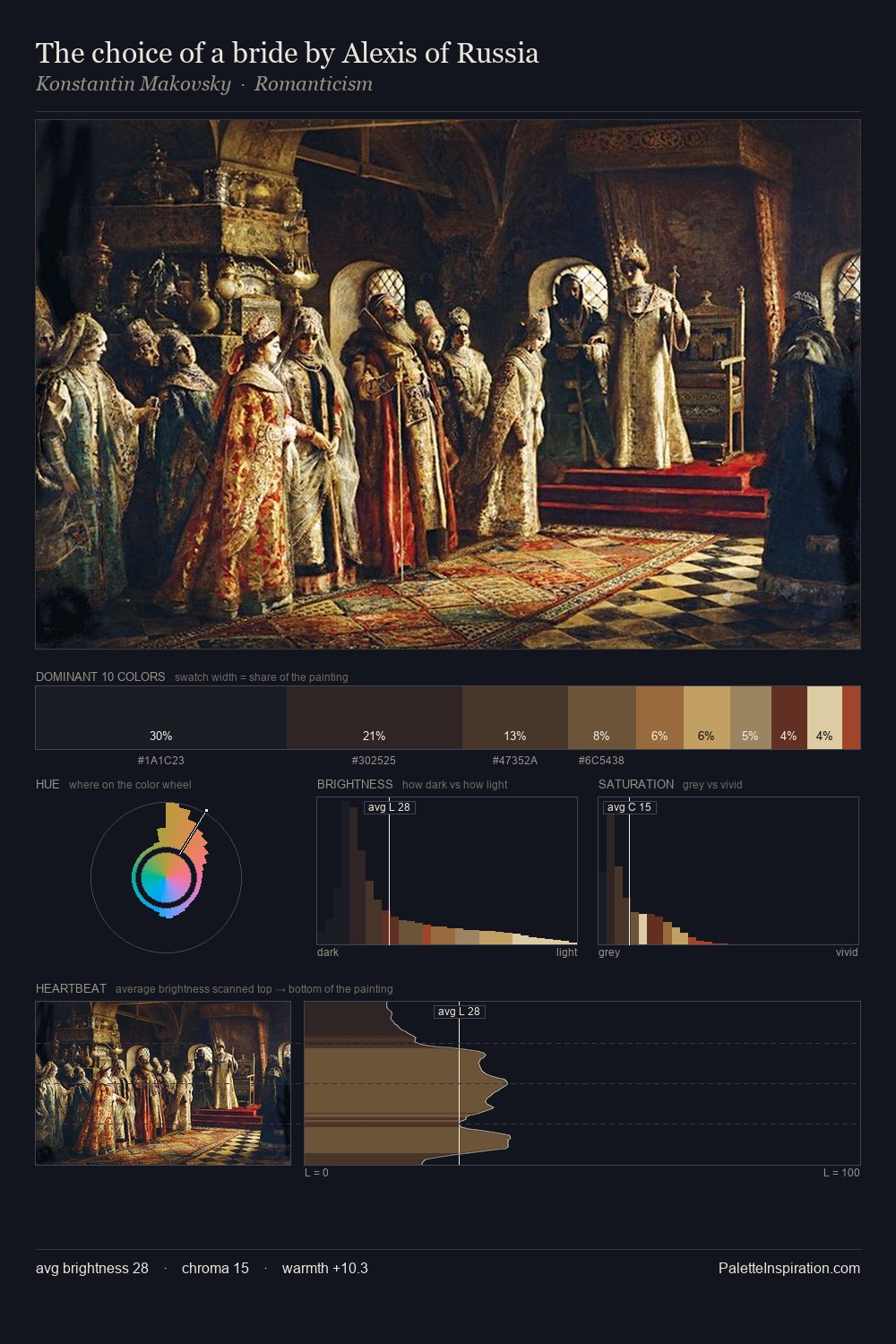
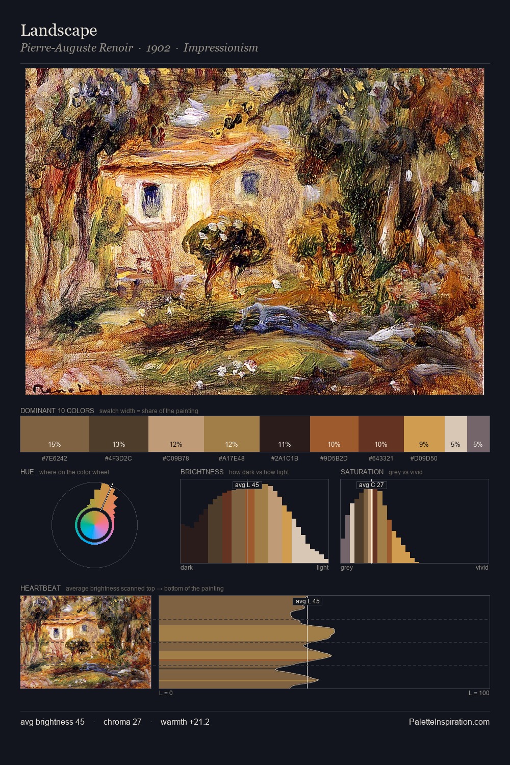
Elias Van Nijmegen sits in the centre of the value range, lending the palette a sense of even, sustained light. Yellow, ochre, sienna: warm hues that Elias Van Nijmegen deploys as the palette's primary energy. Saturation is deliberately withheld - the beauty here lies in the near-monochromatic gradations rather than colour difference. Only 5.0% is devoted to #A8774A, yet that small allocation delivers the palette's entire chromatic tension. From deepest dark to palest light, the palette traverses 64 units of the value scale - a span that creates natural depth. Palette 1 sits within the larger chromatic argument that Elias Van Nijmegen's complete body of work advances.
Example use cases
- film & entertainment
- fine dining
- spirits branding
- menswear
- theater design
I Love This!
Use This Palette
Copy, export, or download for your project
Copy, export, or download for your project
Copy:
Download:
Share: