Eleanor Fortescue-Brickdale Palette 1

Palette Analysis
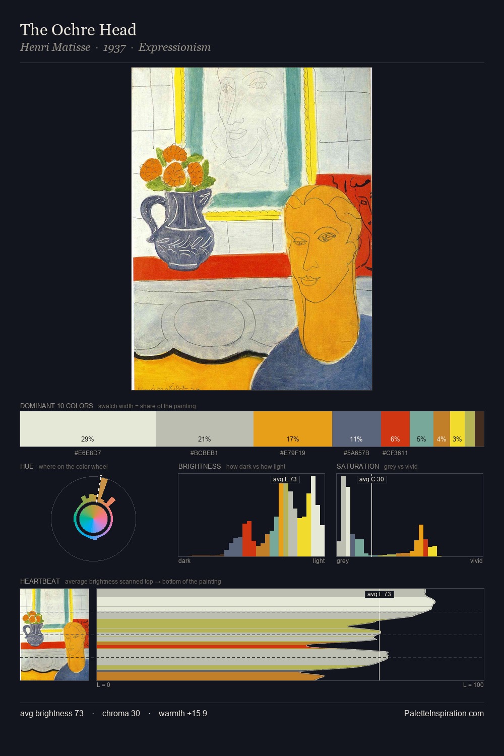
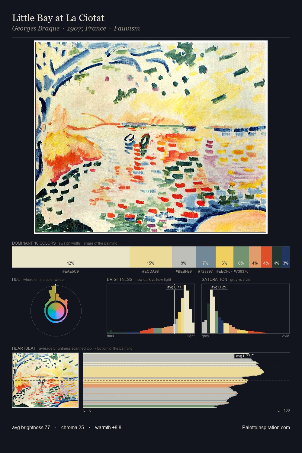
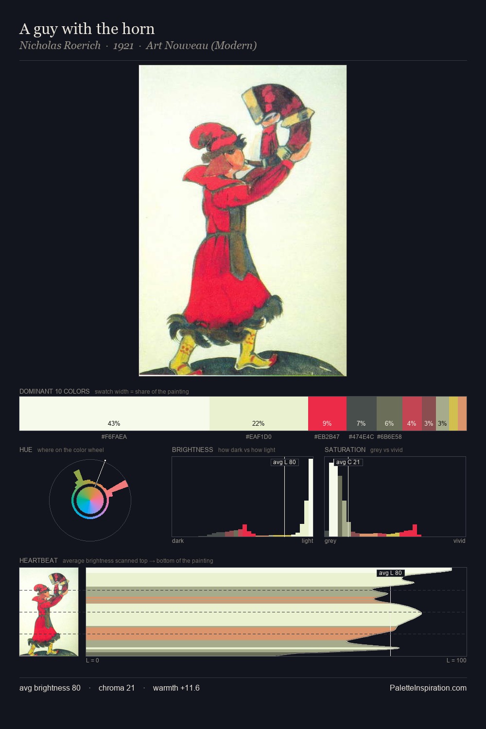
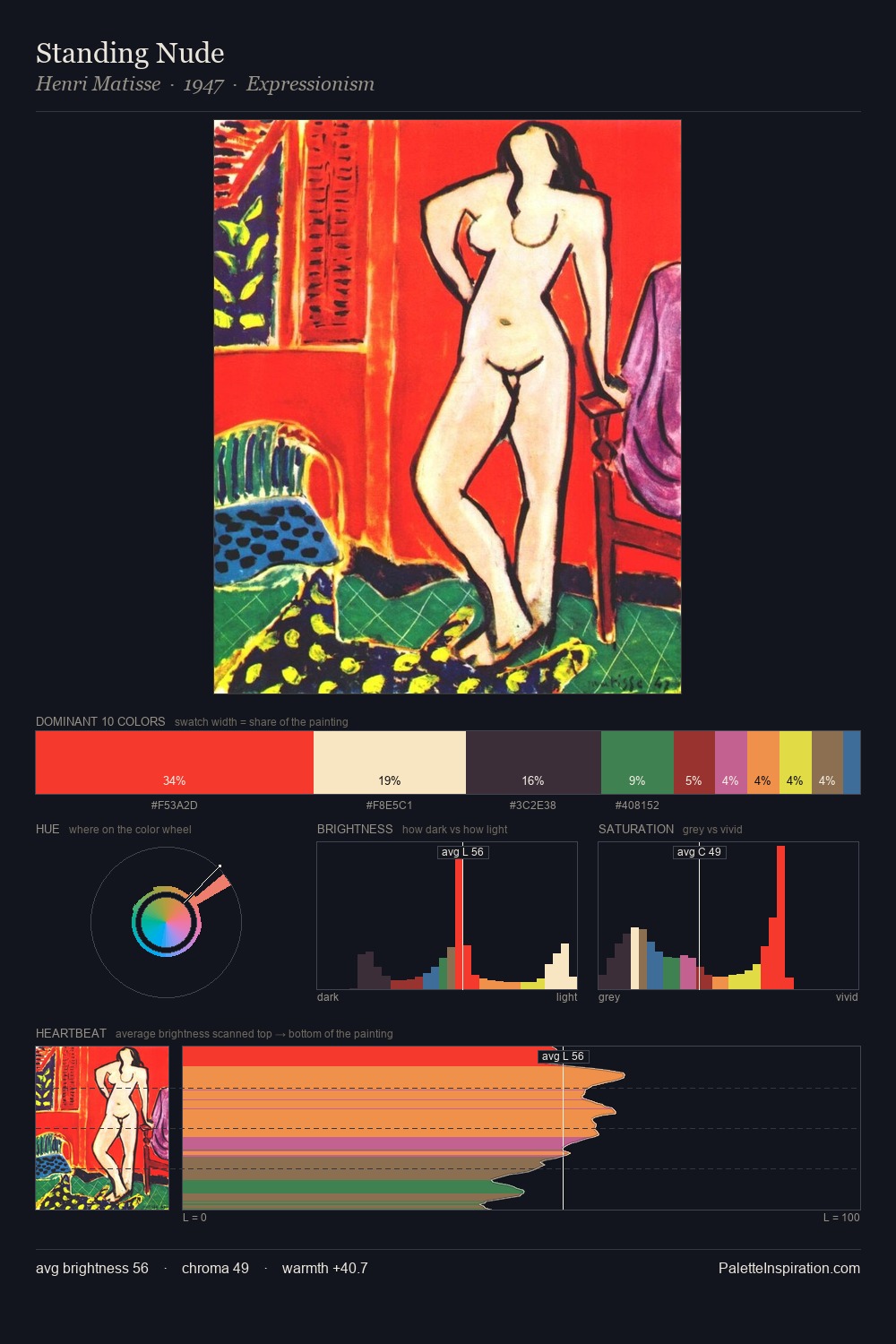
Eleanor Fortescue-Brickdale is strongly light-biased - shadow is suggested rather than declared. Eleanor Fortescue-Brickdale tilts toward cool - blues and silver-greys carry the structural weight. Every colour is desaturated; the palette proceeds through near-neutrals and gently-coloured greys. At 31.8%, #FEFDE8 functions less as a colour accent and more as a complete atmospheric environment. At 1.8%, #E5D45B carries the palette's sharpest chromatic charge: an accent that earns its place precisely because it is withheld. The value range spans 61 units across the palette, providing the full gamut from deep shadow to near-white and ensuring clear tonal hierarchy. High luminosity and cool temperature suggest the plein-air condition: unfiltered daylight and open sky. Palette 1 sits within the larger chromatic argument that Eleanor Fortescue-Brickdale's complete body of work advances.
Example use cases
- publishing
- corporate identity
- consumer apps
- hospitality
- design agencies
I Love This!
Copy, export, or download for your project
Related Palettes

Eleanor Fortescue-Brickdale Palette 2
Blazing Cream

Eleanor Fortescue-Brickdale Palette 3
Luminous Flaxen

Eleanor Fortescue-Brickdale Palette 4
Blazing Cream

Eleanor Fortescue-Brickdale Palette 5
Gleaming Cream

Eleanor Fortescue-Brickdale Palette 6
Veiled Tawny

Eleanor Fortescue-Brickdale Palette 7
Penumbral Tawny