El Lissitzky Palette 2

Palette Analysis
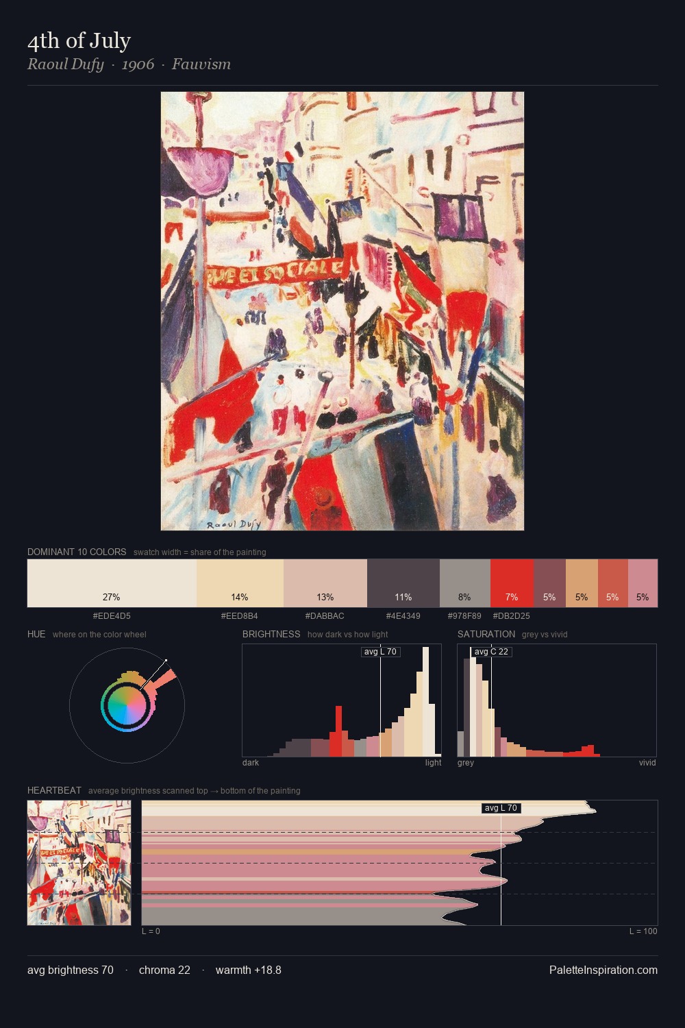
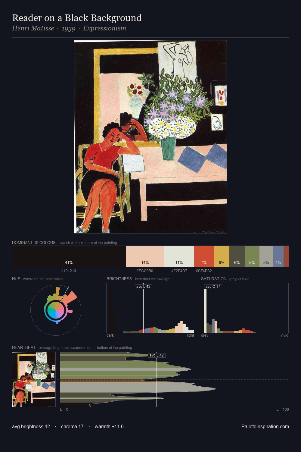
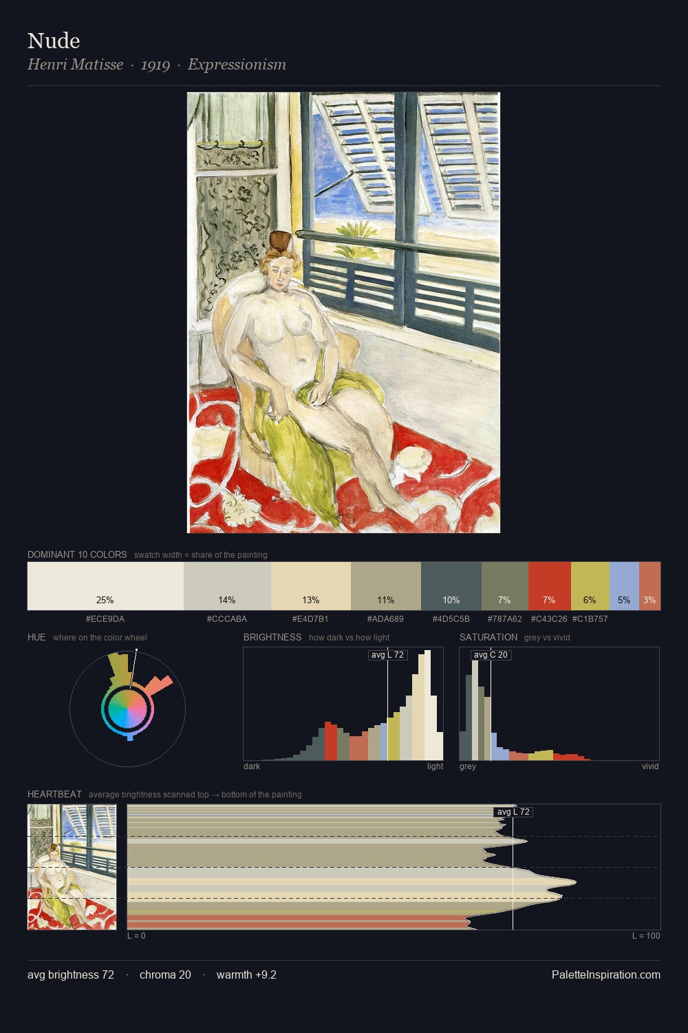
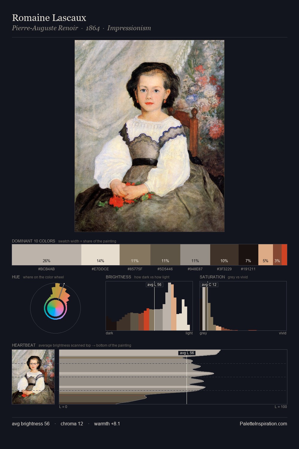
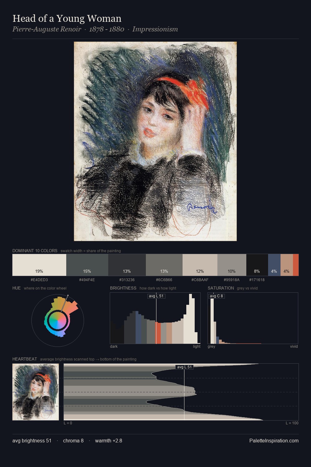
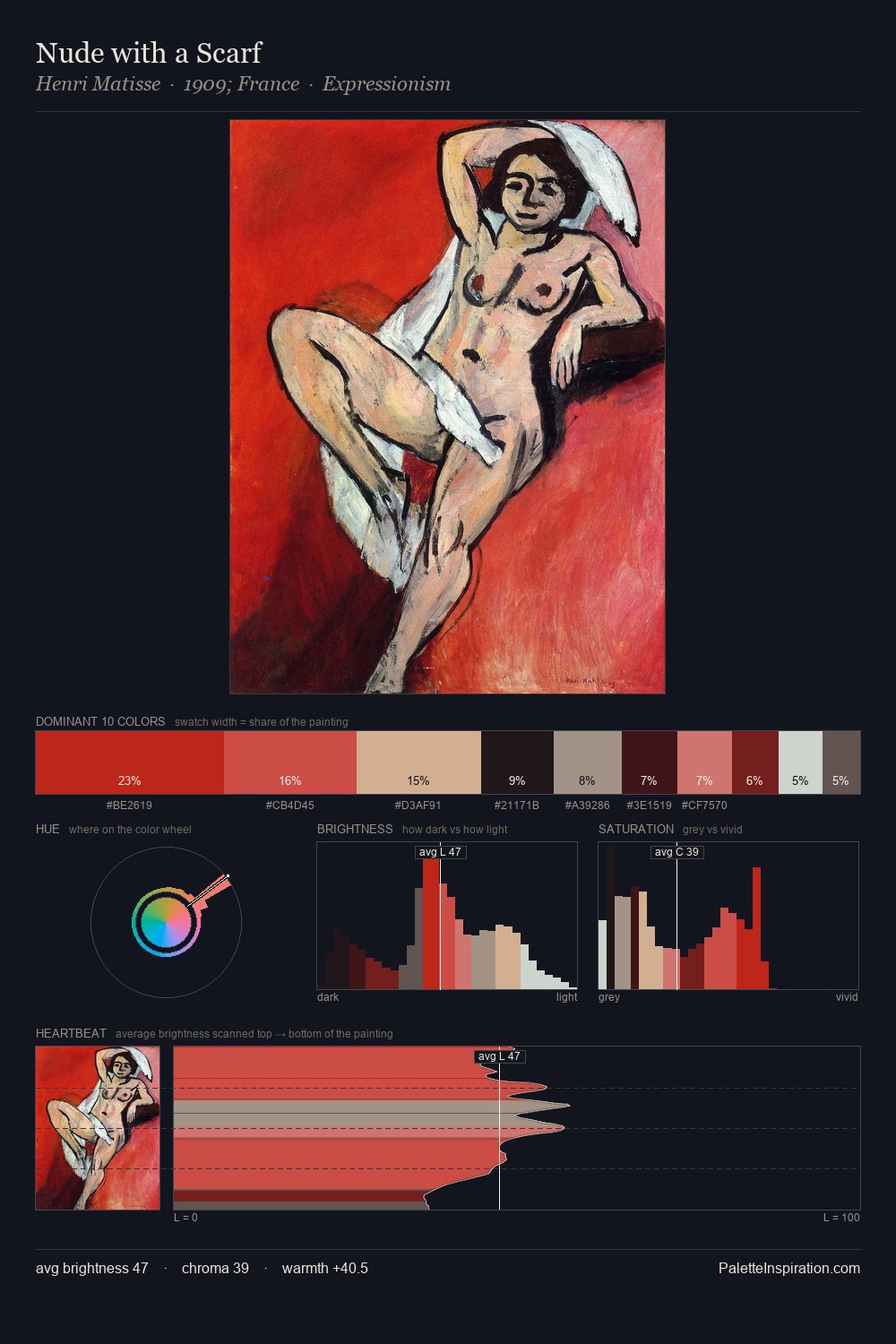
Values in El Lissitzky tilt decisively toward white, giving the palette its luminous character. Blues and teal-greys govern the palette, lending it an aquatic or atmospheric quality. Every colour is desaturated; the palette proceeds through near-neutrals and gently-coloured greys. The dominant colour, #F7F9EC, takes 67.7% of the total area, establishing the overall mood before any other hue is introduced. At 1.8%, #CB624E carries the palette's sharpest chromatic charge: an accent that earns its place precisely because it is withheld. From deepest dark to palest light, the palette traverses 63 units of the value scale - a span that creates natural depth. High luminosity and cool temperature suggest the plein-air condition: unfiltered daylight and open sky. Palette 2 sits within the larger chromatic argument that El Lissitzky's complete body of work advances.
Example use cases
- publishing
- corporate identity
- consumer apps
- hospitality
- design agencies
I Love This!
Copy, export, or download for your project