Edwin Dickinson Palette 2

Palette Analysis
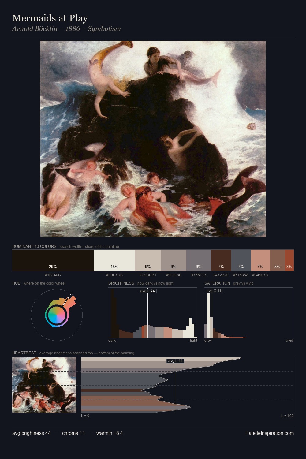
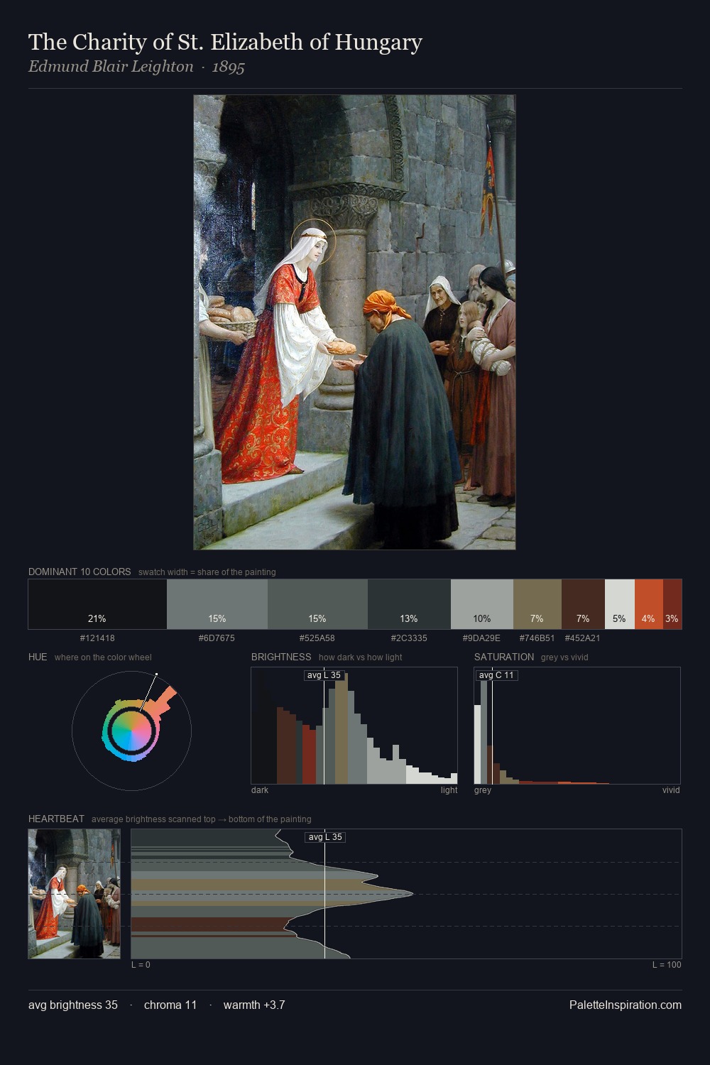
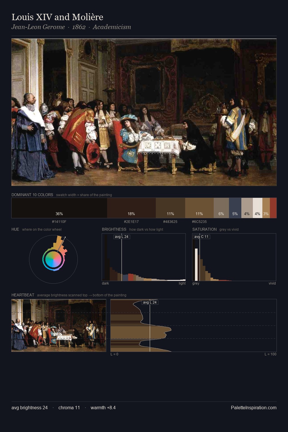
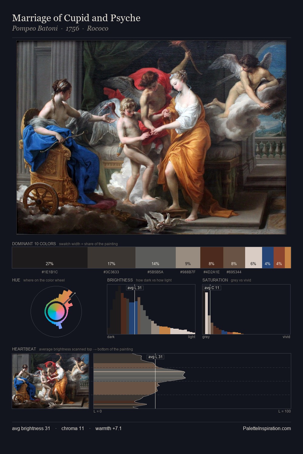
Edwin Dickinson distributes its values across the middle register, creating harmony without high contrast. Warm and cool are kept in productive tension, creating the kind of chromatic harmony that sustains the eye. Every colour is desaturated; the palette proceeds through near-neutrals and gently-coloured greys. The dominant colour, #070607, takes 28.4% of the total area, establishing the overall mood before any other hue is introduced. #D6C8BA delivers the chromatic peak at only 8.7% - a small shot of colour with outsized visual impact. 82 units of value range underpin the palette's structural clarity: the eye always knows where light falls. In the context of Edwin Dickinson's full range of palettes, group 2 represents one movement in an ongoing chromatic dialogue.
Example use cases
- interior design
- furniture brands
- cookbook publishing
- wine & spirits
- food packaging
I Love This!
Copy, export, or download for your project