Edward Wilkins Waite Palette 1
Muted Apricot
Muted Deliberately desaturated - chroma pulled toward gray, the restraint of tonal painting.
Apricot Soft warm orange - peach-adjacent, the color of ripe stone fruit.

Palette Analysis
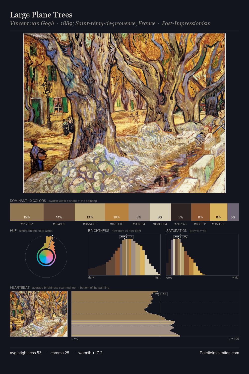
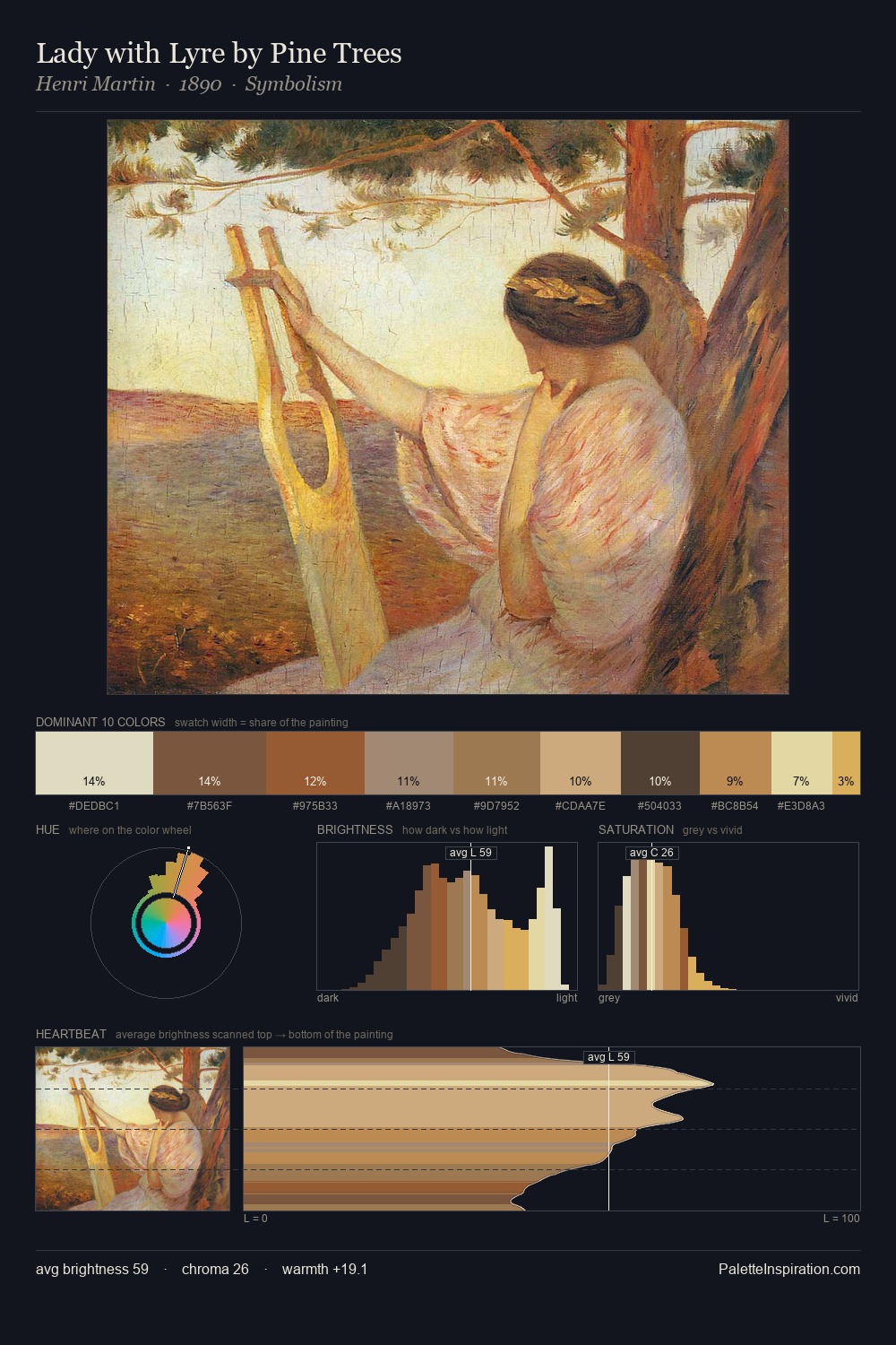
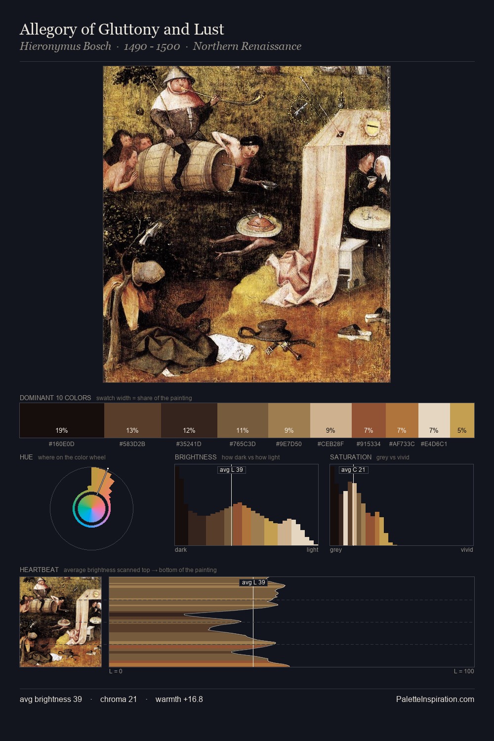
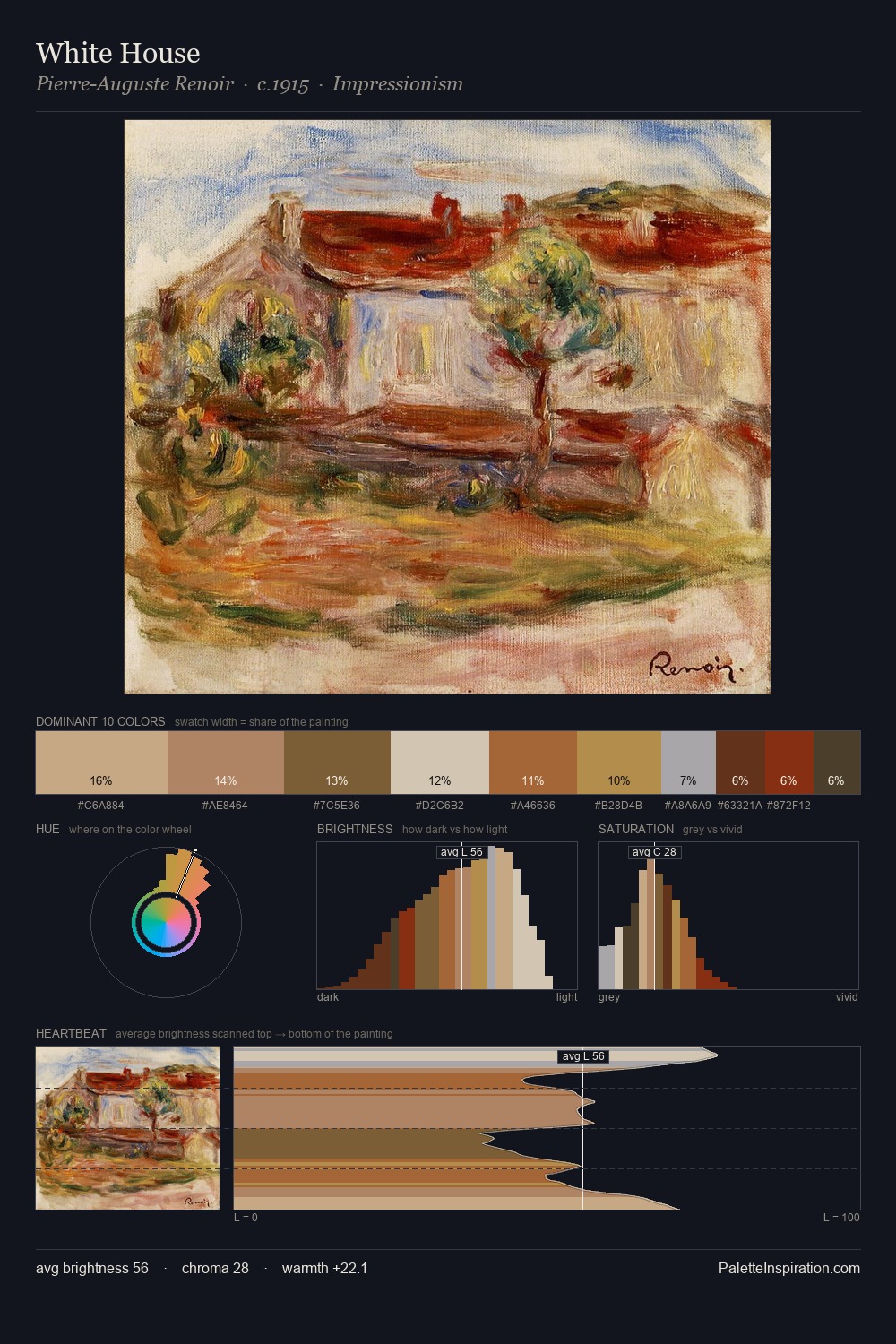
The value structure of Edward Wilkins Waite is mid-key: quiet, controlled, and cohesive. Edward Wilkins Waite orchestrates warmth above all else - reds, ambers, and siennas take the lead. A restrained, mid-chroma palette: every hue is present and legible, but nothing shouts. The highest-chroma note - #E5D8B5 - appears at just 10.2%, deployed as a precision accent against the quieter ground. Value range is moderate at 49 units - enough contrast for legibility, not so much as to fragment the tonal unity. In the context of Edward Wilkins Waite's full range of palettes, group 1 represents one movement in an ongoing chromatic dialogue.
Example use cases
- ceramics & pottery
- boutique hospitality
- menswear
- heritage food brands
- craft & artisan brands
I Love This!
Use This Palette
Copy, export, or download for your project
Copy, export, or download for your project
Copy:
Download:
Share: