Edward Robert Hughes Palette 5

Palette Analysis
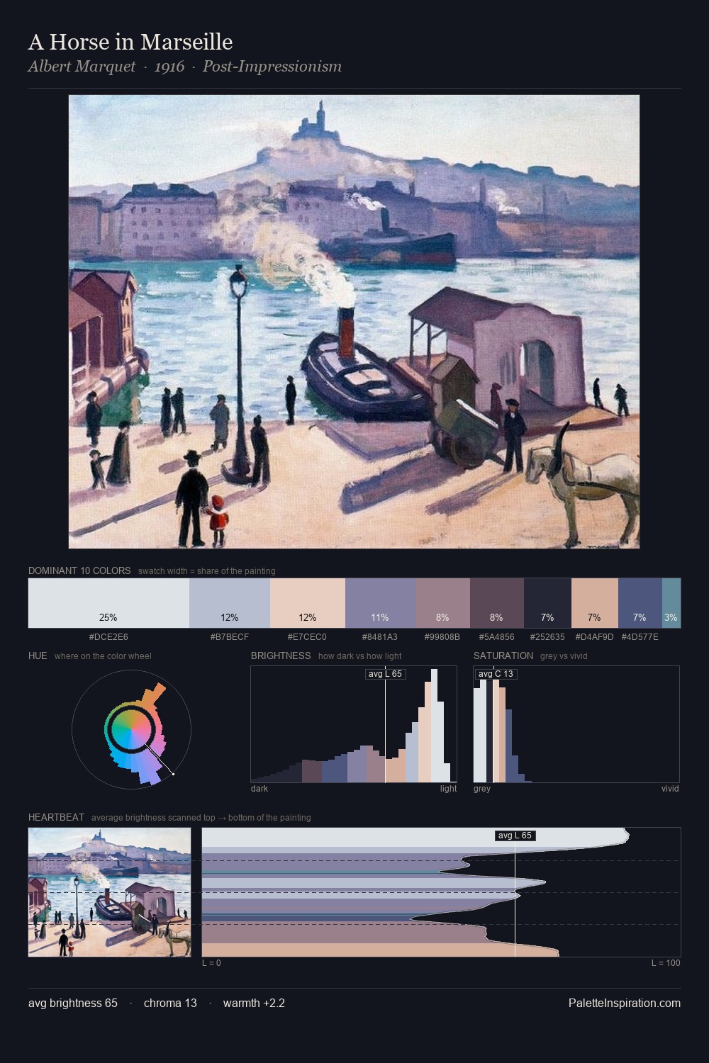
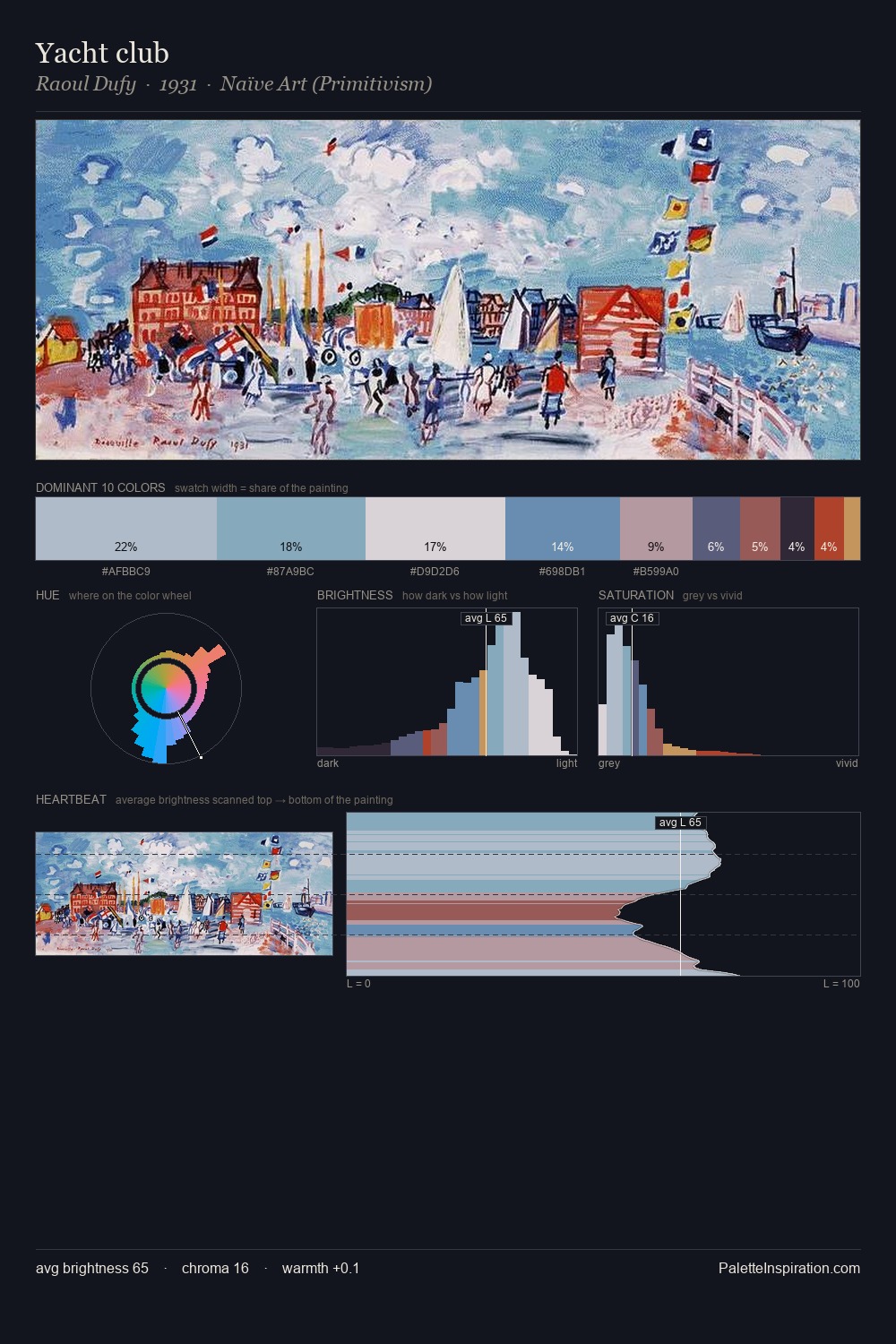
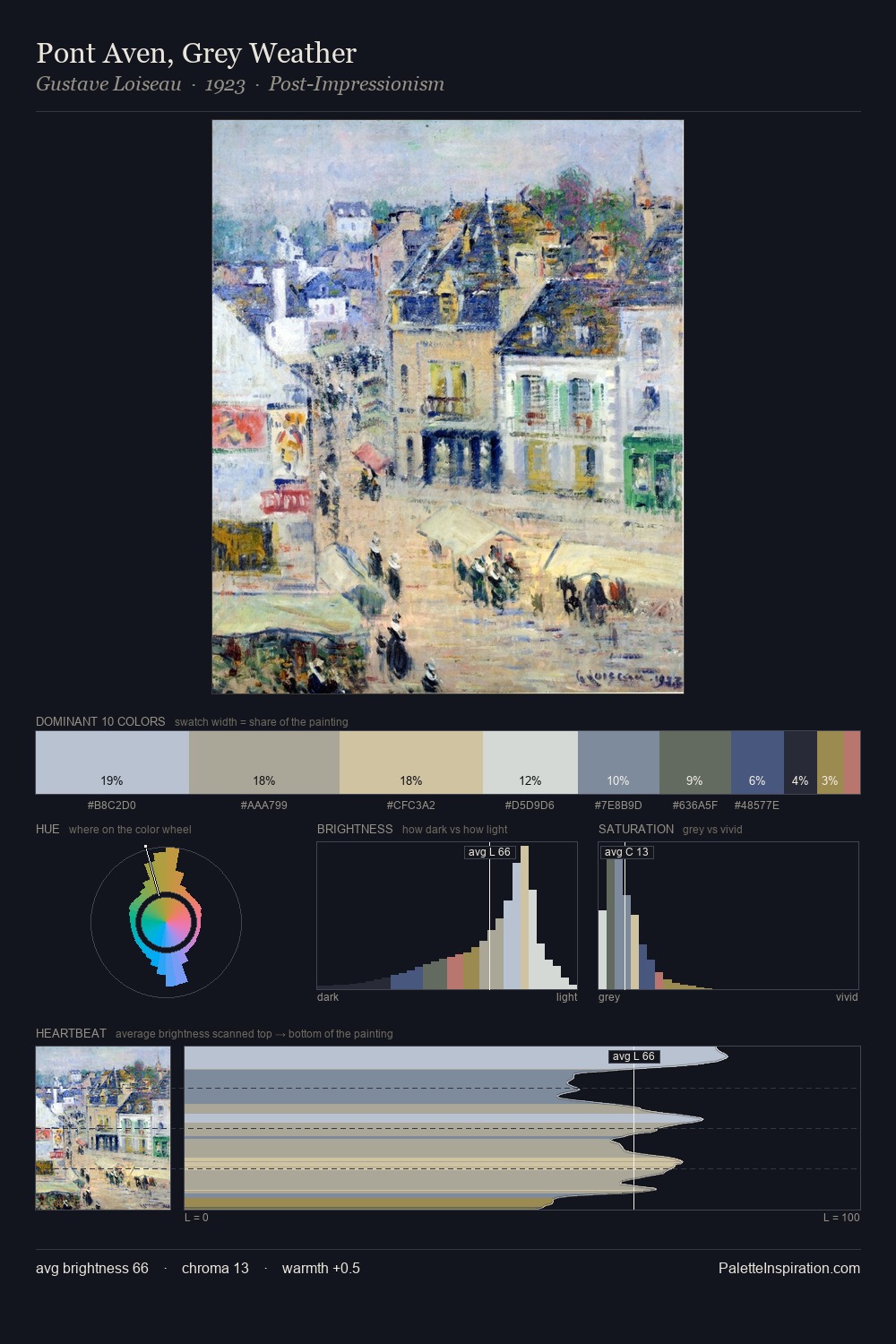
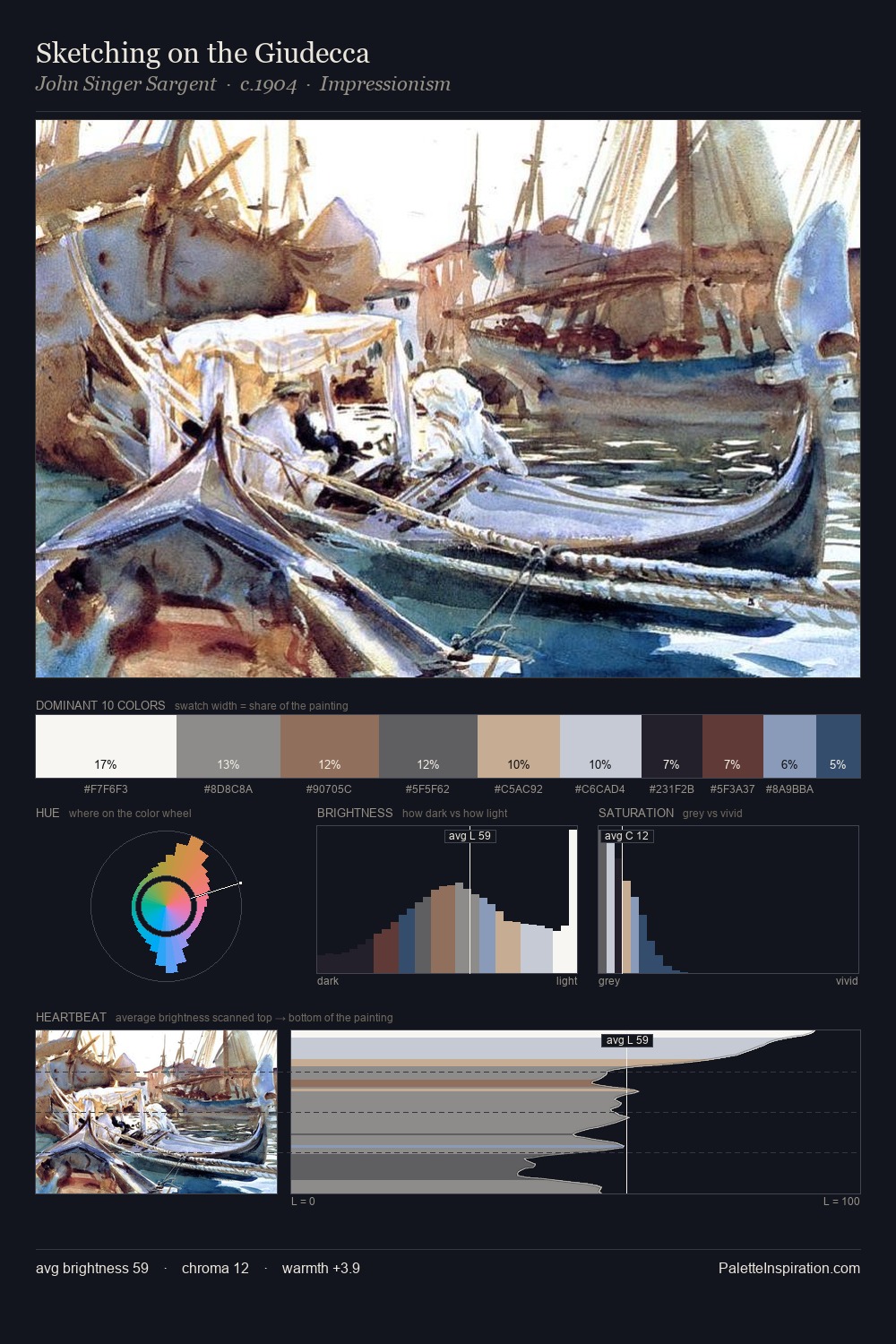
Edward Robert Hughes occupies the comfortable middle of the value scale, avoiding both extremes to hold the eye in a sustained middle grey. Edward Robert Hughes tilts toward cool - blues and silver-greys carry the structural weight. All colours lean toward grey, building depth through value rather than colour punch. The most saturated colour, #1B252D, is reserved to 7.3% of the surface, where it acts as a focal punctuation. At 63 units of value range, the palette has the tonal breadth to sustain complex spatial readings. High luminosity and cool temperature suggest the plein-air condition: unfiltered daylight and open sky. Edward Robert Hughes's palette 5 carries its own internal logic while remaining in conversation with the artist's broader colour intelligence.
Example use cases
- professional services
- specialty retail
- photography agencies
- tech products
- art galleries
I Love This!
Copy, export, or download for your project