Edward Robert Hughes Palette 3
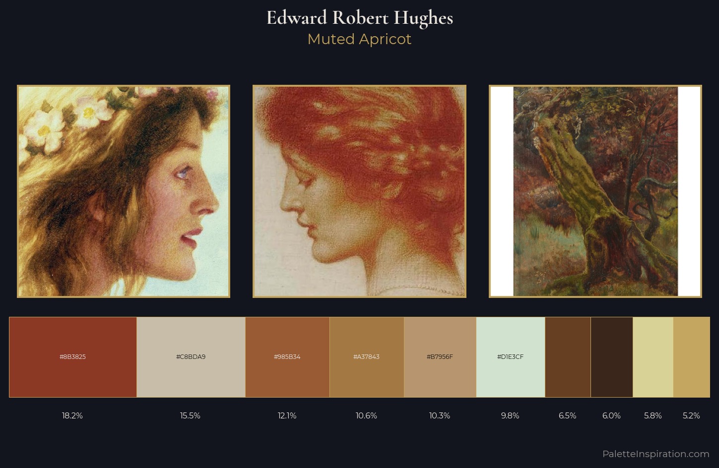
Muted Apricot
Muted Deliberately desaturated - chroma pulled toward gray, the restraint of tonal painting.
Apricot Soft warm orange - peach-adjacent, the color of ripe stone fruit.
Palette Analysis
Mid-key values give Edward Robert Hughes its characteristic quietness - nothing blazes, nothing disappears. Yellow, ochre, sienna: warm hues that Edward Robert Hughes deploys as the palette's primary energy. Saturation is measured and controlled, giving the palette presence without visual aggression. #8B3825 is not a small accent - at 18.2% it qualifies as a major presence and gives the palette its chromatic identity. 61 units of value range underpin the palette's structural clarity: the eye always knows where light falls. Edward Robert Hughes's palette 3 carries its own internal logic while remaining in conversation with the artist's broader colour intelligence.
Example use cases
- ceramics & pottery
- boutique hospitality
- menswear
- heritage food brands
- craft & artisan brands
I Love This!
Use This Palette
Copy, export, or download for your project
Copy, export, or download for your project
Copy:
Download:
Share: