Edward Frederick Brewtnall Palette 1

Palette Analysis
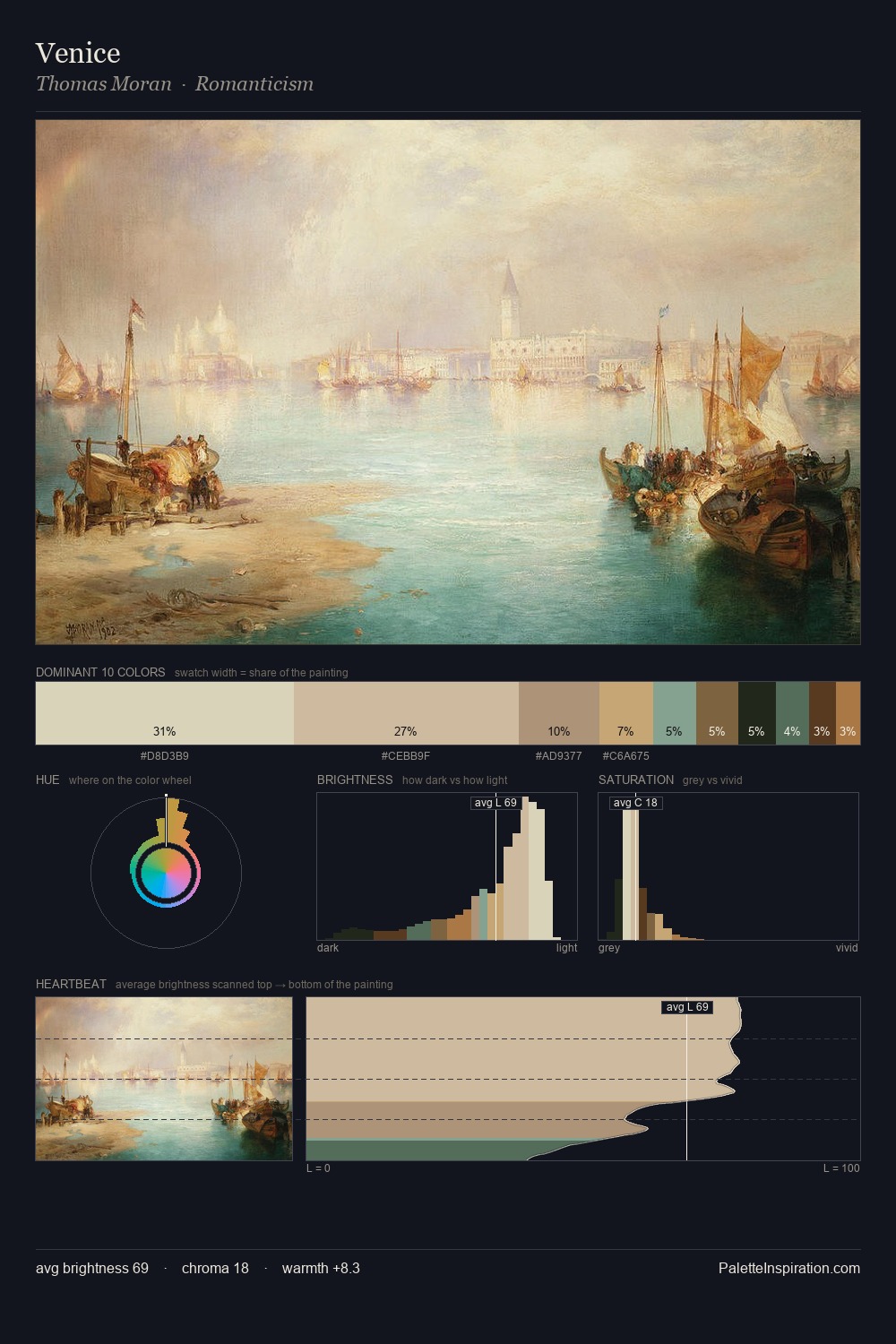
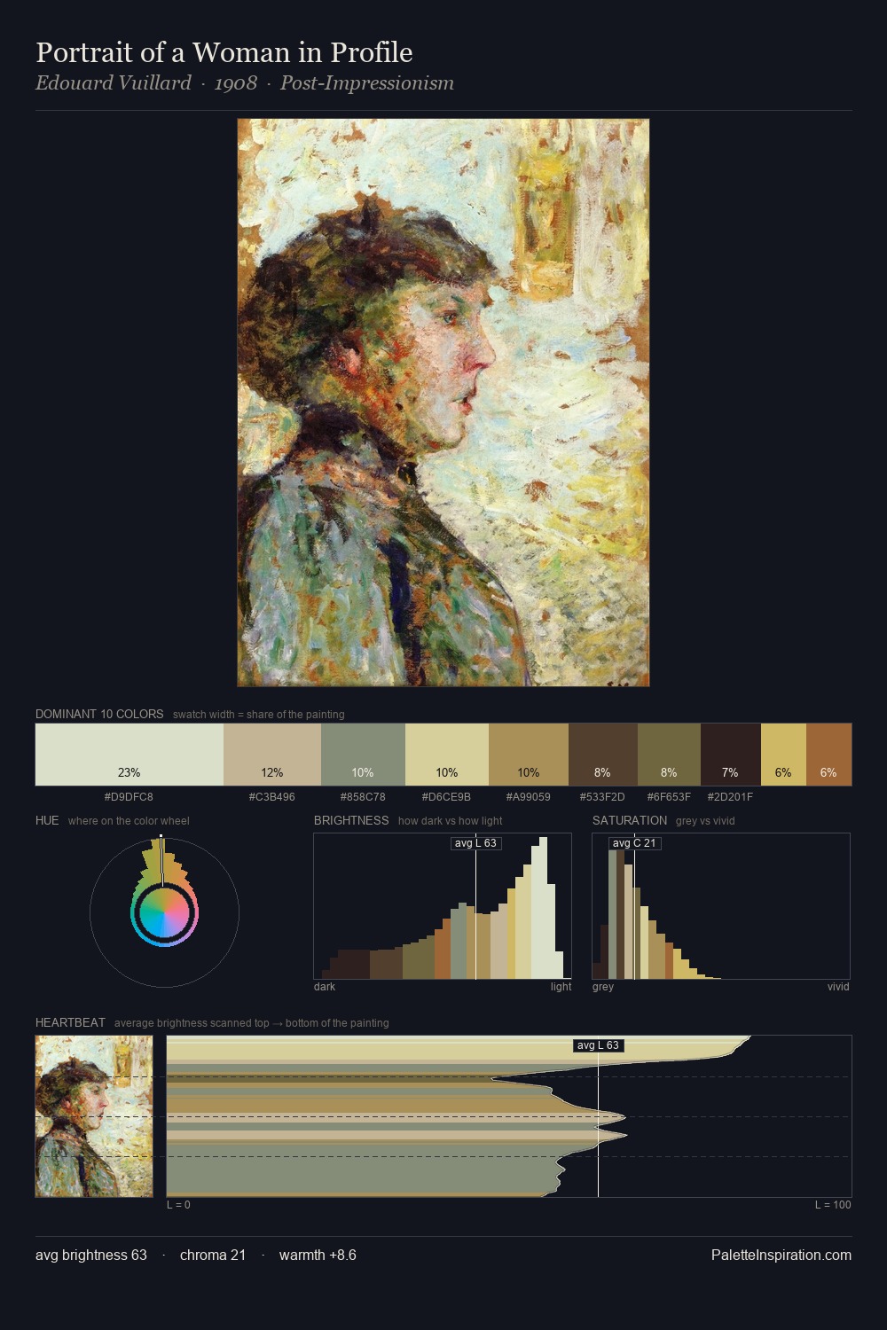
Light floods Edward Frederick Brewtnall; the palette keeps values pale and airy across its range. Cool hues prevail: blues, greens, and greys anchor the palette's emotional temperature. Chroma is held at a comfortable level - distinct colours, but no single hue is allowed to overwhelm. #62422D delivers the chromatic peak at only 3.9% - a small shot of colour with outsized visual impact. Value range is moderate at 49 units - enough contrast for legibility, not so much as to fragment the tonal unity. The palette has the character of outdoor light: cool, mid-bright, with colour rendered faithfully rather than expressively. This is palette 1 of Edward Frederick Brewtnall's sequence - a single chapter in a chromatic story told across many works.
Example use cases
- ceramics & pottery
- boutique hospitality
- menswear
- heritage food brands
- craft & artisan brands
I Love This!
Copy, export, or download for your project