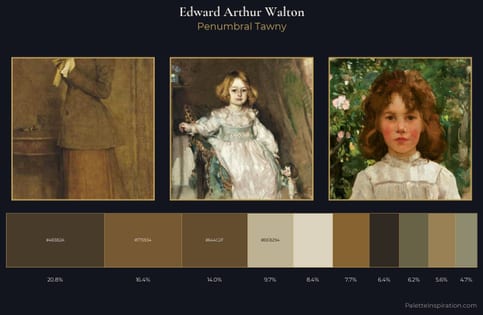
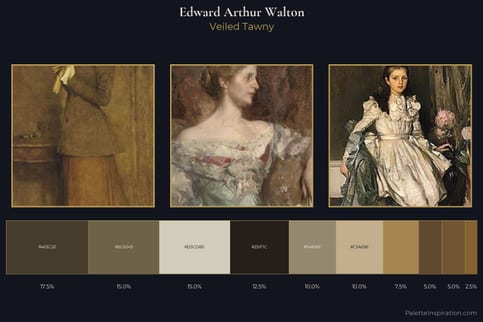
Edward Arthur Walton Palette 4
Palette Analysis
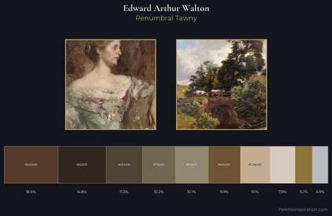
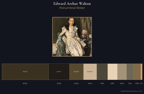
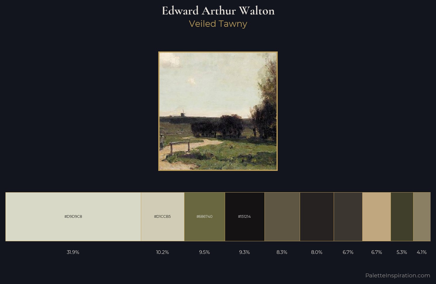
Edward Arthur Walton occupies the comfortable middle of the value scale, avoiding both extremes to hold the eye in a sustained middle grey. Temperature is cool-dominant, with blue and green families claiming the largest areas. The absence of saturated colour is itself an expressive choice: this is a palette of restraint and atmosphere. A single dominant - #D9D9C8 at 31.9% - sets the character of the whole composition. At 6.7%, #C1A77F carries the palette's sharpest chromatic charge: an accent that earns its place precisely because it is withheld. 69 units of value range underpin the palette's structural clarity: the eye always knows where light falls. The mid-to-high key, cool bias, and moderate chroma point to outdoor observation - sky and diffused daylight as the dominant light source. In the context of Edward Arthur Walton's full range of palettes, group 4 represents one movement in an ongoing chromatic dialogue.
Example use cases
- exhibition design
- foundation branding
- estate management
- art education
- museums & galleries
I Love This!
Copy, export, or download for your project