Edmund Charles Tarbell Palette 2
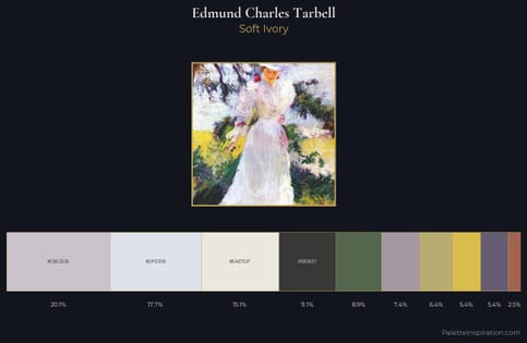
Hushed Ivory
Hushed Very low chroma and quiet value - restrained to near-silence, barely present.
Ivory Warm creamy white - the color of natural ivory, warmer than pure white.
Palette Analysis
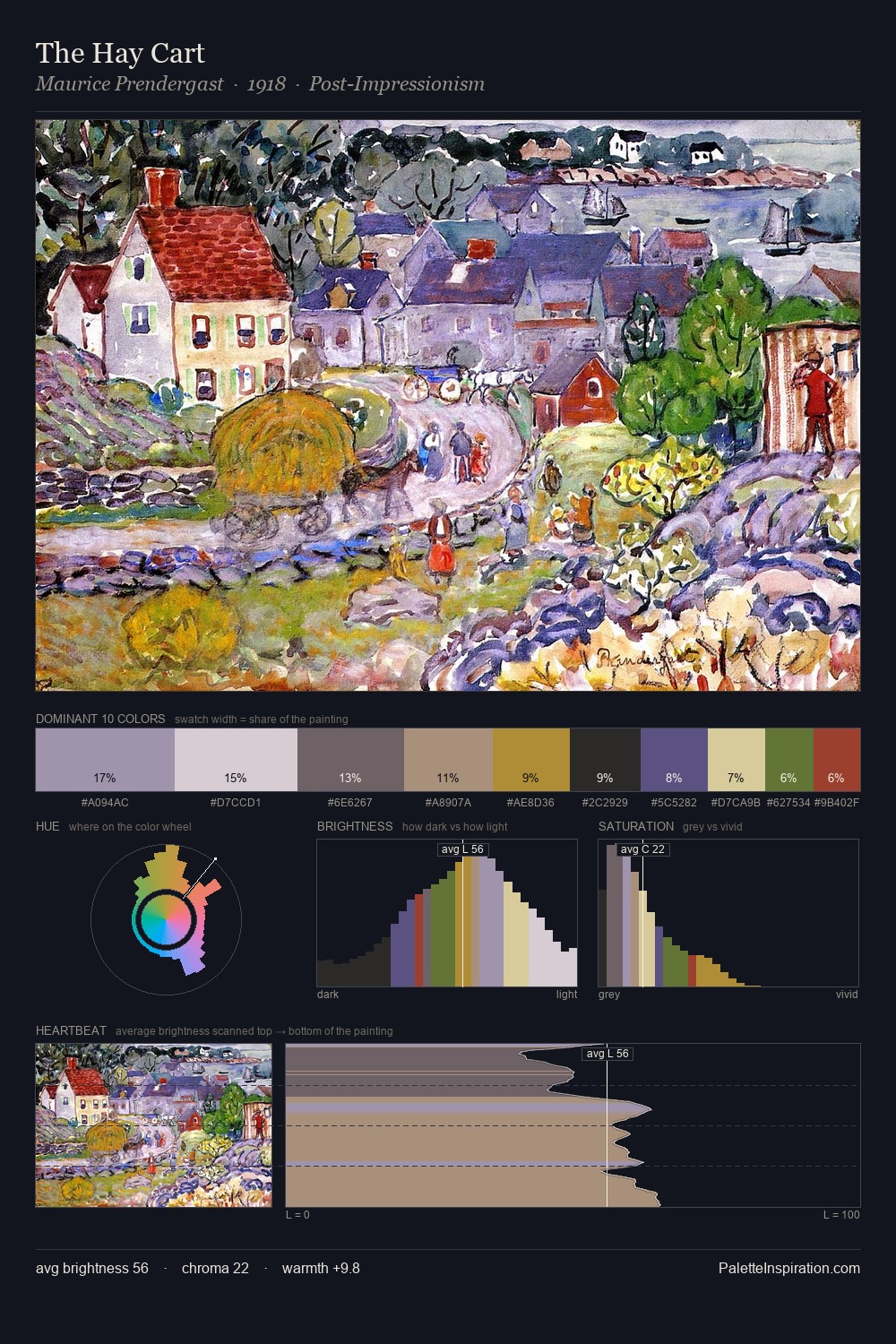
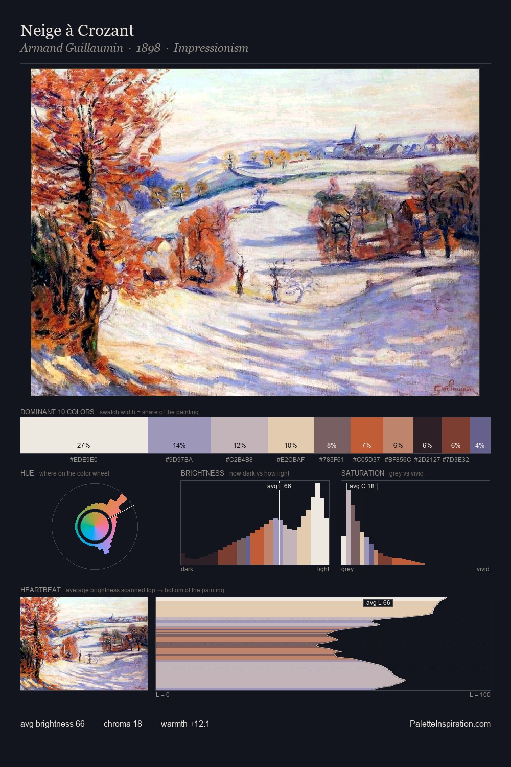
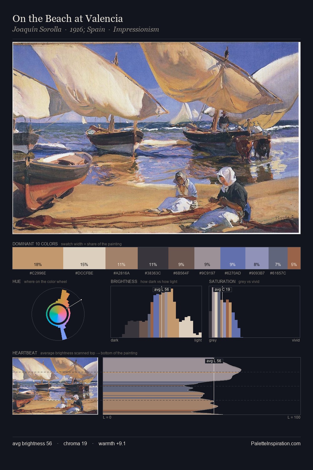
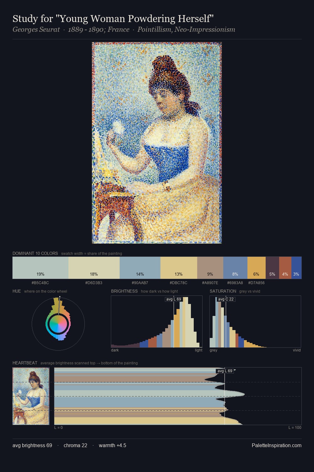
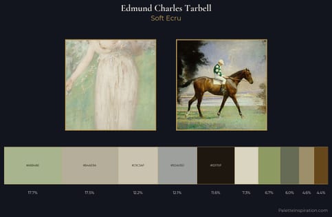
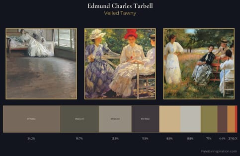
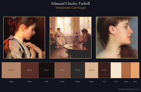
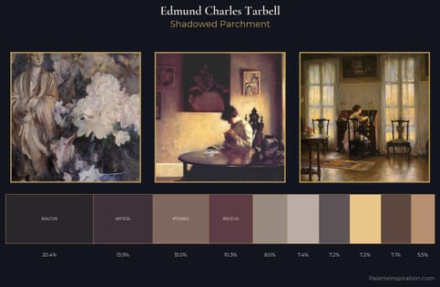
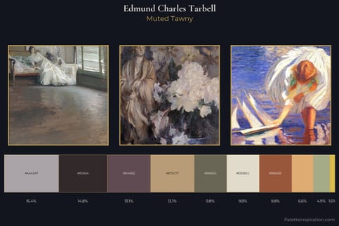
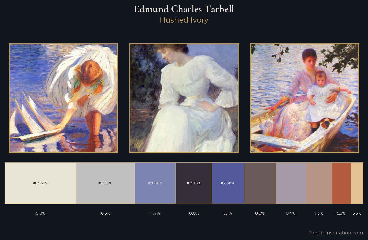
Edmund Charles Tarbell works in the upper reaches of the value scale, creating an atmosphere of brightness and expansiveness. Warm and cool are kept in productive tension, creating the kind of chromatic harmony that sustains the eye. The absence of saturated colour is itself an expressive choice: this is a palette of restraint and atmosphere. Only 5.3% is devoted to #B25A3F, yet that small allocation delivers the palette's entire chromatic tension. 61 units of value range underpin the palette's structural clarity: the eye always knows where light falls. This is palette 2 of Edmund Charles Tarbell's sequence - a single chapter in a chromatic story told across many works.
Example use cases
- exhibition design
- foundation branding
- estate management
- art education
- museums & galleries
I Love This!
Use This Palette
Copy, export, or download for your project
Copy, export, or download for your project
Copy:
Download:
Share: