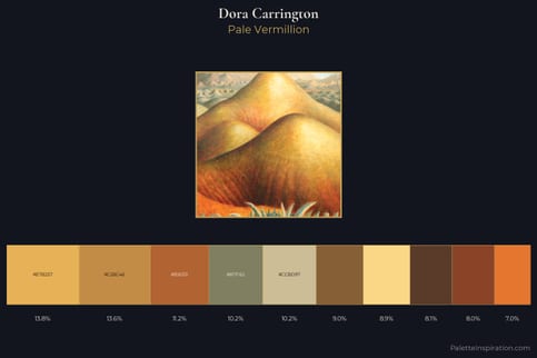
Dora Carrington Palette 1
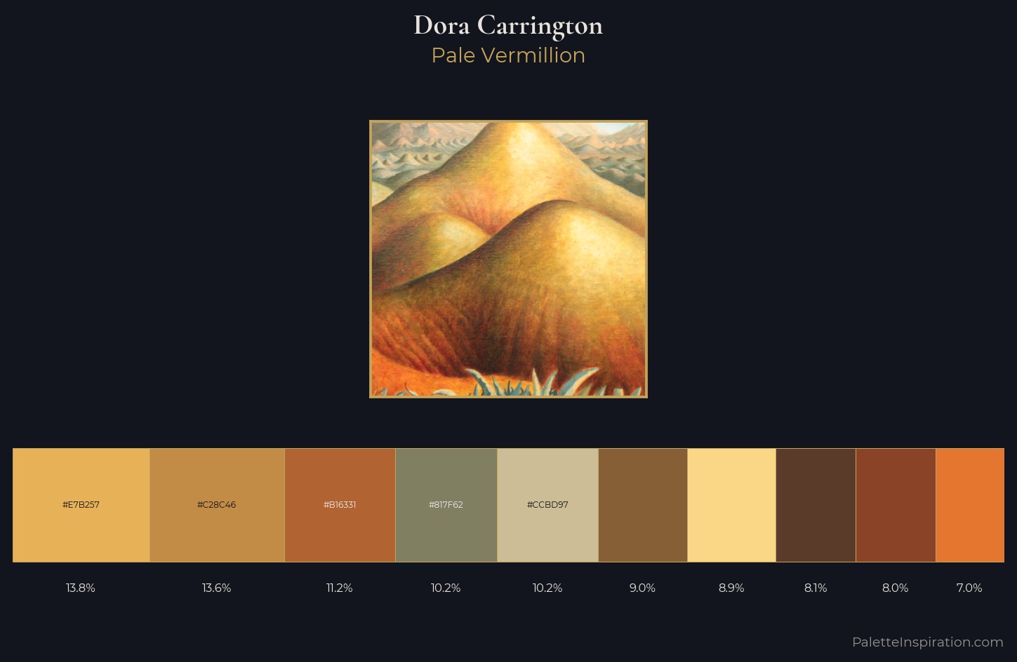
Palette Analysis
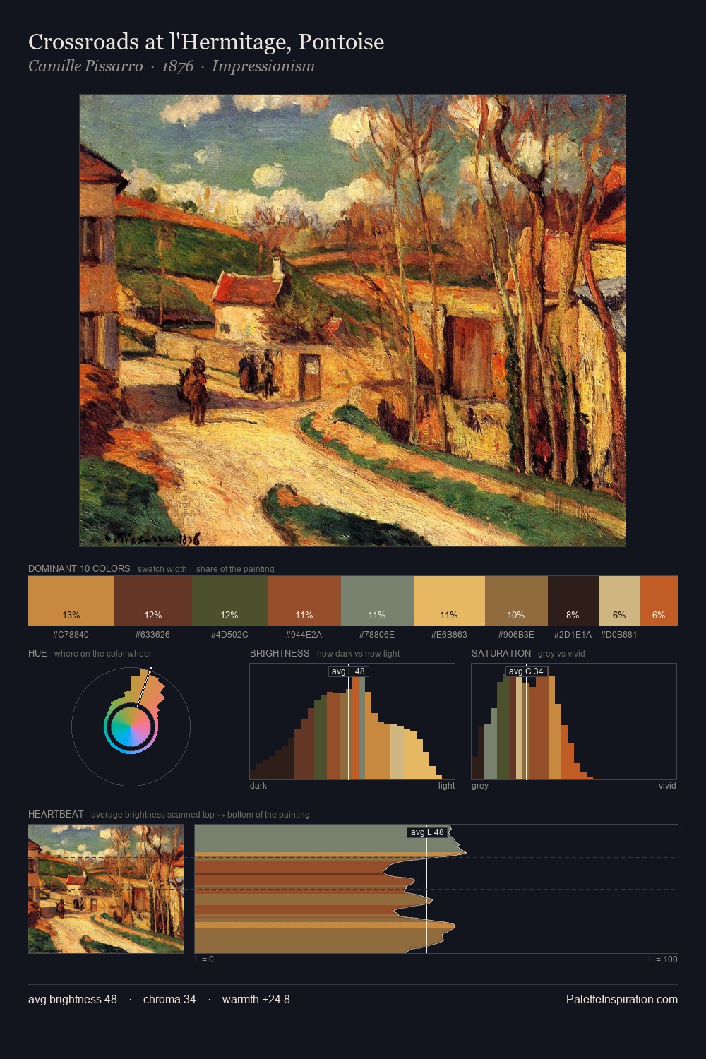
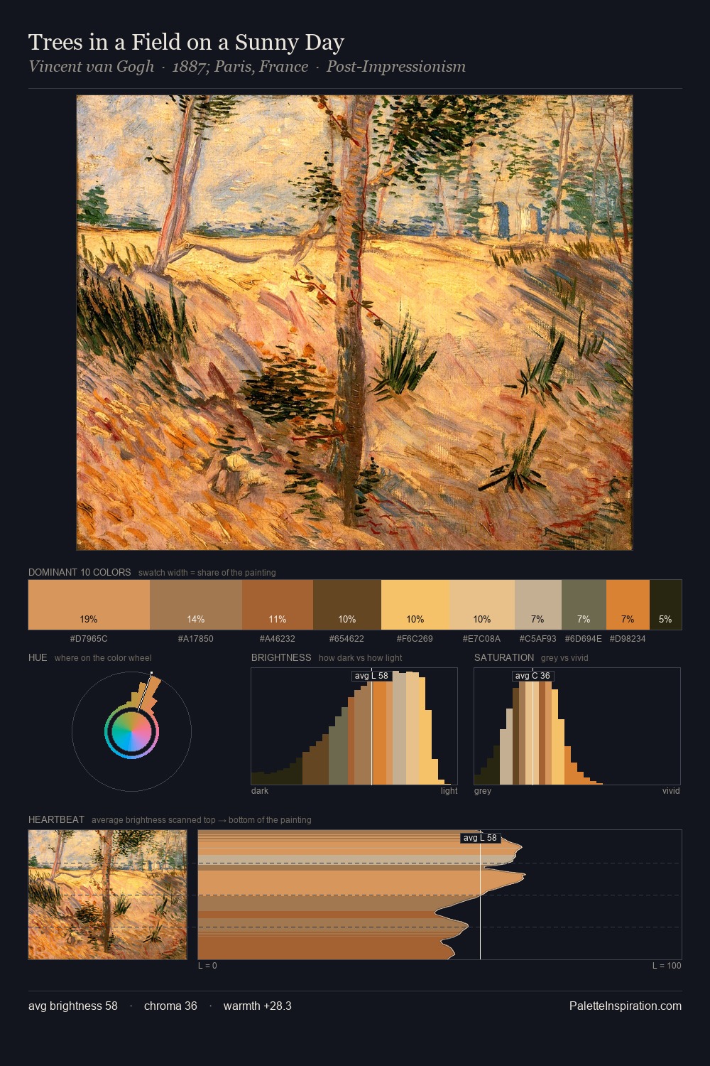
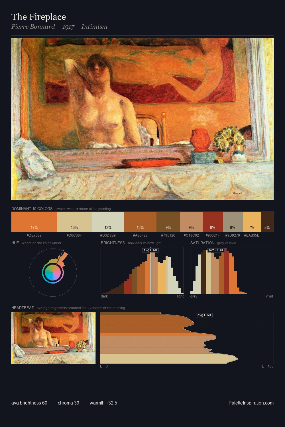
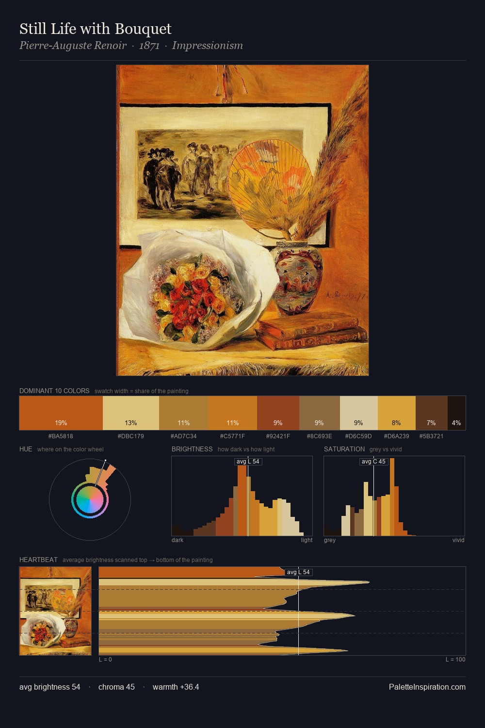
Dora Carrington is high-key - luminous, open, and weighted toward light. The palette achieves thermal balance - reds and blues, ochres and greens, each holding the other in check. Saturation is measured and controlled, giving the palette presence without visual aggression. The highest-chroma note - #8B4327 - appears at just 8.0%, deployed as a precision accent against the quieter ground. Spanning 51 units on the value axis, the palette achieves the balance between tonal flatness and fragmentation. The combination of mid-to-high key, balanced temperature, and elevated chroma is characteristic of Impressionist observation: light broken into its component hues. In the context of Dora Carrington's full range of palettes, group 1 represents one movement in an ongoing chromatic dialogue.
Example use cases
- publishing
- corporate identity
- consumer apps
- hospitality
- design agencies
I Love This!
Copy, export, or download for your project