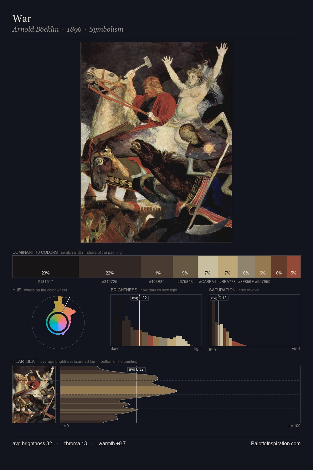
Domenico Ghirlandaio Palette 10
Shadowed Bister
Shadowed Low-key - values weighted toward shadow, the palette of dim interiors and overcast skies.
Bister Dark warm brown - a traditional ink and wash pigment made from wood soot.

Palette Analysis
Domenico Ghirlandaio distributes its values across the middle register, creating harmony without high contrast. Heat pervades this palette; warm chromatic identities outweigh cool ones at almost every weight. Every colour is desaturated; the palette proceeds through near-neutrals and gently-coloured greys. At 25.7%, #3C302C functions less as a colour accent and more as a complete atmospheric environment. The saturated accent, #6F362C, registers at 7.5% - sparse enough to feel like a deliberate surprise. From deepest dark to palest light, the palette traverses 61 units of the value scale - a span that creates natural depth. Palette 10 sits within the larger chromatic argument that Domenico Ghirlandaio's complete body of work advances.
Example use cases
- film & entertainment
- fine dining
- spirits branding
- menswear
- theater design
I Love This!
Use This Palette
Copy, export, or download for your project
Copy, export, or download for your project
Copy:
Download:
Share: