Ditlev Blunck Palette 3

Palette Analysis
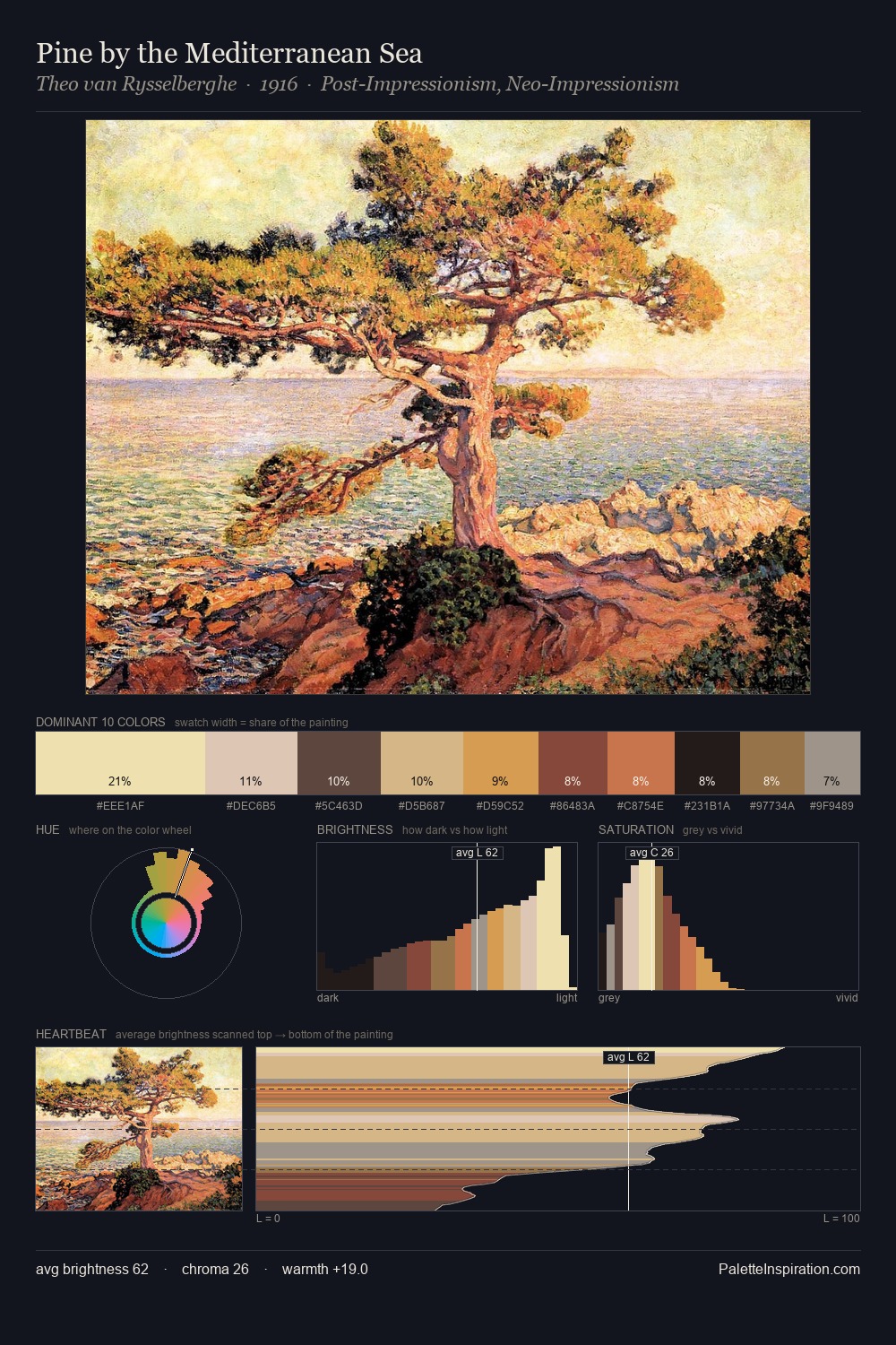
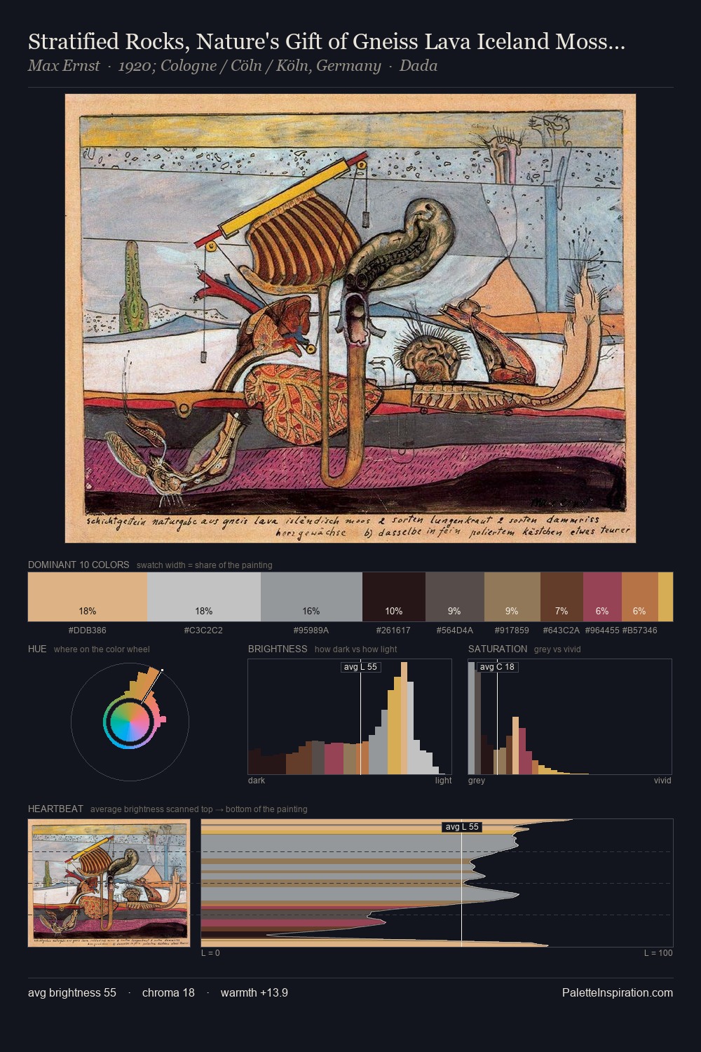
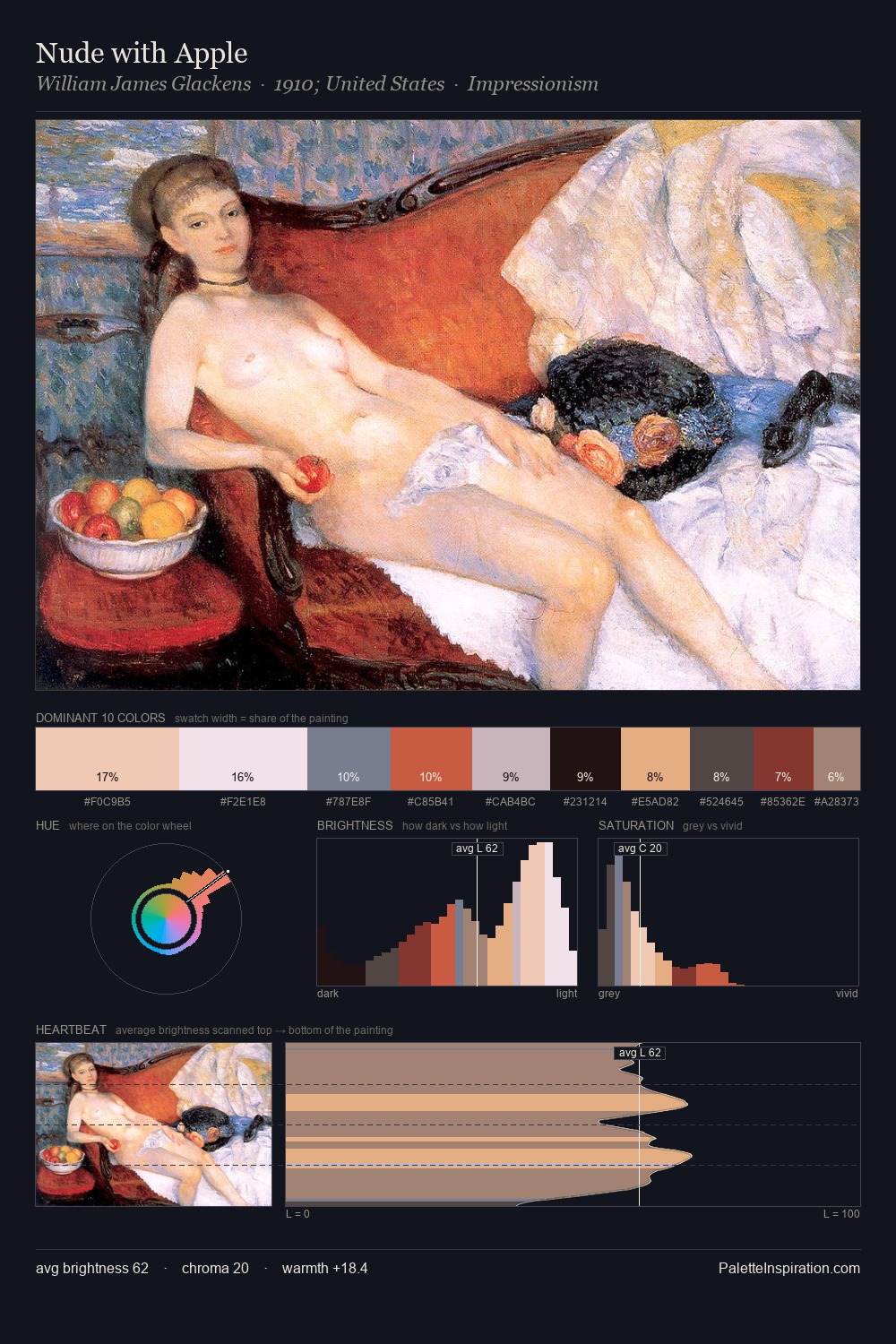
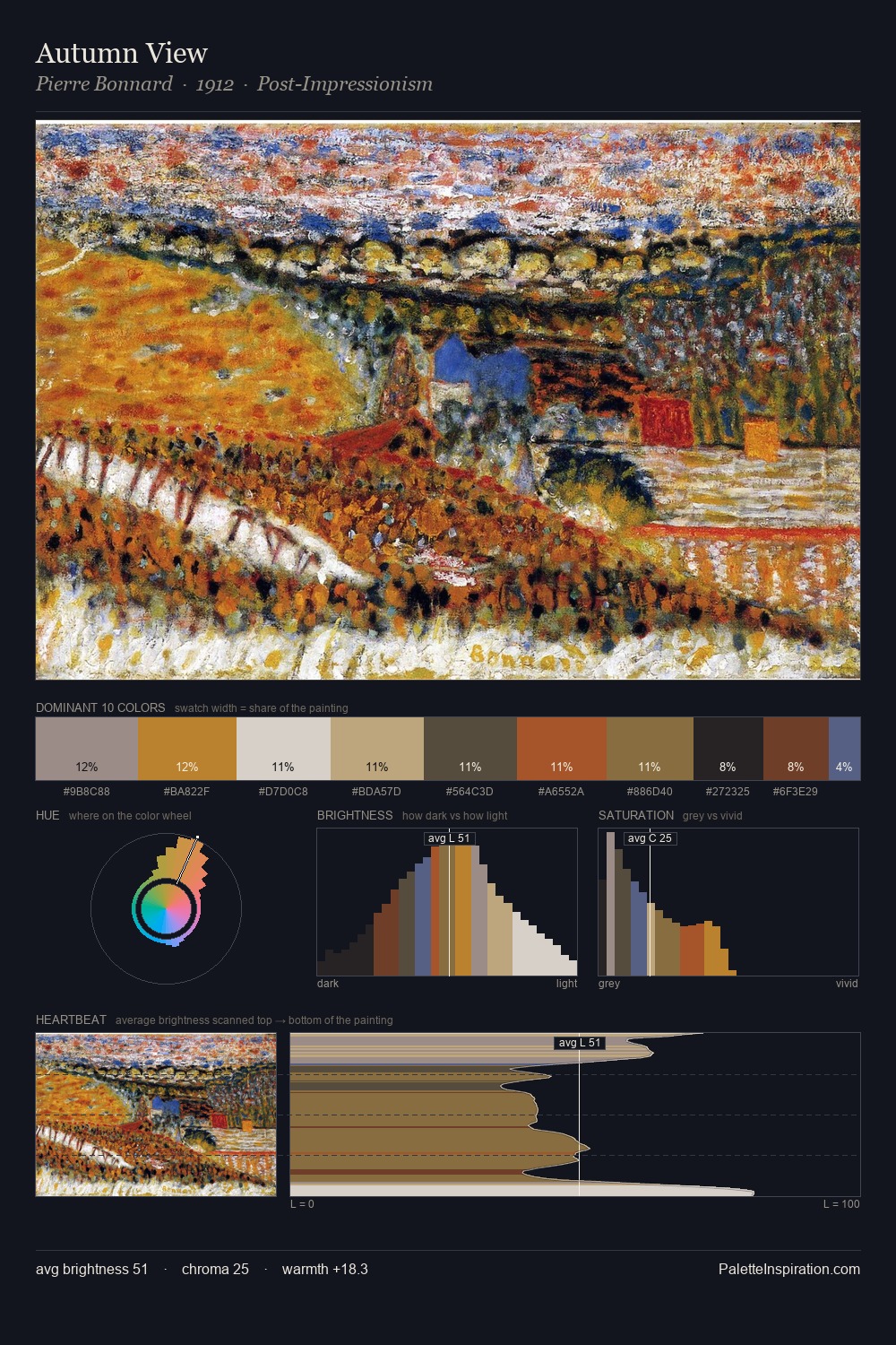
Mid-key values give Ditlev Blunck its characteristic quietness - nothing blazes, nothing disappears. Yellow, ochre, sienna: warm hues that Ditlev Blunck deploys as the palette's primary energy. Chroma hovers near zero; colour declares itself through subtle shifts in hue rather than outright saturation. At 38.3%, #110F14 functions less as a colour accent and more as a complete atmospheric environment. Only 6.0% is devoted to #D1AA7F, yet that small allocation delivers the palette's entire chromatic tension. From deepest dark to palest light, the palette traverses 73 units of the value scale - a span that creates natural depth. Ditlev Blunck's palette 3 carries its own internal logic while remaining in conversation with the artist's broader colour intelligence.
Example use cases
- theater design
- jewelry brands
- tobacco-adjacent retail
- event branding
- film & entertainment
I Love This!
Copy, export, or download for your project