Ditlev Blunck Palette 2
Veiled Gamboge
Veiled Partially obscured light - mid-dark with a hazy, scrim-filtered quality.
Gamboge Deep golden yellow - a traditional warm pigment, rich amber-gold.

Palette Analysis
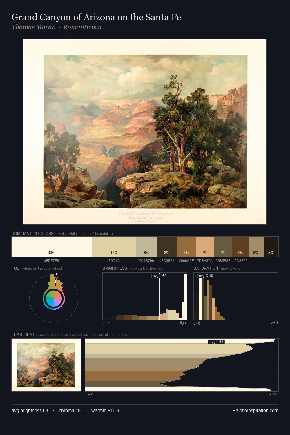
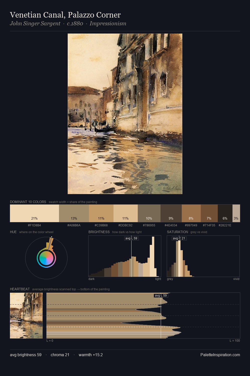
Ditlev Blunck distributes its values across the middle register, creating harmony without high contrast. The dominant temperature is warm, with earth tones and fire-hues setting the emotional key. All colours lean toward grey, building depth through value rather than colour punch. The most saturated colour, #D1AE77, is reserved to 9.2% of the surface, where it acts as a focal punctuation. From deepest dark to palest light, the palette traverses 68 units of the value scale - a span that creates natural depth. In the context of Ditlev Blunck's full range of palettes, group 2 represents one movement in an ongoing chromatic dialogue.
Example use cases
- ceramics & pottery
- boutique hospitality
- menswear
- heritage food brands
- craft & artisan brands
I Love This!
Use This Palette
Copy, export, or download for your project
Copy, export, or download for your project
Copy:
Download:
Share:
![[Unkown] palette card](/cards/0000163.jpg)