Dirck van Baburen Palette 6

Palette Analysis
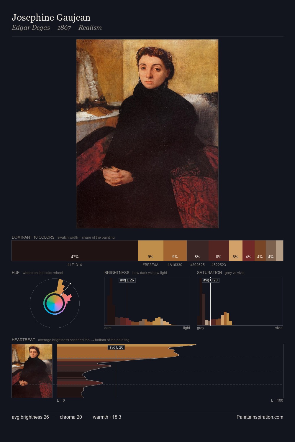
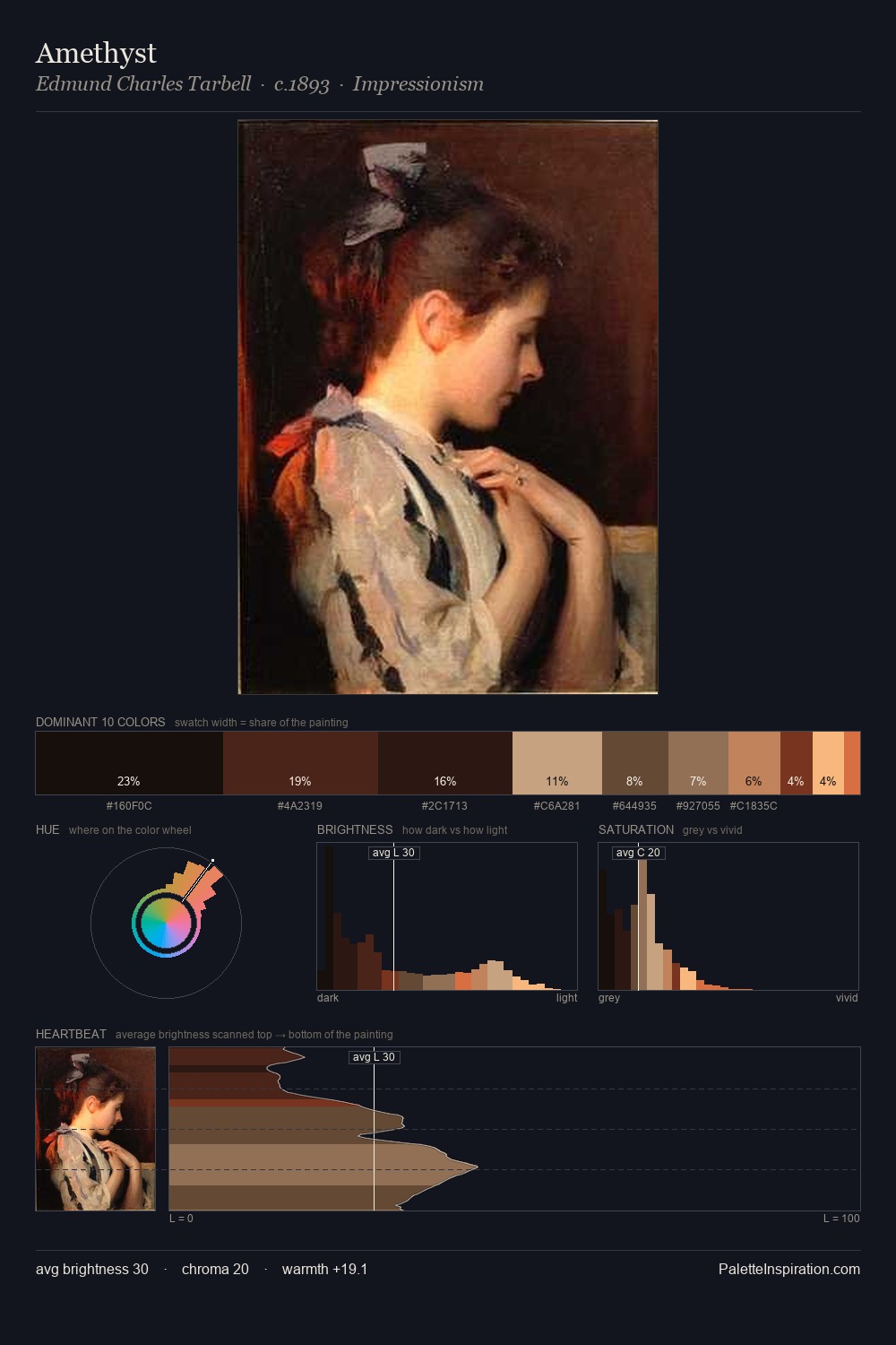
Darkness anchors Dirck van Baburen; light is rationed, creating dramatic contrast rather than open air. The dominant temperature is warm, with earth tones and fire-hues setting the emotional key. All colours lean toward grey, building depth through value rather than colour punch. A single dominant - #0E0C06 at 40.4% - sets the character of the whole composition. #DCA866 functions as the palette's exclamation mark: highest chroma, lowest percentage (1.1%). The value range spans 62 units across the palette, providing the full gamut from deep shadow to near-white and ensuring clear tonal hierarchy. This tonal restraint is characteristic of the Dirck van Baburen approach: colour serves light, not the reverse. Palette 6 sits within the larger chromatic argument that Dirck van Baburen's complete body of work advances.
Example use cases
- theater design
- jewelry brands
- tobacco-adjacent retail
- event branding
- film & entertainment
I Love This!
Copy, export, or download for your project