David Scott Palette 4

Palette Analysis
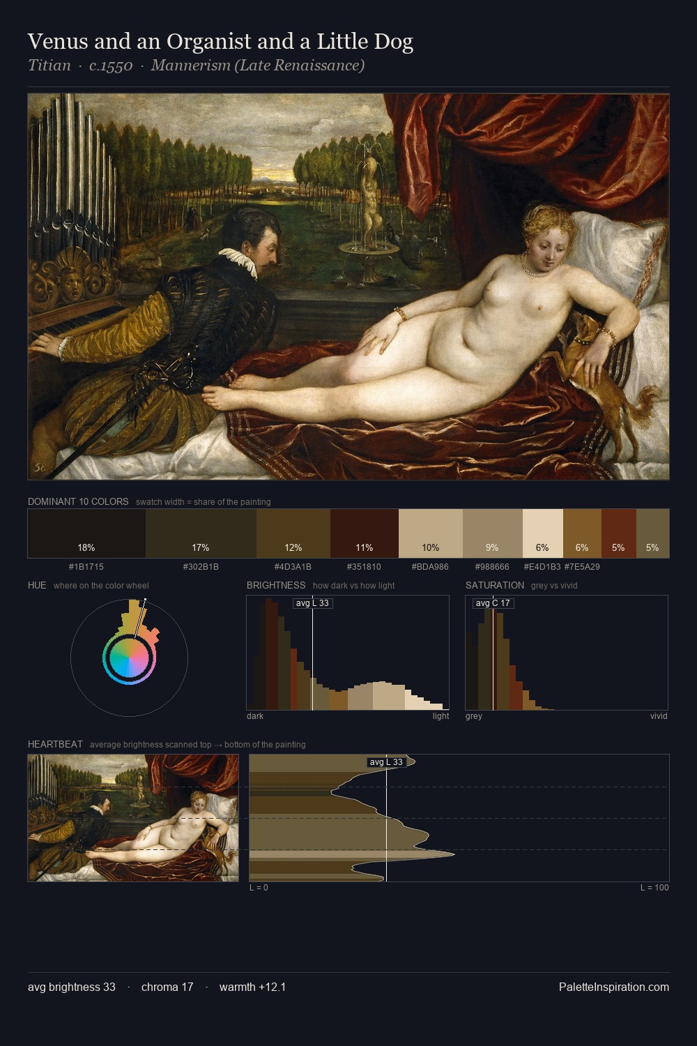
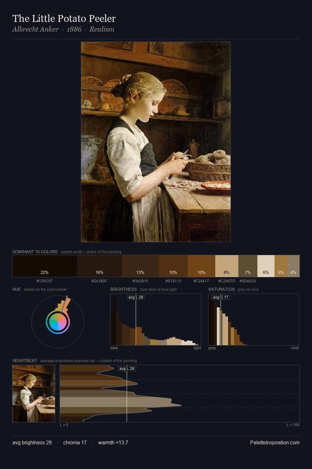
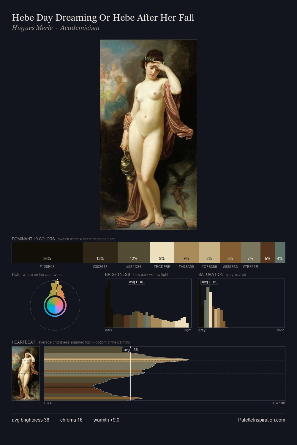
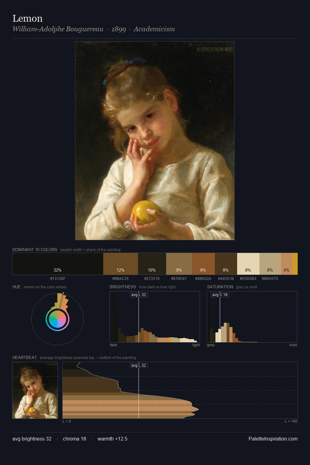
Mid-key values give David Scott its characteristic quietness - nothing blazes, nothing disappears. Temperature is cool-dominant, with blue and green families claiming the largest areas. Saturation is deliberately withheld - the beauty here lies in the near-monochromatic gradations rather than colour difference. Only 4.2% is devoted to #835121, yet that small allocation delivers the palette's entire chromatic tension. 69 units of value range underpin the palette's structural clarity: the eye always knows where light falls. The palette has the character of outdoor light: cool, mid-bright, with colour rendered faithfully rather than expressively. Palette 4 sits within the larger chromatic argument that David Scott's complete body of work advances.
Example use cases
- theater design
- jewelry brands
- tobacco-adjacent retail
- event branding
- film & entertainment
I Love This!
Copy, export, or download for your project